3/$25
carried the stash from 101 Records. into the colors, big time.
started out real wordy with this one. the long and short of it is this: didn’t want to sleep with my phone in the bedroom, but still needed an alarm clock. easy solution: get an alarm clock.
found a suitable candidate on Craigslist and drove into the city for the meet-up. it was a success; and i tacked on a visit to 101 Records on the condition that there was a reasonable place to park – convenient and often used errand loophole. got a spot right out front, of course, and spent some time digging before realizing i was in a different physical store than i’d been in a couple years back when Ed first introduced me and our dinner party after we moseyed over from a nearby restaurant. that shop was around the corner – it’s closed now.
enjoyed convo with the shopkeep – which is one place i struggled with wordiness before; cause there’s a story in it, i think. anecdotal hang-ups aside, this took me somewhere and i need to leave some crumbs. in favor of the new equipment i’d picked up, i got some CDs. “3/$25” is what the sign on the wall said, and here are the three i chose:
‘In Spite of Ourselves’ - John Prine (1999, Oh Boy) design and art direction by Dana Arnett & Jason Eplawy, photographs courtesy of Elliot Erwitt/Magnum Photos
the photograph is what got me. seeing it was a John Prine album, whose catalog i’d been nervously circling and hadn’t listened to, i knew this would be where i started. “Dear John (I Sent Your Saddle Home)” has been a favorite.
‘Shades of Blue’ - Madlib (2003/Blue Note) cover photo by B+, cover design by Jeff Jank
most familiar with Madlib from his Madvillain collaboration with the late great MF DOOM. experimentations with Blue Note recordings sounded intriguing. really digging the tracks “Slim’s Return” and “Stepping Into Tomorrow”.
‘That’s Where It’s At!’ - John Lee Hooker (1979/Stax Records) art direction by Honeya Thompson, design by Christpher Whorf, photography by Beverly Parker
until recently i hadn’t heard much of John Lee Hooker’s music. the album cover’s bright yellow shout and graphic layout immediately caught my attention. recognized John Lee Hooker and Stax – i’d be in good hands. “Slow and Easy”, that’s where it’s at.
‘That’s Where It’s At’ influenced the latest journal cover, too. been experimenting with and developing typography for another project and felt i was playing it safe – being too precious. figured a journal cover could be a good place to test things out. feel less inhibited designing for this space right now. working toward uninhibited.
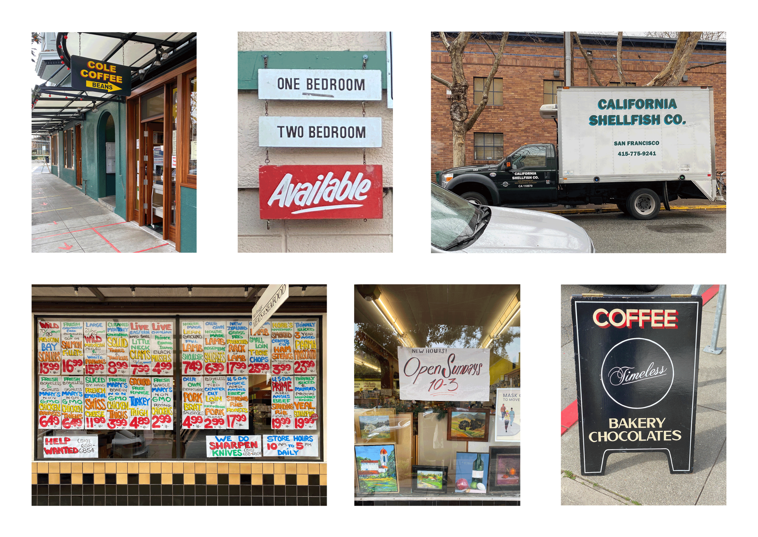
looked at similar graphic text design and sign painting. iterated, iterated some more, and asked for feedback from Sam. important to recognize the collaborative parts of the process. asking for and receiving feedback has been another hang-up for me. it’s all a work in progress.
some frequently observed neighborhood inspirations. Cole Coffee and Timeless signs by sign painter Patrick M. Piccolo. outside Cole is where i’ve seen the California Shellfish Co. truck – nice colors, not sure whodunit.
iterating and experimentating.
happy with the color scheme. a little John Lee Hooker, a little Oakland A’s – nice nice.


