baby steps
notes from a visit to The Caning Shop – several of which may no longer apply… !
weaving Danish cord on a project for a furniture designer and carpenter friend.
learned a good deal so far about weaving Danish cord, communication, time management, and developing a process.
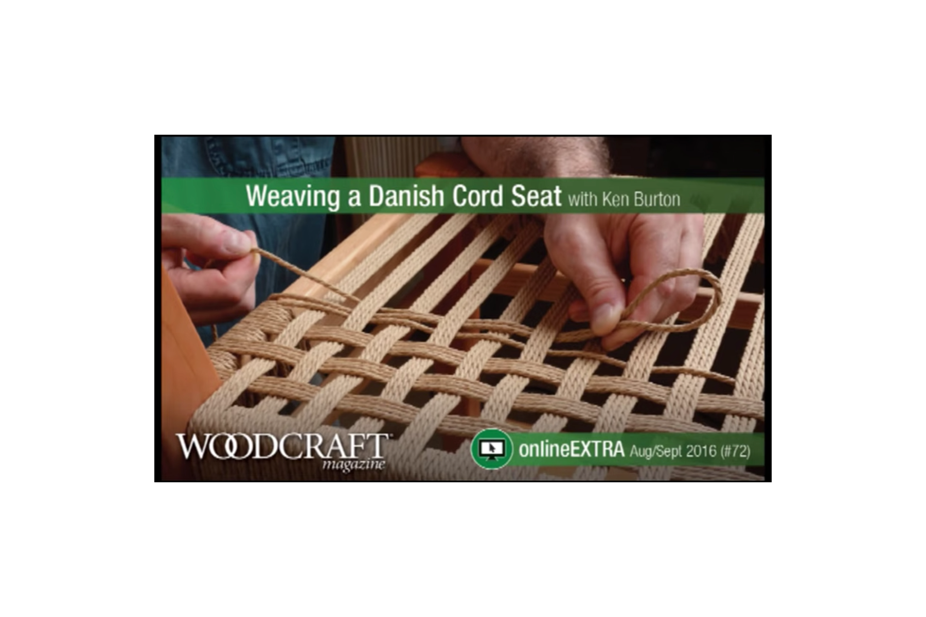
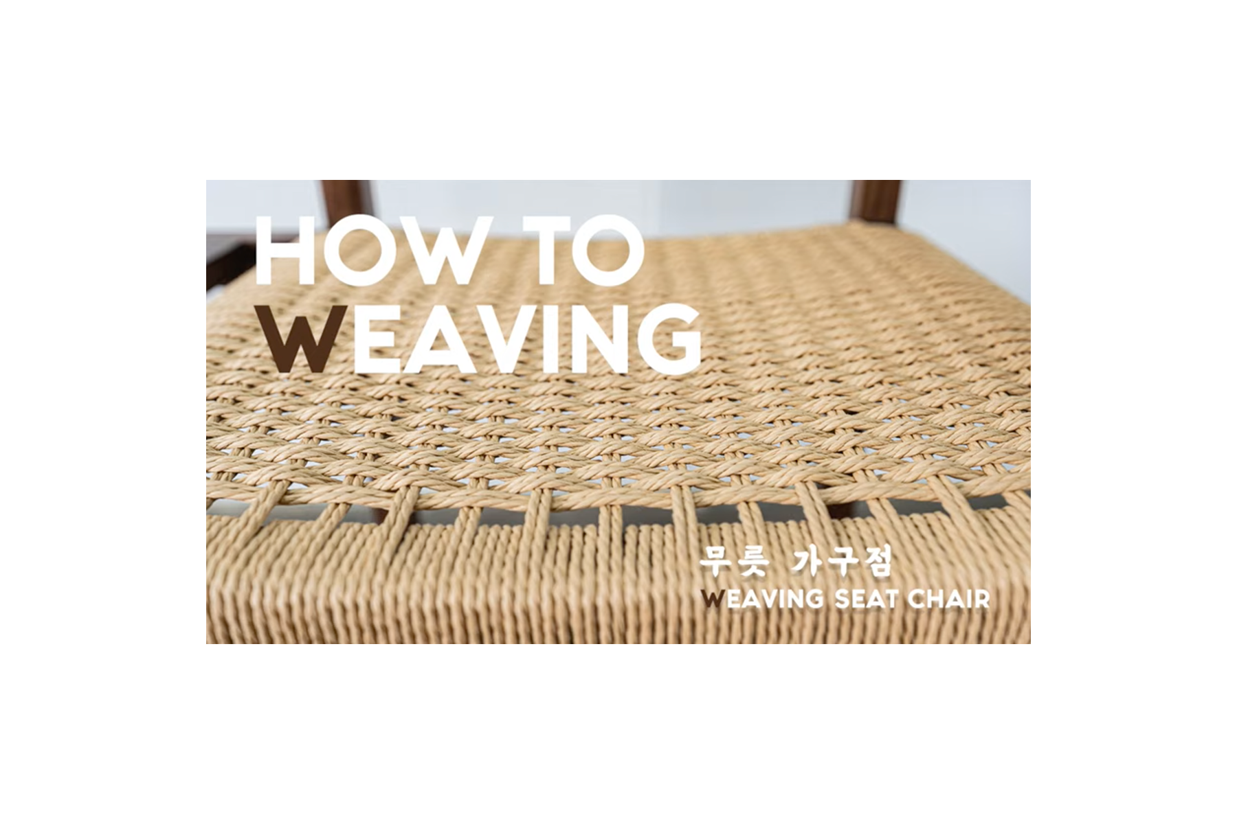
bookmarking a few reference videos to come back to as i get going on the weaving:
steadily working through this. weaving is in my wheelhouse, woodwork isn’t.
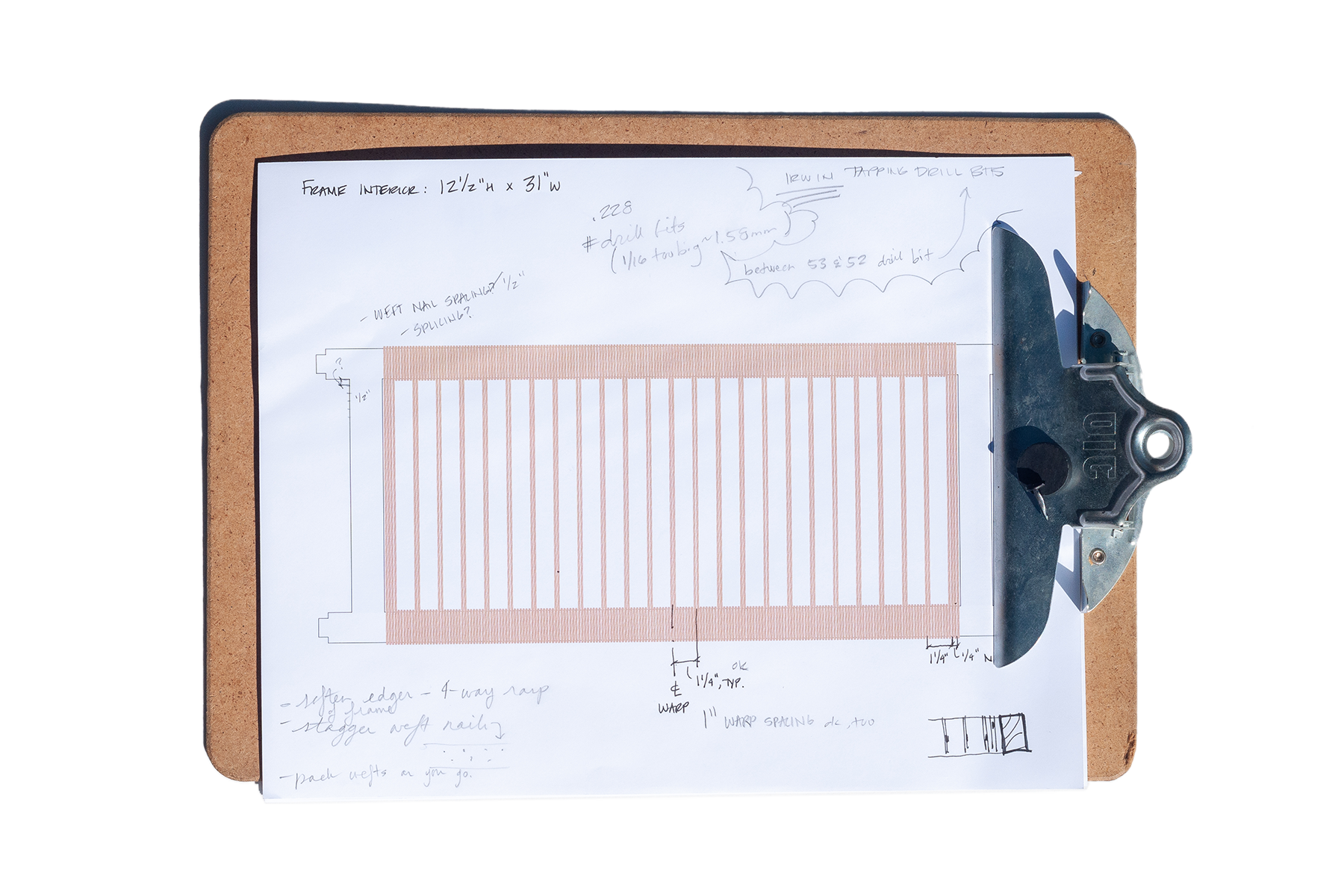
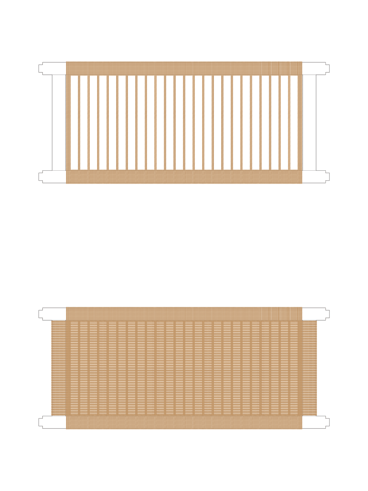
taking baby steps – starting with weaving diagrams and nailing templates.
1 inch warp spacing with typical 1/2 inch weft spacing. most conventional approach resulting in ~ 4 wraps between each warp pair.
1-1/4 inch warp spacing
i like the proportions of this – a bit more frame wrapping between warps (~ 6) and less weaving, seems alright.
1-1/4 inch warp spacing along the frame stiles – kinda neat. may not be the pattern for this, tho.
need to locate and drill pilot holes for the “L” shaped Danish nails to get tacked into.
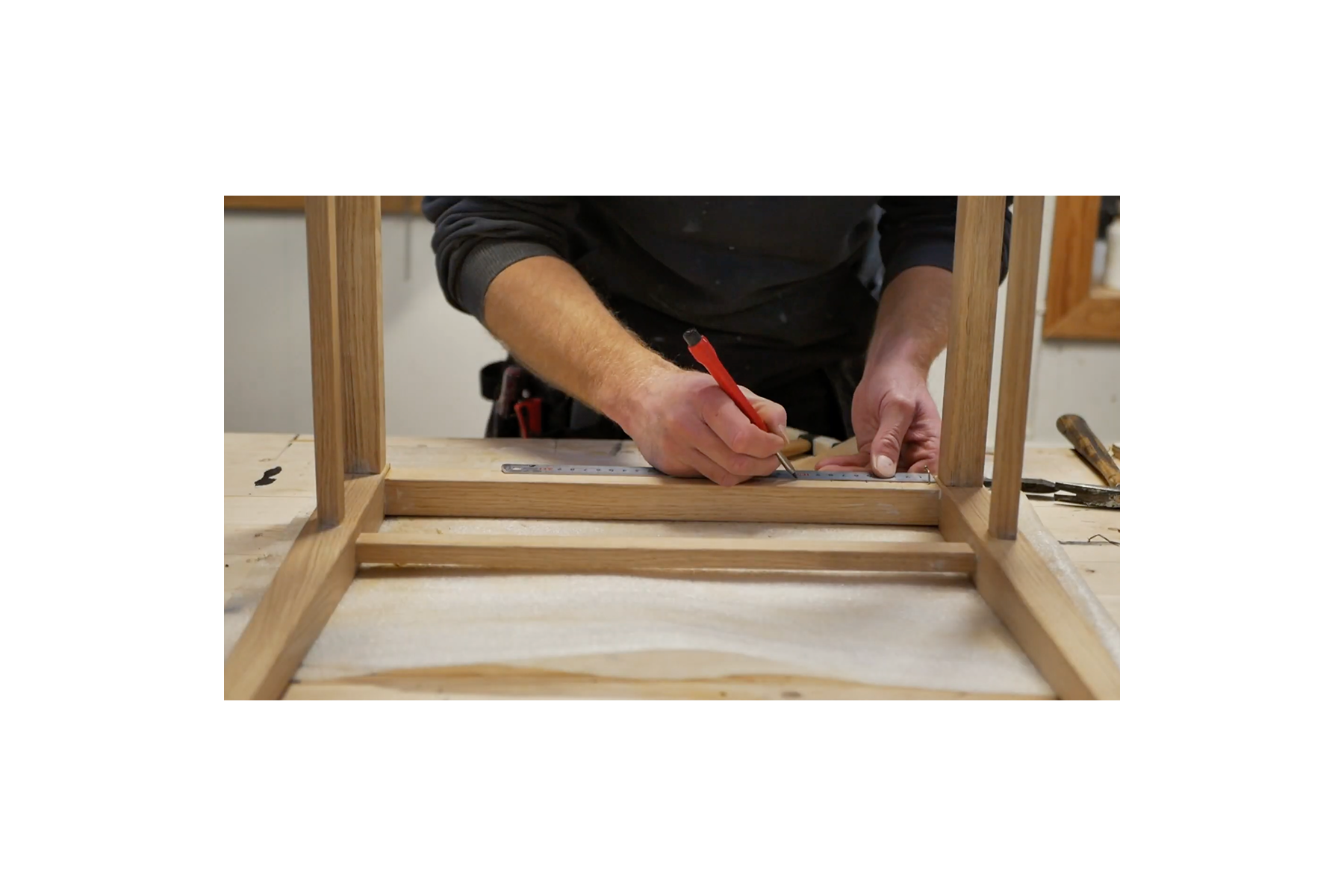
that’s a measure twice drill once type deal. so imma measure a few times more…
made nail templates indicating 1/2” weft (top/cyan) and 1-1/4” warp (bottom/magenta) spacing. first and last warps are a double pair – hence the 1/2” spaced pair at either end.
staggering the nails to help prevent the wood from splitting – a tip first picked up from The Caning Shop.
nail template taped to the inside face of the rails (warp) and stiles (weft).
seeing the template on the frame i’m thinking the orientation of the weft nails should flip. or – could eliminate the farthest weft and warp nails at the inside corners and tack down to start and finish.
goal for this week is to drill pilots, tack “L” nails, and weave at least one frame.
remember: take time to brainstorm, ask for help*, mock things up, take care of your body, document, and enjoy… !
(*thank you, Sam, for your help and support along the way)
sidenote: reminded of Broken Social Scene’s OG version of “Lover’s Spit” via “… (Redux)” off ‘Bee Hives’ played by Rare Earth on KALX last week.
sparked a trip through ‘Spirit If…’ yesterday, from rooter to tooter – *chef’s kiss*
ok, bye bye… !
common assets, vol. 4
it’s that time again. this year marks the 10th trip ‘round since moving out here; though, i haven’t spent nearly as much time calling this place home. it’s been… a journey. still is, too. and with reflection on the menu tonight, thought i’d go over some of the specials.
here goes…
‘Call Me If You Get Lost’ - Tyler, The Creator (2021/Columbia Records)
SWEET / I THOUGHT YOU WANTED TO DANCE … sheeesh!
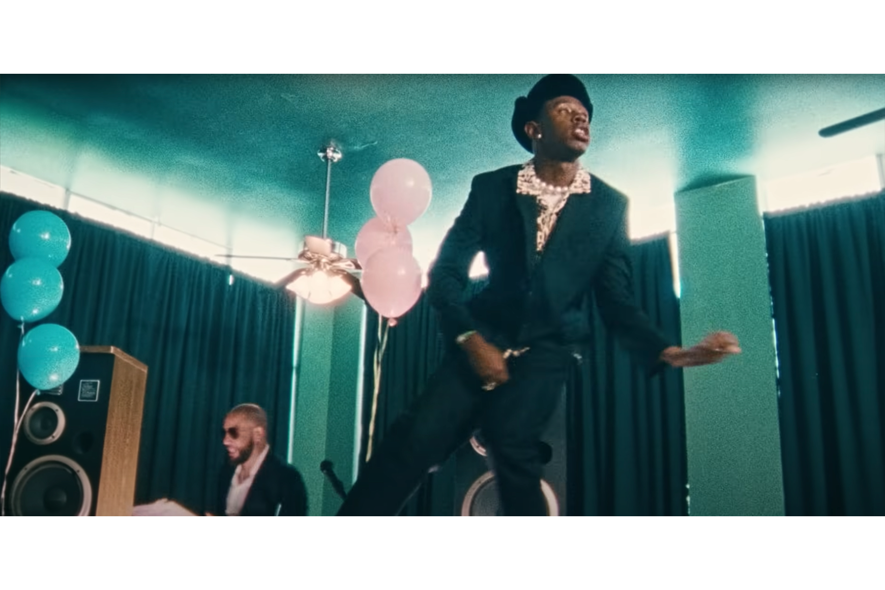
“Corso” - Tyler, The Creator (2021/Columbia Records) directed by Wolf Haley, aka Tyler Baudelaire, aka Bunny Hop, aka The Creator; cinematography/DP by Luis Perez
favorite video from the rollout.
experiencing a streak of luck with neighborhood “free stuff” offerings. some finds from yesterday, and this afternoon:
‘Five Hundred Self-Portraits’ - Julian Bell (2004/Phaidon Press)
‘Over and Over: A Catalog of Hand-Drawn Patterns’ - Michael Perry (2008/Princeton Architectural Press)
‘The Art Quilt’ - Robert Shaw (1997/Beaux Arts Editions)
trio of KOH-I-NOOR stencils from a free pile i passed on my walk home today.
“landscape template”
“isometric ellipse template”
“architectural symbol template”
Youtube started suggesting these S&S Horseshoeing videos and, long story short, i’m hooked. well timed too, following a farrier focused crossword clue from a week or so ago.
anyhow, i really like Sheldon’s videos and learning what farriers do.
some lick-em horseshoe stamps a pen friend included in a recent letter. i mean, c’mon… !
Valida’s 06/27 KCRW set (thanks for the intro, Sam!)
some of the stickier tracks i heard:
and remember…
it’s OK to feel good.
common assets, vol. 3
one Youtube video usually leads to another, and a revisit to the lexicography video led to this Vox video about the Cooper Black typeface by Oswald Cooper.
while working on the… title card, i’ll call it, for this entry i thought of these logos. have nostalgic sentimentality for both. the Payless logo identity has since gone in a different direction… and Love’s looks Cooper Black inspired – it’s not as round, but there are similarities (it’s in the “o”).
“Gimme Some More” - Busta Rhymes (1998/Elektra Records) directed by Hype Williams
(sample from Bernard Herrmann’s “Psycho” theme)
really dig Busta Rhymes’ music videos from this era. “Put Your Hands Where My Eyes Could See” is another favorite, also directed by Hype Williams.
“The Rain (Supa Dupa Fly)” - Missy Elliott (1997/The Goldmind) directed by Hype Williams
(sample from Anne Peebles’ “I Can’t Stand the Rain”)
Missy Elliott has some of the best music videos, ever. period.
“beep, beep. who got the keys to the Jeep? vrrrrroooooom!” ;-)
“B.O.B.” - Outkast (2000/LaFace-Arista) directed by Dave Meyers
such. a. good. time !!! 808s, off the wall colors, candy painted Cadillacs – what more could you want?
crossed paths with a De Tomaso Pantera last autumn. didn’t recognize it and assumed it was an Italian sports car – and it is, sort of. i’ve since learned more about it, in large part from watching Jay Leno’s Garage.
watched a few more episodes since and some favorites include the 1966 Oldsmobile 442 (love, love, LOVE the “442” enameled nameplate !!!), 1931 Duesenberg Model J LaGrande Coupe (that interior, and rumble seat !!!), 1972 Citroën SM (super neat engineering !!!), and the 1957 Imperial (super sweet, retro detailing !!!). been liking the “pandemic editions” – they feel more intimate. Leno’s knowledge and familiarity with his fleet is impressive, and i appreciate the narrative style of his explanations. wish the jokes would catch up…
meant to include this in vol. 2 and forgot. another Youtube gem – meditative bonsai art by a creator in the UK. this is from the beginning of the video – thought it looked pretty nice to start, and was stunned by the result. carefully meticulous and fascinating process.
interference
started with a vector illustration created from a photograph. sent it through the GIF-itizer and this is where it landed.
this last week has been a whirlwind (read with enthusiastic “wh” sounds) and also ushers in the fourth month of my self-established sabbatical. i pivoted some of my attention back to the website i have for presenting “professional” work, which has been more or less neglected – for years. i’ve been wanting to dive back into that work, and now feels like the right time. Tuesday afternoon was productive – i got several ideas out of my head and down onto paper, road-mapped layouts, did a few tests, and identified a strategy for achieving what i want. frankly, a good portion of the work so far has been fiddling with website templates, making tweaks, and letting go of the design i worked on several years ago when i was just getting myself out onto the job market. this time, it’s a little different – i’m feeling much more agency over my work and how it’s represented.
that being said, i realize how diving back into the other side of my online presence has taken some time away from here. doesn’t mean i haven’t been making and reflecting on other projects going on. got a few things out of the embroidery hoop and nearly wrapped. started a new “tri-fold” – a strategy for organizing projects and to-do’s without completely overwhelming myself. in fact, those tri-folds have been much more effective for me than any agenda i’ve tried out (couldn’t have been more serious when i said i’m not a planner…). these next few weeks, and months, will be a lot of work – and that’s exciting! i look forward to it, and the challenges i may face as i continue showing up, authentically. showing up here, and in my “professional” work, and everywhere else i can take space and time to be myself.
something i haven’t yet reflected on here is a personal project i came to a point of closure on at the end of February. it brought up a lot and was difficult to get through, but the process helped me externalize uncomfortable feelings that i had been holding on to. while making the “DO NOT ENTER” illustration, i kicked around a few songs that allowed me contextualize and reflect on what was coming up. i don’t want to leave the energy i came into this project with here in this space; but, i do want to leave evidence of the process-ing involved.
the project – another mixtape – isn’t so dissimilar from “expect trouble…” – they overlap. what’s unresolved between them has been complicated, messy, and confusing… confusing. but not confusing in the same way as “expect trouble…”. this was born from another pain – very much related, but different still. i’m being cagey reflecting on this – this sh-t was tough. (there are plenty of reflections in the offline journal should a refresher be necessary). what it came down to, for me, was recognizing difficulty processing my feelings from “expect trouble…” without acknowledging other pieces of the puzzle around it.
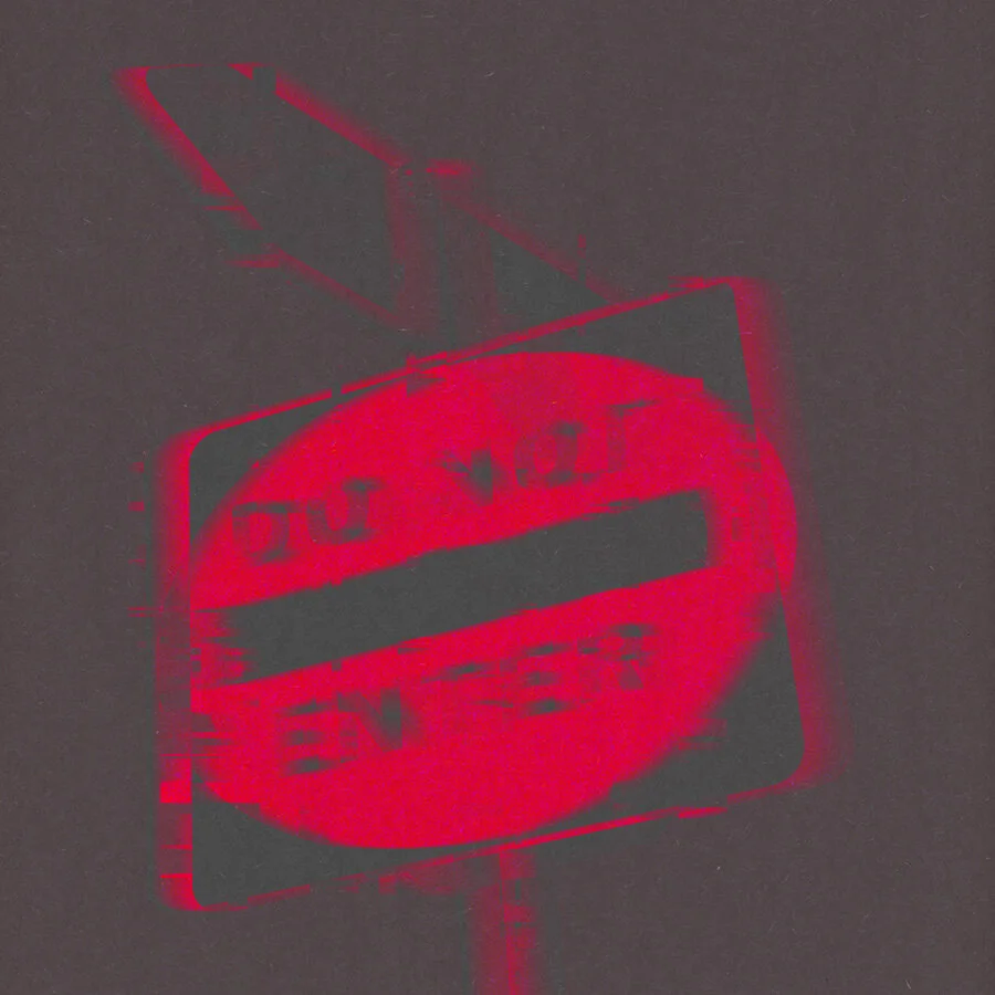
the process for the cover design started with an illustration from a photo taken earlier on during our stay-at-home order. used Illustrator to draw a vector version of the road sign from the image and thought that was the end of the effort and just an extension of warning sign work. it was during that time i recognized feelings spring up that were interfering with what i was doing – getting in my way and preventing me from gaining traction on other fronts.
i wanted to visually represent the interference i was experiencing and brought the “DO NOT ENTER” illustration into Photoshop to experiment with making it into a GIF. i wanted to make it look like it was being pulled apart, as though something was causing a bad connection – “i can’t hear you! you’re breaking up!” that was the feeling i was getting trying to work among unprocessed feelings – some i’ve avoided mostly out of fear. fear of discomfort, and sadness. fear of re-visiting past mistakes and staying there.
i used a couple of youtube tutorials to help me create the GIF from creators Made by Mighty and Photoshop Tutorials | photoshop effects. the effect was pretty easily achieved, and i appreciated having the tutorials as a guide. i used to feel like a cheat using tutorials. like the only way to learn was the hard way. gross. at least that’s the way i felt about using tutorials at some point in time. i haven’t felt that way in a long time, which is good because i use tutorials a lot. like, a lot a lot. it’s curiosity and intentions to realize a concept or idea – i.e. my lack of knowledge on making this idea into a GIF – that lead me to them; and i will gladly engage with guided content from experts in whatever field i happen to land within the perimeter of. like David Bull’s channel a few months back. Bob Ross, move over! but truly, the ability to recognize what you don’t know and seek the information to learn is an asset, not a handicap. traveling down those curiosity streams has taken me places i didn’t even know existed. glad i changed my mind.
leftmost is original illustration, and the following are the frames used throughout the GIF. interestingly, when i change the canvas size, the center blend mode area changes. kinda neat. also, kinda f--king annoying. should figure out why that happens… used layers similar to the last two for the mixtape cover. side note: the blend modes didn’t save out with the GIF either…
i compiled music over the course of working on the illustration and GIF, and a mixtape started to gel – consistency is key for making, and breaking, habits. it seemed a likely pair to use the warning sign illustration as a cover; and, because this sign had text, the mixtape name came as a sign-ing bonus. i’ll show myself out… anyway! the starting point drawing was ok, but flat; so i picked a couple layers from the GIF that had interesting distortion – one with a red shifted blur, the other blue – and brought those layers into a separate Photoshop file to experiment with transparency blend modes. several options didn’t do much, but a couple stood out: a monochromatic red result using “saturation” blend mode and a more vibrant version using “color” blend mode. i like both, and if this process maneuvered around a different memorial narrative, i may have used it.
i liked the distortion of the text in the monochromatic design, too. the lack of clarity resonated with how i felt around the set of circumstances i was revisiting. there are no requirements that these mixtape covers illustrate the musical mood, but i saw an opportunity for this to move in that direction and went with it. i think it fits. and, in a way, serves as a cautionary reminder of the effects of distorted resolution.
monochrome red effect achieved by layering the red shifted layer over the blue with “overlay” blend mode. grouped the two layers and applied “saturation” blend mode to the group.
similar to the monochromatic version, but layered the blue shifted over the red and applied “color” blend mode to the group. i like this one a lot, but it felt too playful for this project.
the work experimenting with layers and blend modes was done over a black background layer. i liked the digital distortion produced in the sign images – how the glitch effect distorted the legibility of the sign – and tried applying distortion and texture to the background digitally, but wasn’t able to achieve what i was looking for. i don’t really know that i had a solid idea of what exactly i was looking for; but i could tell photoshop filters weren’t leading me there. instead, i scanned a texture used in several physical iterations of “warning signs”: construction paper. (ring any bells?). i liked how the flecks and irregularities in the paper’s surface added an organic distortion i wasn’t yet able to recreate using digitally. coupled with the foreground, these designs remind me of spray painted stencils on asphalt. that would be fun to do… the rear cover/song list was created in Illustrator using the Highway Gothic font in a similar red to the original “DO NOT ENTER” sign. brought the vector file into Photoshop and applied saturation blend mode to match the effect of the cover design.
the past has a funny way of showing up. sometimes, it never leaves and i carry the baggage around with me. i’ve gotten more efficient about it over time – packing it down into smaller containers to make it more manageable. or so i thought. this mixtape and “expect trouble…” have served as emotional containers of sorts – for things i’m resolving and don’t need to be packed away anymore. i’m not sure whether i’ll revisit “DO NOT ENTER” in the same way i would other mixtapes; not that “expect trouble…” is a walk in the park for me either. however, i will admit, the last five or so songs on here serve a mood that i am absolutely here for.
while i can’t say that this process was entirely fun, it was certainly helpful. a couple-few takeaways from the process for the future:
K.I.S.S. – keep it short(er) – 80 minutes or less: the time limit on common 700mb CD-Rs. i know there are 120 minute varieties out there, but i needed to draw the line somewhere. 80 minutes felt like a good length and accommodates about sixteen 5-minute-long tracks. should there ever be a reason to have a longer playtime i might consider 120 minutes. might.
mixtape covers can be digital art – or anything else for that matter. i had originally envisioned making physical collage covers and changed my mind when i was fussing around in Photoshop. changing one’s mind can be a good thing.
keep written reflections on songs – this was an important part of my process for the last two mixtapes – helped me better understand my relationship to the music and narrative sequence.
use what you got if it’s given – if the reference image or collage piece has text that can be used as design and title, go for it. two birds…
this recent stretch of time has been instrumental in figuring some sh-t out. i’m feeling more and more myself. more confident to actively engage in difficult and uncomfortable topics rather than passively allowing things outside of my control to affect my life. spending this sabbatical time the way i have been, here and in projects, has been an important part of the process so far. it’s still work, no doubt, but i feel like i’m getting somewhere that i wasn’t able to before – moving through and to the other side of things that i’ve ignored or left unresolved. and in the absence of interference i’m able to find some clarity.
P.S. …
gave this mixtape another listen as i was coming back through this entry for an edit yesterday evening (more for clarity than content, but let’s not bring the editor into this); and again, on a drive earlier this morning. the past two trips resonated differently than before. i switched out the cover this morning, before my drive; bearing in mind a recent personal revelation:
it’s ok to change your mind.
after the first full listen-through yesterday, i knew. the drive this morning was my due diligence: the road test; and, an opportunity to validate the tone struck the night before. as i was beginning this process and processing – moving through this song list and holding space for what came – i remember how much discomfort i was encountering. the red alarm of the monochromatic design was what i most emotionally aligned with. DO NOT ENTER – this might sting. and, until yesterday, i had yet to make it from start to finish without teasing up something that made me squirm — literally, figuratively, take your pick – and i’d ultimately switch to another album that provided more buoyancy (“… a Seduction”, in most cases).
these last two listens were different. the sign is still there, warning of discomfort and, perhaps, pain and sadness. that’s where things started. over time, and with work, i’m making my way through it. now, i’m starting to see there’s something just beyond; and it’s so much more vibrant.


