moody
feeling out of sorts.
listened to Little Simz this afternoon.
a few things, now that some Dust has settled:
bookmarking where i’m at with weepy – cover came together last week.
feeling into the “doubling back” part of the loop-de-loop, too.
taking the time i need to take – no rush.
ok, bye bye
signs
one of the better M. Night Shyamalan movies, i think.
i recall chatting about Signs at work recently. or maybe that was something else…
take a look at these two trailers for Signs: low quality vs. high-er quality. low quality looks like a ’90s Chris Columbus flick – new Culkin.
i digress…
inspired by Sam’s hand diagrams and reminded of sign language diagrams, namely the ASL alphabet.
first sign learned from The Lady: “i love you”
trying stuff with color – “yes, that’s happening!”
Youtube got me again… more signs (p.s. don’t beat your kids… !)
fooled around with Dust Devil while sorting a bungled purchase.
s’alright – but maybe not my cuppa.
tail end
didn’t feel wrapped on the last two mixtapes – cause they weren’t… needed to put attention toward the tail end: track list design.
it’s not that things are now made “final, final”, necessarily; but it helps identify decisions made.
sidenote: cat time reminded me of a time signature explainer i ran into. classic internet vibes – i dig.
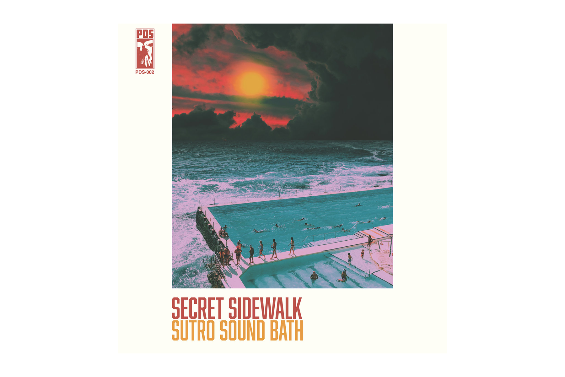
couple album plays from the last few days. got into these between “heads down” sessions. it’s been a ride, enjoyed these pitstops.
Willow and Secret Sidewalk are both trying out some new things – cool to hear it.
gonna keep on creepin’ on with drawing and jamming and whatever else…
ok, bye bye!
Cat Time
happy of myself for making it through this.
‘Cat Time’ mixtape design iterations. ‘Ganache’ served as a base for the lettering – ‘Cheers’ vibes, for sure.
Kit Cat-ified, with a Simon twist – ba-da-bing!
better be on cat time, or f--k around and find out.
thanks Sam, for bringing this into our lexicon. and Simon, for your vigilance… !
removed a couple tracks from an earlier mixtape – felt more like self-sabotaging projections than my feelings. still really like the music, just not in that context.
bedtime – gonna brush and floss.
thumbs up, for rock and roll!
ok, bye bye… !
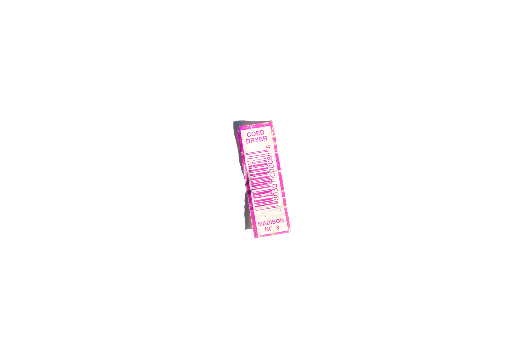
coed dryer
the barcode label on one of the wooden drying racks gave up the ghost this afternoon. “coed”…huh?
went back to the source after deciding to hang on to the label – wanted to see if there were any others.
lucky me, there were two:
nice nice lettering.
i just like it.
4Runner traced sketch pieces. reached a threshold with graphite on trace – needed fixative.
layer by layer it goes: primary outlines, window and interior shading, decals, highlight identification… ? no idea what i’m doing, but i’m enjoying myself.
day one
‘Back to Black’ - Amy Winehouse (2006/Island Records) design by Alex Hutchinson, photography by Mischa Richter
trying to reflect on recent experiences and feeling rusty. it’s been a while and the words aren’t coming out right, but i need to process things in order to move forward. making peace with a sh-tshow of a week closing out May, and welcoming in something new. today was the first day at a new job – day one. in the lead up i’ve felt excited (and nervous!), which was nearly toppled by an unexpected cascade of emotion and conflict. it’s been a doozy… (note to future-self: more nuanced reflections have been recorded elsewhere)
project progress over the last month has come in starts and fits. put together a couple mixtapes earlier on that gave me some confidence, and then hit a wall. it was a bummer. felt like i’d been in the pocket, music-listening wise, and then i wasn’t. on top of previous feelings of being sidelined, i was f--king frustrated.
took a break and got back on the horse arranging songs that’d come over the alarm clock radio first thing in the morning. some played as the radio faded on at 7:30 am; others followed in the moments after while i debated whether to get up or stay in bed a little longer. only condition was the tracks be played via alarm activation. did’t take long for them to gel, but they weren’t quite right over several iterations. felt like i was hitting a wall again until deciding to just flip the whole thing and play the sequence in reverse. ta-da.
called this one ‘snoozy’ on behalf of the material and as a cheeky reminder that the “snooze” button on our alarm clock doesn’t actually work…!
sunrise inspired gradient iterations scattered about the Illustrator workspace. been using a heavy magenta boundary to indicate which iteration i like.
the stuff to the far right was fun – maybe it’ll come back later.
had ideas for the cover inspired by themes of morning and sunrise and started iterating in Illustrator. i like the way the sky is represented in Steven Universe – wanted to use those environments as reference, but quickly ditched the idea of illustrating clouds (or, rather, saved for a later date) and focused on a simple color gradient.
listened to the mix while working on the design and took a moment to investigate a sample used in Vince Staples’ ‘Alyssa Interlude’. learning it was Amy Winehouse catapulted me back to her album ‘Back to Black’, and what an experience that trip was given yesterday’s emotional environment and what lead to it. afterward, i knew i had to leave breadcrumbs back. couldn’t allow myself sleep on Amy’s work again.
fussed with gradients a little more when i felt the tension of frustration creeping in. after pivoting in a completely different direction in a desperate search for something (see lower right of Illustrator workspace), decided to apply the same approach i’d used when feeling frustrated with the sequencing: flip it around. bingo.
‘On Sunset’ - Paul Weller (2020/Polydor) design by Alex Hutchinson
blend modes and overlay experiments in Photoshop – lots more options than Illustrator.
efforts to memorialize my experience listening to Amy’s music began by doing the rounds on Discogs and the like for album liner notes and creative credits. found the designer and the photographer – bing, bang, boom. on my way through graphic designer Alex Hutchinson’s portfolio i saw the cover he designed for Paul Weller’s ‘On Sunset’ and thought, “you’ve gotta be f--king kidding me… come through tangential turbo boost!”
up to that point i’d been hung up on the cover design and where to take the graphics. seeing some of my ideas reflected in Hutchinson’s work was really helpful to get me back into the swing of things. brought the Illustrator gradient background into Photoshop and applied gaussian blur to soften the gradient banding. added a noise filter too, like ‘On Sunset’, to evoke fuzzy, groggy feelings sometimes associated with waking up in the morning.
after considering about a dozen font options from the endless offerings in Adobe, i narrowed it down to LoRes 9 Minus OT and LoRes 28 OT designed by Zuzana Licko at Emigre Fonts. although Illustrator is typically my preference for type design, i used Photoshop this time to take advantage of more versatile color blend modes and overlays applied to the overlapping text of the cover and track list.
not sure whether this would have come together without going down a rabbit hole – tangentiafying. and perhaps this wasn’t so far a leap, but i’m still glad i made the jump.
freebie
prototyping. traced lavender salve tub sized discs of stabilizer backed linen remnants. a triple twist of light-gauge floral wire was sewn down the center of one disk on the stabilizer side in order to hold the future fortune cookie shape. the wire side is then sandwiched onto a second linen disk and attached using blanket stitch. and with a few swift hand moves, the disk turns into a fortune cookie. came across this tutorial when i needed help understanding the folding technique.
picked up heavier gauge wrapped floral wire and covered the ends with floral tape before sewing down to help prevent the wire from poking through the right side of the linen – works pretty nice… this was also my first attempt at using butterfly-clutch pin backs. piercing the pin through the interior to the backside hid the flat fastener, but it needed glue to keep it in place since it lacked any way to mechanically fasten. not fond of relying on glue in this situation.
tried using safety pins too, which had their perks. they were the least expensive option, i already had them, and they did a better job of pinning the width of the cookie than the butterfly-clutch, but they were cumbersome to attach. i’d been wearing a safety pin version on my jacket, and it was tricky to fasten in the right way. mine was too tight, causing the cookie to curl up into a shape more closely resembling tortellini. wasn’t mad at it, per se; but it wasn’t the intended effect…
after exploring a few options for pin backs, i landed on bar pins. they can be sewn in place at several points, provide stability across the pin width, and are much more user friendly.
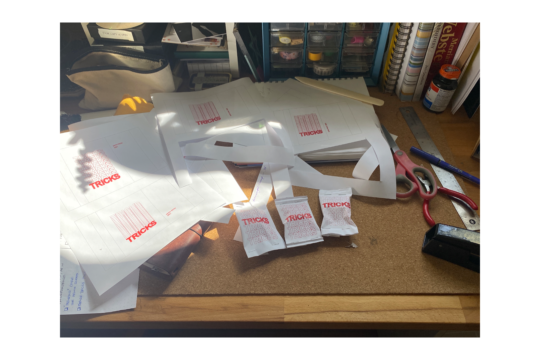
imagined packaging as a narrative element, too. inspired by takeout fortune cookies and a well known “Thank You” bag motif.
designed several iterations of the cookie size packages. digitized in Illustrator and mocked up on printer paper to test dimensions and volume. used actual pins and wadded up balls of paper to make sure the packets would puff enough to hold the pins. in retrospect, i should have started with the wadded up paper. ripped up good prototypes to get the cookies out. d’oh… !
moved on to vellum for the next series of prototypes. i like using vellum. it’s a little transparent and works in the printer – nice nice. used a pattern tracing wheel to pierce a line about half an inch from the top and bottom edges, and hand sewed closed with red Gütermann poly sew-all thread. fan-creased the ends for a finishing touch.
looked into paper crimping tools and techniques and came across a tube wringer which looked like it’d get the job done and could work on heavier materials, too. the package on the left has tube wringer crimped edges, and the right is by hand. the little tags are two Avery labels stuck together, hole punched, and tied to the end of the enclosure string. i’m happy with how these came out.
digging this process. still not quite done yet – need to give the vellum printing another go. using a laser printer and the toner flakes off more easily than i want it to. don’t think the printer settings are quite right yet. also, need to try sewing the closure stitches on the machine instead of by hand to see how that turns out. maybe it’s too powerful for the vellum and makes a mess of things. or maybe it’s perfect! gotta try it.
been incubating these for a little while now and need to push them out the nest… i’ve set aside a couple prototypes as freebies to give folks that strike up conversation about the pins/patches on my jacket – things i’ve made. i imagined the freebies as an opportunity to help me talk about my work with interested folks. however, it’s still in my imagination since i haven’t yet had the confidence to take the final step and hand one over. or i’ve forgotten to bring them with me, like this morning… double d’oh!
i’m feeling nervous about putting them in someone else’s hands – giving up control – and being at the mercy of public opinion. but i suppose that’s the rub: no risk, no reward. working to remember that opinions are only as important as i allow them to be. constructive critique is one thing; ruthless subjectivity is another. i recognize the importance of putting myself out there and i’m working toward the next step, no matter what other people think of me. it’s a fortune cookie, for Christ’s sake…
*created and drafted March, 2021. posted March 23, 2022.
STOP
stop sign sketch – Crayola Super Tips on trace paper.
experiencing some blockage and working to dislodge it – it’s slow work, requires a fair amount of focus. keeping company with Ever Given… couldn’t help myself ( •̀ᴗ•́ )و ̑̑
i’ve been feeling a way about something that happened in the beginning of February. while working offline, i got wrapped up in thoughts about what other people – complete strangers – might think of this space, should they come across it. i worried what they might think of what i’m doing here, what i’m making, how i’m writing. i worried about being judged. i worried people would think my work was derivative, stupid, a waste of time. i got caught up worrying what other people might think and considered editing the content of earlier posts in hopes of preventing negative opinions of me.
holy sh-t…
STOP.
STOP!
first off, editing the content of old posts is completely antithetical to my conception of this space and especially harmful when influenced by the desire to satisfy others’ perceptions of who i am or should be. changing my mind is ok, that’s progress. changing myself to fit someone’s perception of me is unhealthy, regressive, and untrue to what i’m trying to establish in my practice. it’s disingenuous and inauthentic behavior which doesn’t serve me. i have, in the past, felt it necessary to hide parts of myself – code switching and contorting to satisfy social or cultural expectations. that’s not where it’s at for me. not anymore. so who the hell is making me feel like i need to keep up the contortion? ain’t nobody else here but me! this is personal…
i recognized the pattern as the thoughts were pouring in, back in February. i stopped what i was doing to draw a sloppy stoppy in my journal, and reminded myself of some key revelatory material: changing my mind is ok – good, even. recording a catalogue of process with the emotions that accompany brings visibility to how ideas about work and creativity are influenced and change over time. i want this space to reinforce flexibility and exploration in process, which may mean trying an atypical approach and “feeling a way” about previous iterations. going back through old posts and tinkering with time is NOT a helpful way to document process. heck – re-examining and continuing to reflect on processes, experiences, and context is a big part of this thing!
i won’t deny it – i was disappointed in myself for even hosting those thoughts; but i’m glad i caught it and hadn’t acted on the impulse to change myself in order to satisfy a self-projected standard of acceptance on what is “right” or “good”. i woulda been pretty sour had i taken it that far... these thoughts spun around a specific post, one that is more personal than i’d expected to explore in this space, and i felt discomfort around externalizing emotional vulnerability. although spare for personal details; it has still been difficult for me to process.
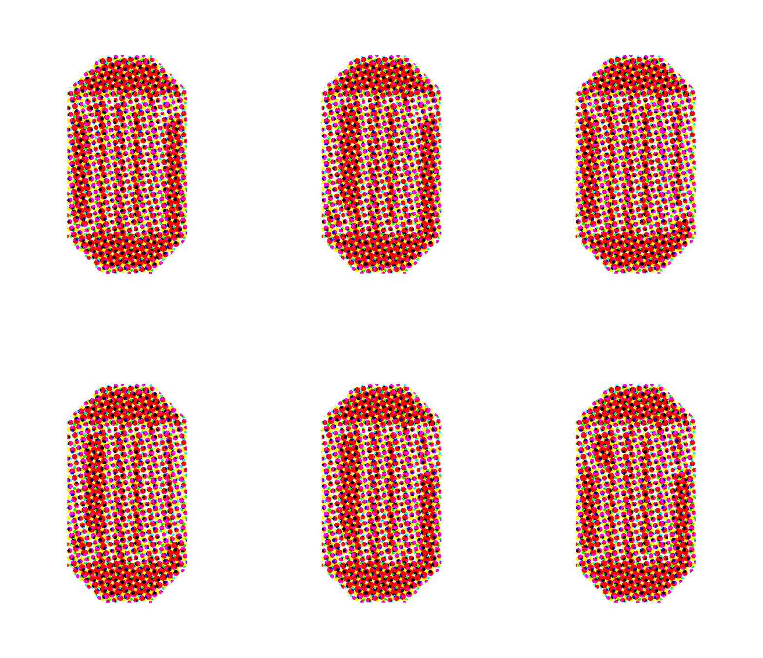
there has been a glint of silver lining from this in my work – i’ve been experimenting with stop sign designs and making GIFs. i wanted to abstract it and stretch it out like i had with several other warning signs, which inspired the first GIF. in order to achieve smoother animation i made more frequent in-between frames, which revealed compositions of stretched letters i don’t think i would have seen otherwise. cool beans. the next GIFs were created from fooling around with CMYK halftones in Photoshop. i’ve used halftone in projects before – it’s fun and pretty simple, and i like it… the second GIF uses varied dot sizes and angles for a spinny-zoomy hi-lo resolution effect. the third was goofing around to create a lo-res halftone version of the original GIF. no big deal, simple. and i like it… another step in this exploratory process will be to make some patches. i recently picked up red velveteen fabric to use as a base – it’s fabulous… the velveteen has a nice texture and matte finish, and is much more vibrant than the red cotton fabric i’d picked up prior. not quite sure how i’m going to approach all the steps of this project – i’m unfamiliar with using velvet/velveteen. i’m hopeful fora fun experiment!
not every creative effort needs an analyzed explanation of how it came to be, but in this case it felt important. the stop sign was introduced because i needed it; and, like the recursive loops before were a way for me to imagine processing through design, the stop sign was a visual cue to pump the brakes before careening into unhealthy territory. i felt embarrassed about the misdirection of energy, and yet work came from it. i haven’t felt like i could reflect on it without feeling shame that i’d even considered tinkering in the first place, which allowed this work to stay hidden and more guilt to build around not staying true to the spirit of this space: reflecting on work as it happens. i thought i was past this, but i’m still working through it.
in the months since, i’ve recognized the hard work in gaining, and maintaining, confidence in my authenticity. i also recognize the work in resisting outside influences that i should do or be something i’m not. and should those negative influences call from inside the house – come from me projecting on behalf of some fictional entity – i’ve got to stop. that. sh-t.
i’m still learning. i’m still growing and becoming more comfortable being myself. i’m more confident in what i desire to do and who i desire to be. i’m excited to keep moving in each of the directions i’m going, even if i don’t know exactly where i’m headed or how i’ll get there.
needed to stop for a little bit back there, but i’mma keep it going.
warning signs
not the biggest art board mess i’ve made. yes, that is a little head illustration in the middle.
getting into good things. making good messes. although never intended, i often end up with an illustrator art board ‘splosion. i can make sense of it, which is what ultimately matters. the days of naming files “pinup boardsfinal-final-FINAL.ai” are in the rearview, mostly. i have created “file name_versionx.ai” a time or two. harm reduction. i’m hesitant to break up design families and iterations into different files. can be frustrating looking for an element that’s similar but saved in a different file. fortunately illustrator has a limited drawing area, otherwise…
up in the left hand corner i had been working on lettering to use as a journal cover based on the hairpin turn. with more work i think it could get there, but it needed a lot of time and wasn’t the originally intended subject. saving for another day.
original “winding road ahead”
winding, winding, winding
worked out the spiraling curves on dot-grid paper first.
the graphic brevity of warning signs can, at times, bely the severity of what needs to be brought to a driver’s attention. like, did a snake pave this road? why so windy? i imagined driving down a stretch and seeing a ludicrously exaggerated road sign for “winding road ahead.” a relentless warning.
“oh geez, well it’s gonna go on winding for a good ways there. be careful!”
i don’t know, that’s just what came to mind.
three main squeeze warning signs show up here: winding road, hairpin turn, and added lane. these schemes were simple and, importantly, repeatable. wanted something that could be made into an extended path or line pattern.
the original winding road graphic is more of a sine curve, and i was having a bit of a hard time re-creating it. i went off-book from the MUTCD and used half-circles instead. it’s not an exact replica. it was never meant to be.
tested out some of the lettering ideas too.
“hairpin turn ahead” was the first one i worked on in the series. it reminded me of a professor’s diagram on recursive design process. the gist of the pedagogical ideology being discussed was that working recursively encouraged processing ideas forwards, and backwards, yielding a more dynamic result than a linear process. each time the loop makes a turn to come back around it has to pass over a previous section of itself.
this graphic resonates with my own goals for process. hashtag goals.
the bit of yellow sign that peeks through when the loops cross-over is an overlaid path. i think that could be created more elegantly, but it worked!
original “hairpin turn ahead”
recursive loops
the “added lane ahead” sign reminded me of how easily thoughts can come and go. although i’m finding mine rarely go. my noggin can bottleneck.
i like that this sign is diamond shape, like the others, but the design is also on the diagonal. made for a fun opportunity to exaggerate the sign diagonally. imagine a sign like this jutting over a road, ha! aside from the obvious obstacle it would create, it would be a funny sight.
tried a version of this were the sign was vertically plumb. it just didn’t hit the same. there’s something about the angle to the graphic that gives the impression of the lanes coming from and going off the sign, “lanes are longer than they may appear.”
also recognizing that i’ve have been altogether too protective of this series of drawings. feel like i was saving them for some sort of grand reveal. to who? anyway, i could tell that i was starting to get all “my precious” gollum-y with it. cut that out!
i think i see potential for this exploration to generate other ideas and i’m feeling guarded about marking it down and moving on. no, moving forward. there will be a time when i’m not working with these signs, but that doesn’t mean i’m done with them. just need to switch gears and tend to the other simmering pots.
vertical version. was also trying out some graphics that would “make sense.” dropped that pretty quickly.
original “added lane ahead”
added lanes on lanes on lanes
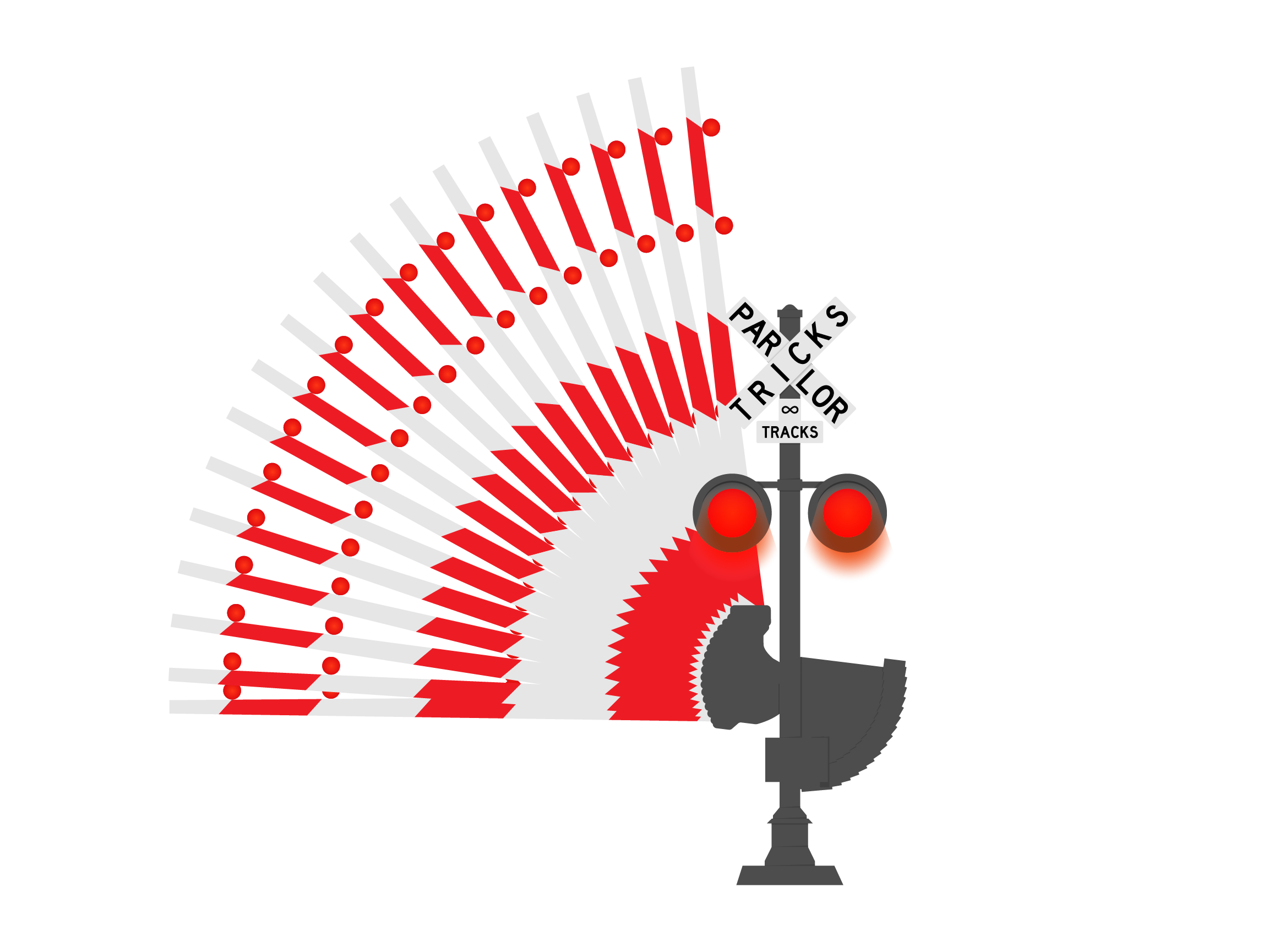
almost, almost, left out the railroad crossing sign from the journal cover. this was from a little while ago, which is still not governed by the same rules of time as “the before times.” so, to be more accurate, this is from early january this year. having already gotten to work on the warning signs, i was looking to create more road sign/warning sign type GIFs. railroad crossing was another straightforward design that incorporated motion.
couple of image references i used. the diagram on the left is from the previously mentioned MUTCD, continues to be a great resource. the image to the right is a cool articulated arm that i thought i would incorporate but realized partway into creating the base illustration that i would be punching way above my weight class. for now, at least.
sketch study of sign, working out whether to include “tricks” in the criss-cross or beneath it.
all the GIF frames collapsed into one. turkey tail? … anyone?
there were 20 frames in all. the arm at the top and bottom positions were 2 frames, one for each flashing light. the frames between could have been more frequent for a smoother animation. i also considered how this would look if i hand drew out the arm raising and lowering. i think there would be an opportunity to add smoothness (or, smoothnicity, as CrafsMan says). oh! or i could add motion blur between the frames in photoshop. that would double the ‘tweener frames though since i would need a motion blur for each direction… another to save for later.
color studies
first things first, yesterday kicked off a string of palindromic days this month: 1-20-21, 1-21-21… always enjoy a palindrome!
little bit of vamping for an intro that may be unnecessary. the title is a giveaway, right? simply put, continuing work on warning sign designs while studying color. here’s where i’ve been with that over the last couple of days:
at the start: stencils, color wheel, and construction paper
simple triad combo
triad: yellow, blue, & red
hi-yo! what better place to start than the classic primary triad of yellow/blue/red? seriously, it's the most straightforward so i really did want to start here. color seems really simple, which is usually the first indication of how complex something is.
i used the “hairpin turn ahead” graphic, i like it. looks like a “u-turn”, but it’s not. i think that’s because the momentum is up and to the right giving an impression of moving forward. like writing and reading. at least in a Latin/Greek influenced written language sort of way…
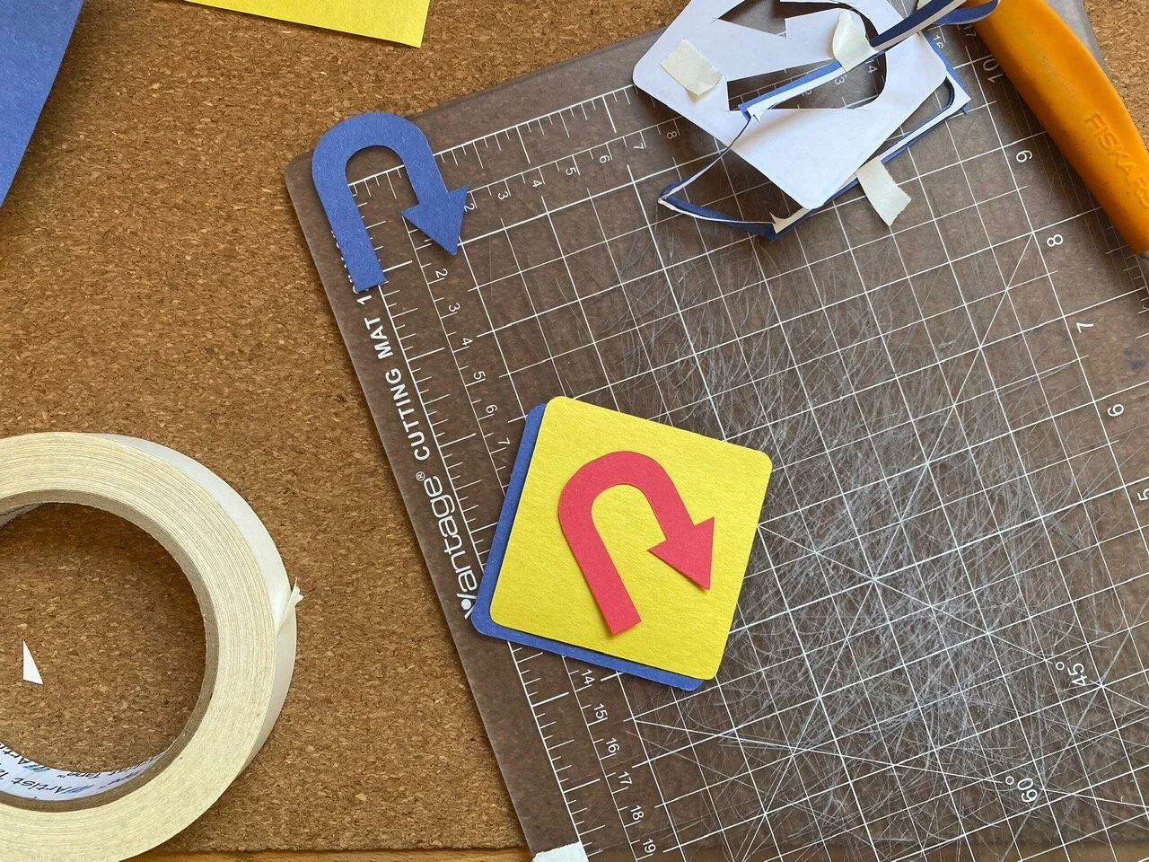
printed out some stencils that i made from my illustrator doc with other signs and stuff that i’ll get to later… anyway! printed some stencils and got to cutting.
kept the primary (yikes, punny) foreground color yellow, cause i like it; and because it’s evocative of the original warning sign design. then, cut the additional elements from the remaining colors to test which worked best as background/arrow/ring. having more cut-out pieces than needed gave room for experimentation with background, arrow, and border color. glad to have stuck around for a bit of swapping rather than just charging ahead. it allowed me to consider alignments and relationships i may not have otherwise.
i like how the blue arrow over yellow foreground looks like a cut-out in the foreground through to the blue background.
mock-up with red background and blue foreground arrow. i preferred the visual impact of the blue background and red foreground arrow.
now, cutting the little ring that borders the edge has bested me time after time. thought i’d gotten the technique down to where only one stencil could be used to make all cuts. not the case. what ended up working was to use one stencil for the foreground and background pieces and a second for the ring and arrow cut-outs. the stencil intended for the ring cut-out needs to have a bit more paper excess around the edges to allow the straightedge to keep the paper taut while cutting the thin strip. otherwise, if the stencil is cut too close to the design lines, the pressure of the blade on the paper pushes it down ending up with an uneven cut. these aren’t intended to be perfect, but i know myself better than to say i’d walk away happy from a roughly cut edge… i think i’ve gotten it down now.
i like all of the color combinations of this triad. the primaries are sort of fool-proof. they look good in any arrangement and working with them felt approachable and flexible.
using constriction paper in primary colors felt like bing in elementary school again - only now i understand a little more why they go together so well.
the ring of color matched the arrow here. when used in a split complementary or triad scheme, these elements appear as one “sign” kind of like they were offset screen printed over top. i dig.
the second study was violet/red-violet split complementary. using what colors i had from 12 included in the pack. this combination is reading between the lines a bit. the purple is taking the place of a more nuanced “red-violet” that may not even be available in construction paper of this quality… no matter, made do.
i like this one too. it’s not as bare bones basic as the primary combo, but it still feels familiar to me.
still using two separate pieces for the arrow cut-out. it was with this and the first r/b/y that i thought to cut away the arrow from the overlapping diamond to reveal the color behind.
“red-violet” split complementary: green, violet (should be “red-violet”), & yellow
so, a couple few things i noticed while working on the first studies yesterday:
when the background color and bottom arrow are the same, it appears as if the arrow is cut from the foreground. i hadn’t achieved it that way in the first two studies, i used two additive arrows
studies that followed had foregrounds with arrow shape cut from it
in the primary triad, the red ring is shifted left while the red overlapping arrow is shifted right. (that sentence reads funny. just scroll back up to see what it’s about.) this looks strange if the eye is meant to see the red ring and red arrow as paired together. however… the miss-match isn’t a deal breaker for me
i like the negative space around the overlapping arrows of the primary triad study. it feels like the right amount of breathing room in the main background/foreground offset and around the overlapped arrows
and probably some other things i forgot to jot down for later…
triad: green, orange, & violet
i do like this one as-is. maybe save for later.
worked on another triad of green, orange, and violet. there are two greens in my paper pack and i chose “yellow-green” for this, which should be accompanied by a “red-orange” and “blue-violet” according to my new, handy-dandy color wheel. in addition to the violet, i cut out a blue ring and arrow to test out as a stand in for “blue-violet”. with the orange it felt too New York Knickerbockers for my taste… no shade! went with violet in the end.
the violet gives this combo 1990’s Nickelodeon vibes. super into it. the simple study with green cut-out foreground and orange background is a fun one too.
first tetrad study testing out violet arrow with orange ring…
… or orange arrow with violet ring
tetrad: blue, yellow, orange, & violet
tetrad: pink, violet, yellow, & yellow-green
the last one for today was a tetrad of lighter colors. this, along with the other studies, looked instinctively harmonious once everything was pieced together, but i had my doubts… i wouldn’t have picked these colors on my own without the aid of a color wheel. realizations like this during the process of making each of these studies encourages me to continue exploring. i feel less intimidated by color after the last couple of days, and that feels empowering.
there are a couple of books that Sam has, and i’m borrowing, to help along the way. one is Josef Albers' ‘Interactions of Color’ and the other is Garth Lewis’ ‘2000 Colour Combinations’. i believe the Albers book has exercises in it which i’m excited to get into. i’m also cooking up project ideas that incorporate color studies experimenting in different mediums and techniques. hello appliqué!
this is only the beginning!
i had started to write a bit about yesterday’s presidential inauguration, but didn’t see much use. it is what it is. pomp isn’t really on the itinerary for me. i am glad i caught it in time to see Kamala Harris being sworn in as vice president. and to hear, and see, Ms. Amanda Gorman perform her poem ‘The Hill We Climb.’
continuing to observe and stay engaged. i am much more cautiously optimistic about things now than in the last four years. and, for lack of cheerfully enthusiastic words to raise a glass to, i’ll borrow a few from a fave: “to better times.”
speed hump
soooo… i’ve been working on some road signs - yes, sticking with that theme currently — and have been putting off documenting the process because… i don’t have a reason. not a good one at least. i think i was adding things to the overall project, and made myself believe that i shouldn’t post anything about it until it was buttoned up and polished.
hold on a sec…
lemme make sure this thing is plugged in…
*ahem*…
process is what you came here for!
ok? future me?! hope you remember that! or remember to come back here and refresh yourself. refresh yourself!
without further ado, or pomp, or verbose word vomit to vamp around my discomfort documenting something that isn’t finished (i’m working on it…), here are a few pieces that i’ve been working on over the last few weeks:
from left there’s the “winding road”, “hairpin curve”, and “added lane” ahead signs.
i’ve been using the Manual on Uniform Traffic Control Devices to reference design standards and sign usage. i hadn’t seen the design standards before getting into the making of the three signs above in illustrator, but am now incorporating the standards into future explorations. i’m not about to mass produce road signs, so i’m adhering loosely. nevertheless, the standards provide a helpful touchstone for composition and color.
started out looking at the “warning signs” which are classically yellow with black text or graphics. big fan of the color yellow, why resist it?
a good mess
the first iteration: solid yellow base with black cut-out glued over top
and the second: black loops cut from yellow.
i prematurely decided while making the recursive hairpin loops that i didn’t like the way the second iteration was going. so i got sloppy when i was gluing and ripped the yellow paper in a few places. looking at it now, i don’t dislike it as much as i had convinced myself in the making of, but i still like the first iteration better. i like the detail of the narrow strip around the border. i also cut it and remember how delicate i had to be to not rip the thin ring of construction paper.
i’ve been using run-of-the-mill construction paper. keeping that barrier to entry low, things aren’t as precious as they may be if i was using “nice” paper. i really like construction paper, actually. the cheapy, inexpensive stuff that litters elementary school classrooms. it’s no fuss and after being handled it starts to take on characteristics similar to fabric. i like that it has texture and character. i like it.
this exploration has also encouraged me to look at color using these simplified road sign graphics. that’s why i wanted to get a color wheel the other day. color is daunting, so i’m starting small.
using colors as close as i can get them from my pack of construction paper to explore color theory.
like i said at the top, i was putting this off after convincing myself i needed to have all of the pieces of this project completed, or nearly so, in order to document it. then, late last night, i opened an email from The CrafsMan and saw that he too was working on warning signs of his own. i felt excited seeing a creator i admire exploring something similar to what i had been. and with precision timing my anxiety walked through the door to let me know that i was un-original and anything i shared after-the-fact would be seen as a rip-off.
my head can be a mean place…
took a bit to shake those feelings away, but i have, and will continue to. this is just a pit stop along the way. a snapshot on the road trip. a whole host of other metaphors and similes and analogies that i don’t know or have the energy to corral.
alrighty, off for a morning walk to coffee and breakfast. back to the drawing board later.
fun after-the-fact: i used the phrase“without further adieu” when i first wrote this. thought it read strangely using the french word for goodbye. turns out i correctly identified my incorectness. the saying is actually “without further ado.” not this time, eggcorn!


