eye spy
spent the afternoon buffering…
… tangentiafying…
HOT TIPS:
close project “windows” after a desk session (smoother landings when the runway is clear)
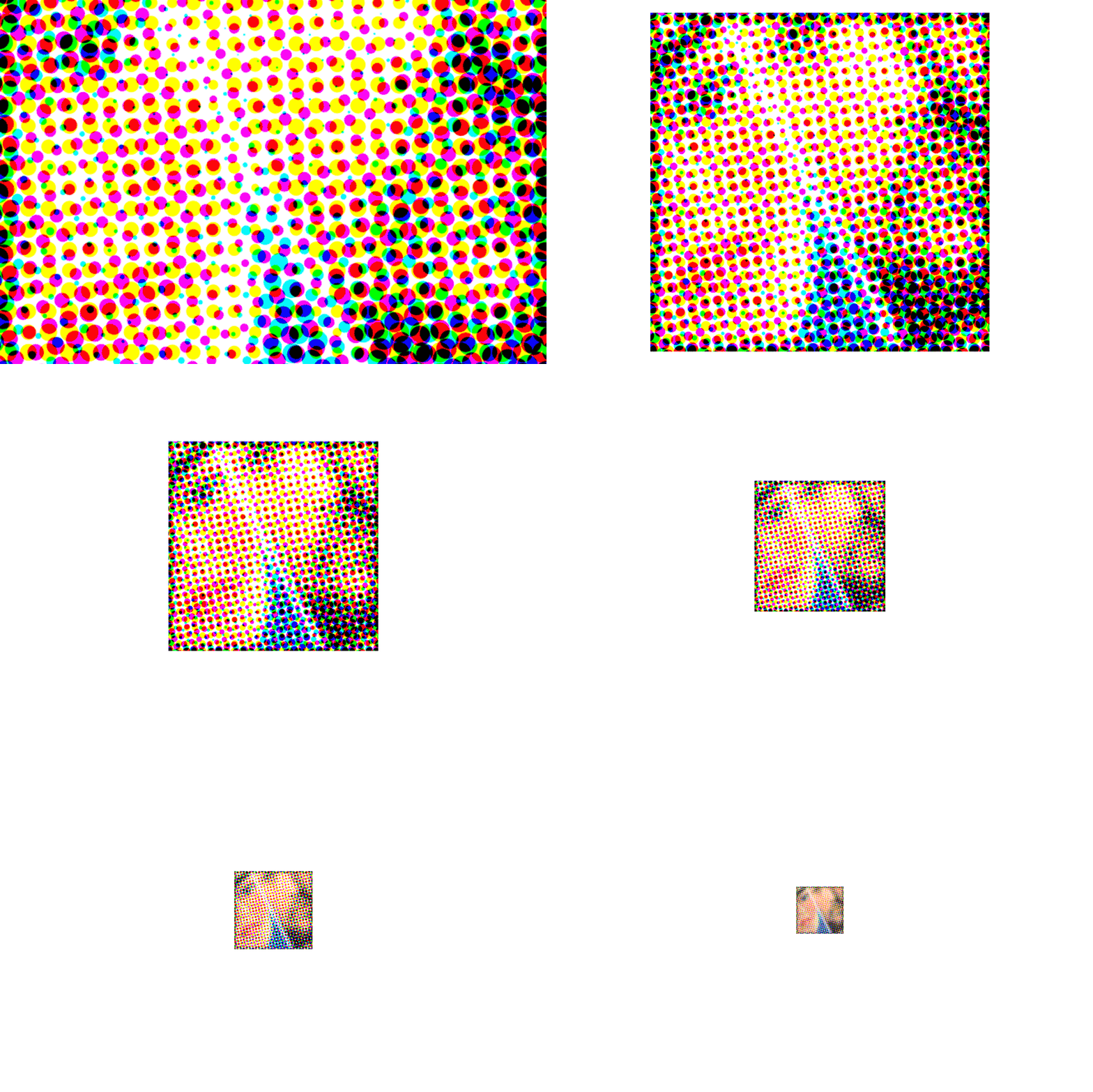
zoom way in
zoom way out
ok, bye bye!
day one
‘Back to Black’ - Amy Winehouse (2006/Island Records) design by Alex Hutchinson, photography by Mischa Richter
trying to reflect on recent experiences and feeling rusty. it’s been a while and the words aren’t coming out right, but i need to process things in order to move forward. making peace with a sh-tshow of a week closing out May, and welcoming in something new. today was the first day at a new job – day one. in the lead up i’ve felt excited (and nervous!), which was nearly toppled by an unexpected cascade of emotion and conflict. it’s been a doozy… (note to future-self: more nuanced reflections have been recorded elsewhere)
project progress over the last month has come in starts and fits. put together a couple mixtapes earlier on that gave me some confidence, and then hit a wall. it was a bummer. felt like i’d been in the pocket, music-listening wise, and then i wasn’t. on top of previous feelings of being sidelined, i was f--king frustrated.
took a break and got back on the horse arranging songs that’d come over the alarm clock radio first thing in the morning. some played as the radio faded on at 7:30 am; others followed in the moments after while i debated whether to get up or stay in bed a little longer. only condition was the tracks be played via alarm activation. did’t take long for them to gel, but they weren’t quite right over several iterations. felt like i was hitting a wall again until deciding to just flip the whole thing and play the sequence in reverse. ta-da.
called this one ‘snoozy’ on behalf of the material and as a cheeky reminder that the “snooze” button on our alarm clock doesn’t actually work…!
sunrise inspired gradient iterations scattered about the Illustrator workspace. been using a heavy magenta boundary to indicate which iteration i like.
the stuff to the far right was fun – maybe it’ll come back later.
had ideas for the cover inspired by themes of morning and sunrise and started iterating in Illustrator. i like the way the sky is represented in Steven Universe – wanted to use those environments as reference, but quickly ditched the idea of illustrating clouds (or, rather, saved for a later date) and focused on a simple color gradient.
listened to the mix while working on the design and took a moment to investigate a sample used in Vince Staples’ ‘Alyssa Interlude’. learning it was Amy Winehouse catapulted me back to her album ‘Back to Black’, and what an experience that trip was given yesterday’s emotional environment and what lead to it. afterward, i knew i had to leave breadcrumbs back. couldn’t allow myself sleep on Amy’s work again.
fussed with gradients a little more when i felt the tension of frustration creeping in. after pivoting in a completely different direction in a desperate search for something (see lower right of Illustrator workspace), decided to apply the same approach i’d used when feeling frustrated with the sequencing: flip it around. bingo.
‘On Sunset’ - Paul Weller (2020/Polydor) design by Alex Hutchinson
blend modes and overlay experiments in Photoshop – lots more options than Illustrator.
efforts to memorialize my experience listening to Amy’s music began by doing the rounds on Discogs and the like for album liner notes and creative credits. found the designer and the photographer – bing, bang, boom. on my way through graphic designer Alex Hutchinson’s portfolio i saw the cover he designed for Paul Weller’s ‘On Sunset’ and thought, “you’ve gotta be f--king kidding me… come through tangential turbo boost!”
up to that point i’d been hung up on the cover design and where to take the graphics. seeing some of my ideas reflected in Hutchinson’s work was really helpful to get me back into the swing of things. brought the Illustrator gradient background into Photoshop and applied gaussian blur to soften the gradient banding. added a noise filter too, like ‘On Sunset’, to evoke fuzzy, groggy feelings sometimes associated with waking up in the morning.
after considering about a dozen font options from the endless offerings in Adobe, i narrowed it down to LoRes 9 Minus OT and LoRes 28 OT designed by Zuzana Licko at Emigre Fonts. although Illustrator is typically my preference for type design, i used Photoshop this time to take advantage of more versatile color blend modes and overlays applied to the overlapping text of the cover and track list.
not sure whether this would have come together without going down a rabbit hole – tangentiafying. and perhaps this wasn’t so far a leap, but i’m still glad i made the jump.
critter keeper
“Wild Bird Ultra” seed mix we keep on deck. it’s got good variety and brings a regular cast of characters to the yard.
Junie likes the dried papaya. i offer almonds, but Junie knows what Junie likes.
Junie appears to be an American Crow.
Stu is a stud, though his advances are often rebuffed by the lunch crowd. the pigeons eat everything except for the papaya, which works for Junie just fine.
Stu appears to be a Pied Rock Pigeon.
Squirrel comes to eat the larger seeds, harass the pigeons, and somehow always has unshelled peanuts? a scavenger and survivor, through and through.
i believe Squirrel here is a Fox Squirrel.
and there it is, a trip on the tangent highway (which would probably just be off-ramps?). been calling these jaunts tangentiafying – start off in one spot, end up somewhere else. i often feel pulled in a tangential direction and peel away telling myself it’s silly or a waste of time to pursue. not this go-round – i’m rolling with it, baby. seeing where things go…
started on this yesterday and hit a critical point of travel after which abandonment really would mean wasted time. not so! learned the patience of pigeons, used a new typeface – “Barricada Pro” by Elí Castellanos – and enjoyed myself. radical.
i will admit to procrastinating a bit. stalling for time before putting together bigger projects – productively procrastinating. honestly, this feels good. the handkerchief was a bit of the same; providing a gentle re-entry to creative spaces after a couple weeks of going through sh-t – necessary sh-t, but difficult all the same.
feeling better on the other side, free from some hang-ups. getting my feet wet again and dipping my toes into something new, too. tangentiafying.
let’s see where this goes…


