doubles
look–alike \ˈluk-ə-ˌlīk\ n (1947) 1 : one that looks like another : DOUBLE — look–alike adj
(Merriam-Webster’s Collegiate Dictionary, 11th Edition)
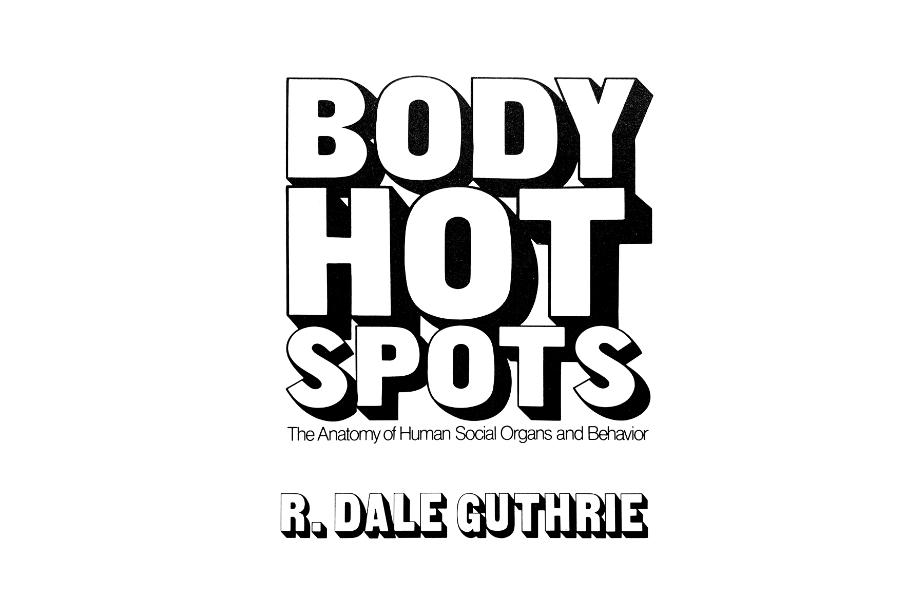
‘Body Hot Spots’ – R. Dale Guthrie (1976/Van Nostrand Reinhold)
kinda… sorta…
here it is: fonts i like with a lot of body
same Buffet’s, new box
contemporary interpretation of a classic – nice
thanks for the candy, Lady* ;-)
*(not to be confused with 'The Candy Lady' – though my Lady does love candy… !)
sound•alike \ˈsaün-də-ˌlīk\ n (1970) : one that sounds like another — soundalike adj
(Merriam-Webster’s Collegiate Dictionary, 11th Edition)
and, also, as well:
“Ashtray” – Brian Jonestown Massacre ~ “Mop Tops (Twist While the World Stops” – EMA
bassline buddies
“Fire Song” – Brian Jonestown Massacre ~ “Paperbag” – Turqouiz Noiz
it’s a vibe
“Don’t Be Cruel” – Billy Swan’s cover of Elvis ~ “Don’t You Think I’m Funny Anymore” – Dougie Poole
in the intro, a bit
“I Would Die 4 U” – Art School Girlfriend & “Purple Rain” – Dwight Yokam
dou•ble \ˈdə-bəl\ adj [ME, fr. AF duble, double, fr. L duplus (akin to Gk diploos), fr. duo two + -plus multiplied by; akin to OE -feald -fold — more at TWO, -FOLD] (13c) 1 : having a twofold relation or character : DUAL 2 : consisting of two usu. combined members or parts < an egg with a ~ yolk > 3 a : being twice as great or as many < ~ the number of expected applicants > b of a coin : worth two of the specified amount < a ~ eagle > < a ~ crown > 4 : marked by duplicity : DECEITFUL 5 : folded in two 6 : of extra size, strength, or value < a ~ martini > 7 : having more than the normal nyumber of floral leaves often at the expense of the sporophylls 8 of rhyme : involving correspondence of two syllables (as in exciting and inviting) 9 : designed for the use of two persons < a ~ room > < a ~ bed> — dou•ble•ness n
(Merriam-Webster’s Collegiate Dictionary, 11th Edition)
‘Road House’ – (1989/Metro-Goldwyn-Mayer Studios Inc.)
“stay cool, kid…”
dit•to \ˈdi-(ˌ)tō\ n, pl dittos [IT ditto, detto, pp. of dire to say, fr. L dicere — more at DICTION] (ca. 1639) 1 : a thing mentioned previously or above — used to avoid repeating a word; often symbolized by inverted commas or apostrophes 2 : a ditto mark
(Merriam-Webster’s Collegiate Dictionary, 11th Edition)
day one
‘Back to Black’ - Amy Winehouse (2006/Island Records) design by Alex Hutchinson, photography by Mischa Richter
trying to reflect on recent experiences and feeling rusty. it’s been a while and the words aren’t coming out right, but i need to process things in order to move forward. making peace with a sh-tshow of a week closing out May, and welcoming in something new. today was the first day at a new job – day one. in the lead up i’ve felt excited (and nervous!), which was nearly toppled by an unexpected cascade of emotion and conflict. it’s been a doozy… (note to future-self: more nuanced reflections have been recorded elsewhere)
project progress over the last month has come in starts and fits. put together a couple mixtapes earlier on that gave me some confidence, and then hit a wall. it was a bummer. felt like i’d been in the pocket, music-listening wise, and then i wasn’t. on top of previous feelings of being sidelined, i was f--king frustrated.
took a break and got back on the horse arranging songs that’d come over the alarm clock radio first thing in the morning. some played as the radio faded on at 7:30 am; others followed in the moments after while i debated whether to get up or stay in bed a little longer. only condition was the tracks be played via alarm activation. did’t take long for them to gel, but they weren’t quite right over several iterations. felt like i was hitting a wall again until deciding to just flip the whole thing and play the sequence in reverse. ta-da.
called this one ‘snoozy’ on behalf of the material and as a cheeky reminder that the “snooze” button on our alarm clock doesn’t actually work…!
sunrise inspired gradient iterations scattered about the Illustrator workspace. been using a heavy magenta boundary to indicate which iteration i like.
the stuff to the far right was fun – maybe it’ll come back later.
had ideas for the cover inspired by themes of morning and sunrise and started iterating in Illustrator. i like the way the sky is represented in Steven Universe – wanted to use those environments as reference, but quickly ditched the idea of illustrating clouds (or, rather, saved for a later date) and focused on a simple color gradient.
listened to the mix while working on the design and took a moment to investigate a sample used in Vince Staples’ ‘Alyssa Interlude’. learning it was Amy Winehouse catapulted me back to her album ‘Back to Black’, and what an experience that trip was given yesterday’s emotional environment and what lead to it. afterward, i knew i had to leave breadcrumbs back. couldn’t allow myself sleep on Amy’s work again.
fussed with gradients a little more when i felt the tension of frustration creeping in. after pivoting in a completely different direction in a desperate search for something (see lower right of Illustrator workspace), decided to apply the same approach i’d used when feeling frustrated with the sequencing: flip it around. bingo.
‘On Sunset’ - Paul Weller (2020/Polydor) design by Alex Hutchinson
blend modes and overlay experiments in Photoshop – lots more options than Illustrator.
efforts to memorialize my experience listening to Amy’s music began by doing the rounds on Discogs and the like for album liner notes and creative credits. found the designer and the photographer – bing, bang, boom. on my way through graphic designer Alex Hutchinson’s portfolio i saw the cover he designed for Paul Weller’s ‘On Sunset’ and thought, “you’ve gotta be f--king kidding me… come through tangential turbo boost!”
up to that point i’d been hung up on the cover design and where to take the graphics. seeing some of my ideas reflected in Hutchinson’s work was really helpful to get me back into the swing of things. brought the Illustrator gradient background into Photoshop and applied gaussian blur to soften the gradient banding. added a noise filter too, like ‘On Sunset’, to evoke fuzzy, groggy feelings sometimes associated with waking up in the morning.
after considering about a dozen font options from the endless offerings in Adobe, i narrowed it down to LoRes 9 Minus OT and LoRes 28 OT designed by Zuzana Licko at Emigre Fonts. although Illustrator is typically my preference for type design, i used Photoshop this time to take advantage of more versatile color blend modes and overlays applied to the overlapping text of the cover and track list.
not sure whether this would have come together without going down a rabbit hole – tangentiafying. and perhaps this wasn’t so far a leap, but i’m still glad i made the jump.
critter keeper
“Wild Bird Ultra” seed mix we keep on deck. it’s got good variety and brings a regular cast of characters to the yard.
Junie likes the dried papaya. i offer almonds, but Junie knows what Junie likes.
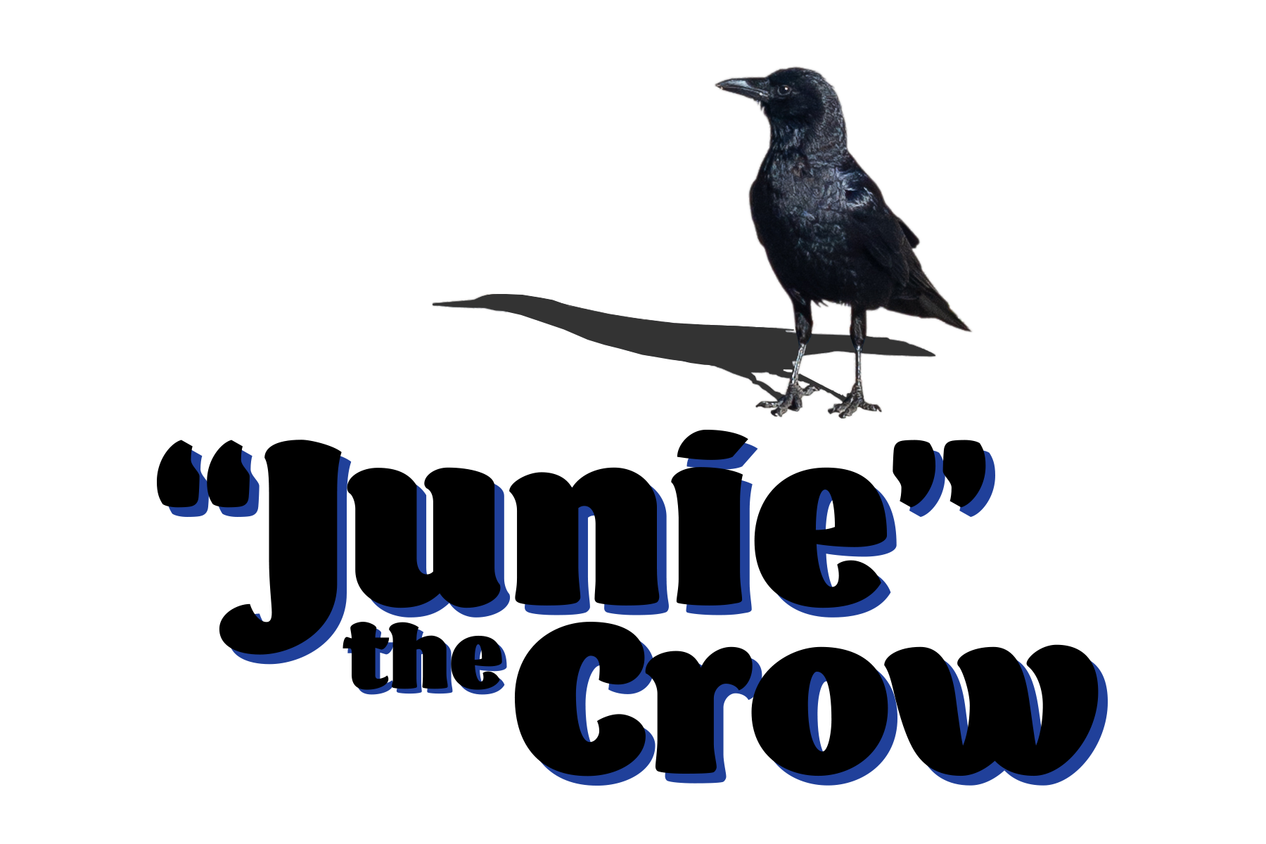
Junie appears to be an American Crow.
Stu is a stud, though his advances are often rebuffed by the lunch crowd. the pigeons eat everything except for the papaya, which works for Junie just fine.
Stu appears to be a Pied Rock Pigeon.
Squirrel comes to eat the larger seeds, harass the pigeons, and somehow always has unshelled peanuts? a scavenger and survivor, through and through.
i believe Squirrel here is a Fox Squirrel.
and there it is, a trip on the tangent highway (which would probably just be off-ramps?). been calling these jaunts tangentiafying – start off in one spot, end up somewhere else. i often feel pulled in a tangential direction and peel away telling myself it’s silly or a waste of time to pursue. not this go-round – i’m rolling with it, baby. seeing where things go…
started on this yesterday and hit a critical point of travel after which abandonment really would mean wasted time. not so! learned the patience of pigeons, used a new typeface – “Barricada Pro” by Elí Castellanos – and enjoyed myself. radical.
i will admit to procrastinating a bit. stalling for time before putting together bigger projects – productively procrastinating. honestly, this feels good. the handkerchief was a bit of the same; providing a gentle re-entry to creative spaces after a couple weeks of going through sh-t – necessary sh-t, but difficult all the same.
feeling better on the other side, free from some hang-ups. getting my feet wet again and dipping my toes into something new, too. tangentiafying.
let’s see where this goes…
3/$25
carried the stash from 101 Records. into the colors, big time.
started out real wordy with this one. the long and short of it is this: didn’t want to sleep with my phone in the bedroom, but still needed an alarm clock. easy solution: get an alarm clock.
found a suitable candidate on Craigslist and drove into the city for the meet-up. it was a success; and i tacked on a visit to 101 Records on the condition that there was a reasonable place to park – convenient and often used errand loophole. got a spot right out front, of course, and spent some time digging before realizing i was in a different physical store than i’d been in a couple years back when Ed first introduced me and our dinner party after we moseyed over from a nearby restaurant. that shop was around the corner – it’s closed now.
enjoyed convo with the shopkeep – which is one place i struggled with wordiness before; cause there’s a story in it, i think. anecdotal hang-ups aside, this took me somewhere and i need to leave some crumbs. in favor of the new equipment i’d picked up, i got some CDs. “3/$25” is what the sign on the wall said, and here are the three i chose:
‘In Spite of Ourselves’ - John Prine (1999, Oh Boy) design and art direction by Dana Arnett & Jason Eplawy, photographs courtesy of Elliot Erwitt/Magnum Photos
the photograph is what got me. seeing it was a John Prine album, whose catalog i’d been nervously circling and hadn’t listened to, i knew this would be where i started. “Dear John (I Sent Your Saddle Home)” has been a favorite.
‘Shades of Blue’ - Madlib (2003/Blue Note) cover photo by B+, cover design by Jeff Jank
most familiar with Madlib from his Madvillain collaboration with the late great MF DOOM. experimentations with Blue Note recordings sounded intriguing. really digging the tracks “Slim’s Return” and “Stepping Into Tomorrow”.
‘That’s Where It’s At!’ - John Lee Hooker (1979/Stax Records) art direction by Honeya Thompson, design by Christpher Whorf, photography by Beverly Parker
until recently i hadn’t heard much of John Lee Hooker’s music. the album cover’s bright yellow shout and graphic layout immediately caught my attention. recognized John Lee Hooker and Stax – i’d be in good hands. “Slow and Easy”, that’s where it’s at.
‘That’s Where It’s At’ influenced the latest journal cover, too. been experimenting with and developing typography for another project and felt i was playing it safe – being too precious. figured a journal cover could be a good place to test things out. feel less inhibited designing for this space right now. working toward uninhibited.
looked at similar graphic text design and sign painting. iterated, iterated some more, and asked for feedback from Sam. important to recognize the collaborative parts of the process. asking for and receiving feedback has been another hang-up for me. it’s all a work in progress.
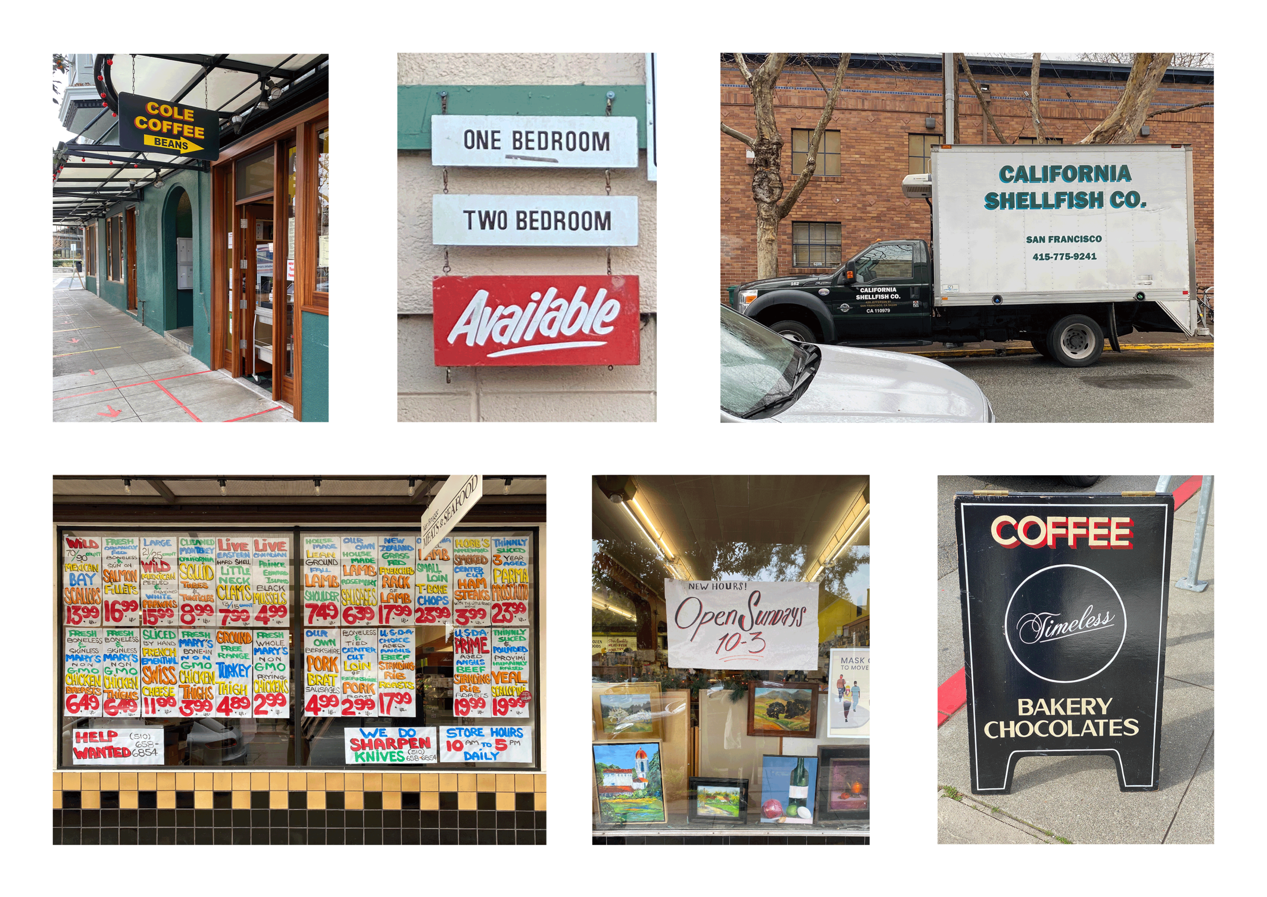
some frequently observed neighborhood inspirations. Cole Coffee and Timeless signs by sign painter Patrick M. Piccolo. outside Cole is where i’ve seen the California Shellfish Co. truck – nice colors, not sure whodunit.
iterating and experimentating.
happy with the color scheme. a little John Lee Hooker, a little Oakland A’s – nice nice.
slow in, slow out
the new year arrived, as anticipated; and under current circumstances i feel motivated to memorialize it this time around. 2020 was a ride, and bore the blame for a heap; but not everything was bad. the coming of a new year injects renewal and hope and brings some relief, if only rhetorically. i’m steering clear of urges to produce grand summations or predictions, just excited to see where this one goes and play an outro to one helluva year.
from top left to bottom right, the numeral iterations got more curvy. there was one iteration past this that i tweaked on the final tracing base.
still being in GIF zone, i thought it would be fun to capture the change of year with an animation. i imagined it would begin as “2020” revealing “2021” as the last digit swings away to reveal the new year. this felt achievable: low barrier to entry and relatively straightforward in terms of moving parts.
starting with a quick sketch of blocky numerals i realized that using the same thickness for both positive and negative space in the numbers would work well for the reveal from “0” yo “1”. i’m not familiar with typographic vocabulary and terminology likely exists for what i’m trying to describe (*not to self: research typography anatomy, fill in the gaps!).
i worked through some iterations to use as a template to trace over for the animation frames in adobe illustrator making an effort to keep evidence of each design iteration along the way. may have missed a few but i think most are accounted for and it’s helpful, for me, to see where things started and ended up. kept things s-i-m-p-l-e design wise for time’s sake. future me is thankful to have spent less of it in a design iteration rabbit hole and endless tracing for the actual animation frames.
while i hadn’t intend to focus so much on the numeral design, i’m glad to have meandered in that direction.
first tracing template i tried out with crop marks to register frame alignment. i 86’d this template when i realized there wasn’t enough room for the zero to completely swing down within the frame… d’oh.
the lower frame is the version i used for all of the tracing. it also shows the revised version of the number “2” that i tweaked to have a longer leading “hook”.
i had imagined using blank paper for this exercise, but all i had access to was ruled 3” x 5” index cards (thank you Sam!). i’m happy with the way things worked out with the ruled cards. i dig the subtle jostle of ruled lines over the animated frames.
when it came to how to animate the swinging “0”, i focused on the animation principle of “slow in, slow out” illustrated in the linked video by youtube creator Alan Becker. “slow in, slow out” is one of twelve principles of animation used to achieve lifelike, dynamic motion. these principles have been described by Disney animators Frank Thomas and Ollie Johnston in the book “The Illusion of Life” .
i’ve come across a few youtube tutorials on animation that describe these principles, and have learned a lot from them. Andy Bailey, a stop-motion animator and flip-book illustrator, has good resources; and The CrafsMan, an all time favorite creator, has several youtube videos on animation too.
after jotting some sketchy notes that look like messy spirograph attempts i moved onto tracing. this part was tedious and a bit monotonous, but fun and enjoyable. I mapped out where i thought the “0” should be to achieve the “slow in, slow out” effect, going back to add in-betweens where the “0” swings back and comes to rest. i scanned the frames, and added more where the animation was choppy.
sketchy spirograph notes on top. the long tick marks in the bottom frame are radiating at intervals exercising the “slow in, slow out” principle.
the starting, stopping, and “1” frames felt too static as just one frame, so i traced multiple to add a little more wiggle to the squiggle.
in the end there were 23 traced frames that i brought into photoshop, straightened out, squared up, and added a little drop shadow for depth. several were used a couple times either for effect or to achieve the returning swing without re-tracing any frames; a big perk to doing a GIF animation rather than a flip-book. some things i learned on this trip to keep in mind for next time:
numbering the back of the cards was a lifesaver for keeping things in order. could think about ways to differentiate frames used several times in one sequence
complete all edits to each animation layer before adding to timeline in photoshop! this is a biggie. each time i made a substantial edit (mostly adding effects to layers or new frames) it would throw the whole animation timeline out of whack. layer edits would show up during incorrect frames and not for the intended for reasons that make total sense but result in an absolute nuisance. i think that can be avoided and the workflow could benefit a lot from storyboarding and planning out edits
like storyboarding edits, map out where elements are moving in the frame so that space, scale, and placement are accounted for (so the zero can swing out of the flipping way)
i think there will be nuggets of information and “hot-tips” from the making of this animation that will be apparent over time. simple and straightforward, this process was encouraging and i’ll continue experimenting with animation and the different principles. to close, i’ll leave behind the hottest tip: keep doing animations, this was flipping fun.


