house numbers
walked into the first monday of the year pretty hard, a true headbanger. i had set myself up for a breezy morning after spending the later bits of sunday leaving breadcrumbs of ideas and thoughts from the weekend. instead, i turned to anxiety who is a dang hostess with the most-est. however, recognizing my uninvited guest, i tried not to allow anxiety to make itself comfortable. a conscious move toward self-care and kindness. while i don’t want to linger here, it did feel necessary to acknowledge the anxiety shaped elephant in my room before taking time to reflect on the walk Sam and i went on yesterday. the subject i had intended to come to at the start of the day. it was the first walk of the new year which came after a string of walks that had been postponed, delayed, or distracted from (can’t blame inclement weather for everything).
from left to right: love the “heavy bottom” of the mod numbers, the after-the-fact slant makes me giggle, sculpey can make house numbers too!, and the petite illuminated numbers are so sweet.
usually neighborhood walks, independently or with Sam, are without agenda or direction or concern for time. i think this approach has precedent in dérive and the situationists (a topic discussed in architecture school), but not quite. thought i’d mention it in case i need to come back to it, but i really don’t want to get into that…
contributing factors like time of day, light quality, season, and mindset, amplify or subdue the characteristics of each neighborhood. the feature that stood out more on this walk than others before was house numbers. i think because it was foggy and the field of view was limited i was focused on things nearer and at a smaller scale. a few house numbers jumped out toward the start, first taking notice of an abundance of sans-serif Neutra Modern numbers, the kind usually affixed to a remodeled or newly constructed home facade. to my surprise and delight, there were just as many numbers that embraced whimsy and playfulness, and even humor (although likely intentional). like ones that appeared to have been arranged on a level, horizontal line only to be mounted after the fact at an angle to match a railing or sloping trim.
i browsed the internet for a bit to see whether i could identify some of the more interesting looking house numbers, quickly ended up on pinterest, and became instantly claustrophobic from it all. so. much. Neutra. Modern.
spotted several homes with acrylic address numerals, a neat idea subject to questionable execution. there was one example i saw where acrylic house numbers were done sharply. in this case, the numbers worked in concert with the surrounding elements. opaque numbers were fixed to an acrylic base and hung above the door frame of an enclosed porch allowing the woodwork behind to remain visible. the numbers may have been an off-the-shelf selection (no shade!) but were set more thoughtfully than others like it, which is another way of saying that i liked the kerning and orientation. i think the italicized nature of many house numbers does a doozy on their installers. there were so many along our walk that were italicized and installed italic-ly (slightly leaning forward). looked as thought they were going to tumble right off the wall.
not this house. the numbers were nice, and so was the rest. the exterior was a rich jade green with white painted woodwork and trim and brick red stairs. the scale was nice and it had a well manicured yard, but not too fussy. i don’t know… i just got a good feeling looking at this house, and quickly realized that with three security cameras the house was looking back. yikes…
while i like to share many of the neighborhood photos i take, i do so with privacy in mind; omitting house numbers and street signs where possible when composing a photo. but seeing as how this was focused on the character and composition, including house numbers specifically, i thought it best to represent this house with a sketch from the photo rather than the photo itself and leaving some room for ambiguity.
i really enjoyed the scale and symmetry of the entry. the flanking sidelights are geometric and playful. it’s well detailed and uncomplicated. i appreciate that.
“gentrification special”
now, it’s not uncommon to pass by a remodel or ground-up home that falls into the category of “gentrification special”. several visual characteristics easily identify a house like this, including but not limited to: tall, narrow board ipe privacy fences, dark gray and black painted exteriors, and Neutra Modern house numbers (*wink) are a few. we came across just the sort containing the aforementioned characteristics: dark exterior, tall privacy fence, modern house numbers; the architectural headbanger of our walk. i remember passing it and doing a double take. stopping and pointing at it. gawking. reading an obnoxious “no dog poop” sign hanging from the handrail and feeling an impulse to hang an even bigger, “this is dog poop!” sign over it. i don’t know, i could go on about this house but i won’t. i mean, i don’t like it, but so what?
for me, stepping away from working in architecture also means stepping away from the toxic critique culture that it engenders. i am allowed my opinion, and so is everyone else. so what? i find it less useful or helpful to my own process to nitpick and criticize this house. people live here and call it home, their opinion on this house far outweighs anyone else’s. critiquing this house isn’t going to make me feel more confident in my design sensibilities. something i can extract and keep for personal benefit are design elements that i don’t like/agree with/care for and therefore won’t use in my own work. this one may not be worth remembering for the same reasons as the jade green number, but i’ll remember what i need to from it. “design moves to avoid…”
trying to stay mindful and present, i didn’t have my phone out to take quick pics the whole time. there was also a lot of juggling foggy glasses with my face mask that made taking film photos an effort. while i may not need specks to wander they do come in handy where clarity counts, like manually focusing an image. this situation was fully avoidable, but i forgot to do the whole contacts thing before heading out the door. what i’m trying to get at is that i won’t talk about things that aren’t here and that i didn’t take quick pics of. i’ll need to wait for the film rolls to get developed, whenever that happens.
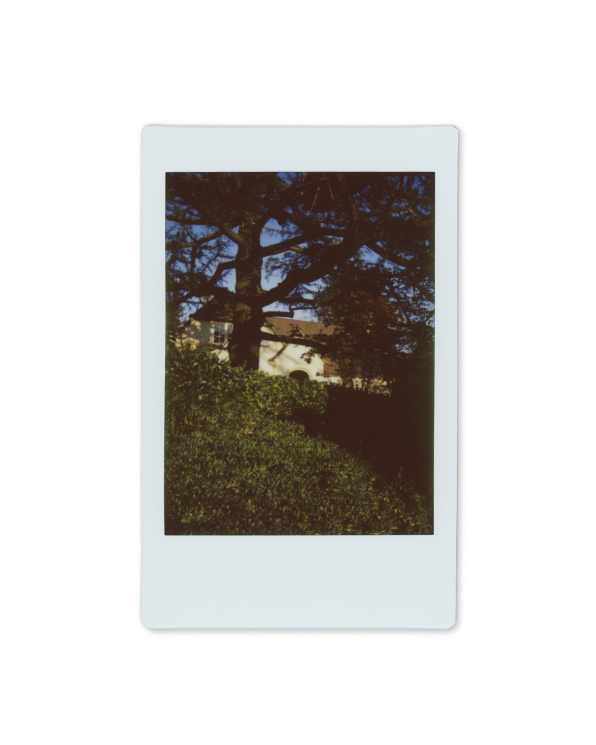
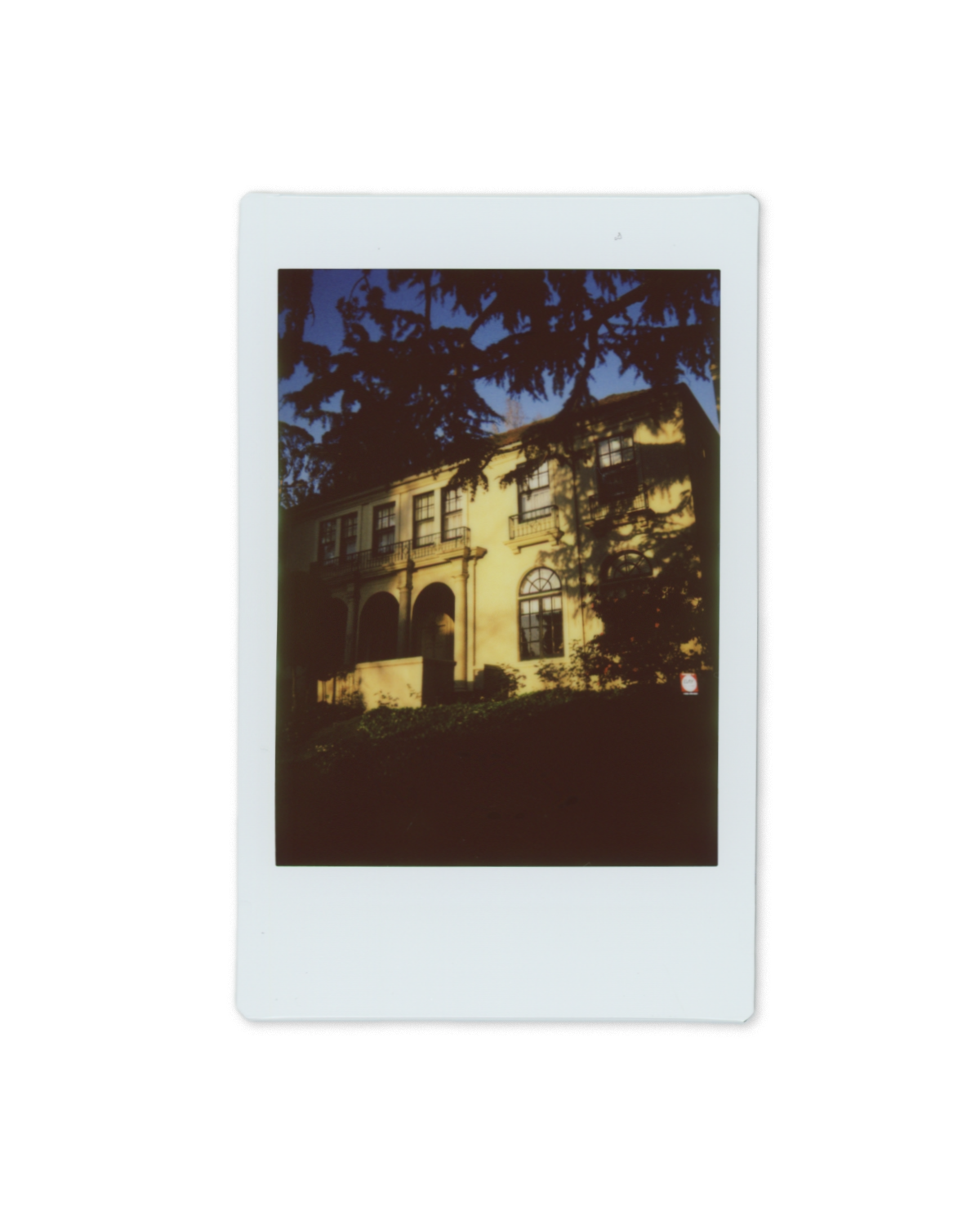
though there were several moments that i may want to return to later including a cheerfully shingled two-story character, old-timey fonts on signs, and a cheery neighborhood offering of sweet limes.
it’s the roof shingles for me, i really dig the scale and coloration. on top of that, the symmetry, dormer, and birds of paradise give this a “Bahamian feel,” says Sam.
“by appointment only” sign font + camellia blossoms. yes please.
sweet limes offered with a fun handwritten advert. love to see it.
this one was hard.
i’m still looking for ways to exercise agency in creative spaces and what that looks like for me. i’m still trying to get into a groove and establish a rhythm and pattern that is sustainable, encouraging, and flexible. when i sat down to write this morning i wanted to bypass negative ideations and ignore my anxiety, but i think that would have been unfair to the spirit of this and other spaces where i record myself and ideas. my mind can be a clutter and anxiety comes and goes. my work doesn’t happen in a vacuum; and i want to be honest about that. i also want to be kind to myself now so that my future selves have an example, and reminder, of what self-kindness looks like. i am familiar with how anxiety has derailed me, and i’m becoming more familiar with how to be kind to myself and approach my feelings - including difficult, messy, and unpleasant feelings - with curiosity and compassion rather than shame derision.
and sure, this was a departure from what i had originally set out to do, and GIF free at that; but i want to be honest with myself. i started off in a different direction, but the breadcrumbs brought me back to thoughts from the weekend walk with Sam, our discussions about our neighborhood, foggy hair, gentrification and bad architecture, love, and becoming a jedi (you know where to find the more intimate tid-bits).


