

warning signs

not the biggest art board mess i’ve made. yes, that is a little head illustration in the middle.
getting into good things. making good messes. although never intended, i often end up with an illustrator art board ‘splosion. i can make sense of it, which is what ultimately matters. the days of naming files “pinup boardsfinal-final-FINAL.ai” are in the rearview, mostly. i have created “file name_versionx.ai” a time or two. harm reduction. i’m hesitant to break up design families and iterations into different files. can be frustrating looking for an element that’s similar but saved in a different file. fortunately illustrator has a limited drawing area, otherwise…
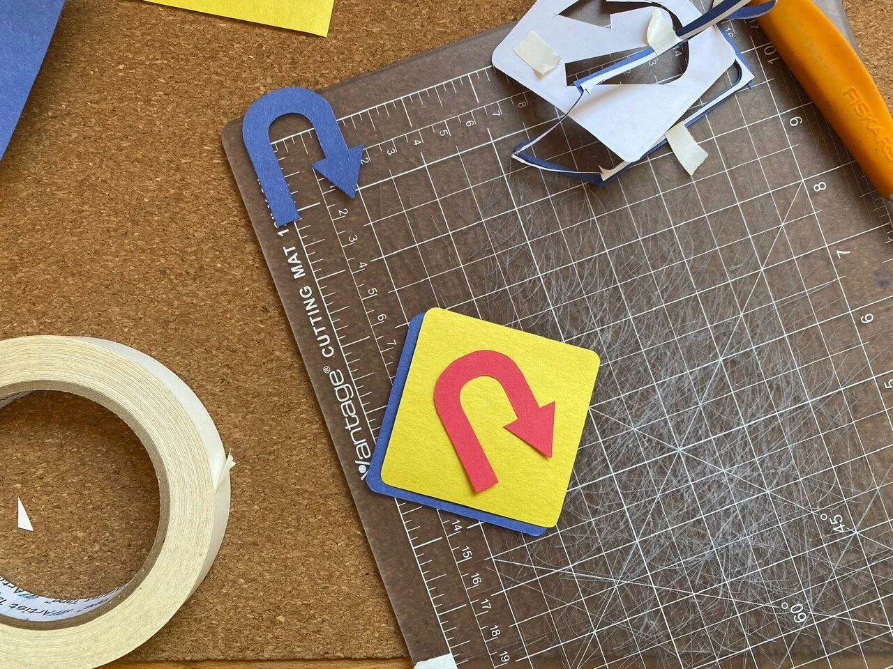
up in the left hand corner i had been working on lettering to use as a journal cover based on the hairpin turn. with more work i think it could get there, but it needed a lot of time and wasn’t the originally intended subject. saving for another day.

original “winding road ahead”

winding, winding, winding

worked out the spiraling curves on dot-grid paper first.
the graphic brevity of warning signs can, at times, bely the severity of what needs to be brought to a driver’s attention. like, did a snake pave this road? why so windy? i imagined driving down a stretch and seeing a ludicrously exaggerated road sign for “winding road ahead.” a relentless warning.
“oh geez, well it’s gonna go on winding for a good ways there. be careful!”
i don’t know, that’s just what came to mind.
three main squeeze warning signs show up here: winding road, hairpin turn, and added lane. these schemes were simple and, importantly, repeatable. wanted something that could be made into an extended path or line pattern.
the original winding road graphic is more of a sine curve, and i was having a bit of a hard time re-creating it. i went off-book from the MUTCD and used half-circles instead. it’s not an exact replica. it was never meant to be.

tested out some of the lettering ideas too.
“hairpin turn ahead” was the first one i worked on in the series. it reminded me of a professor’s diagram on recursive design process. the gist of the pedagogical ideology being discussed was that working recursively encouraged processing ideas forwards, and backwards, yielding a more dynamic result than a linear process. each time the loop makes a turn to come back around it has to pass over a previous section of itself.
this graphic resonates with my own goals for process. hashtag goals.
the bit of yellow sign that peeks through when the loops cross-over is an overlaid path. i think that could be created more elegantly, but it worked!

original “hairpin turn ahead”

recursive loops

construction paper version. wrote a little about it a few days ago.
the “added lane ahead” sign reminded me of how easily thoughts can come and go. although i’m finding mine rarely go. my noggin can bottleneck.
i like that this sign is diamond shape, like the others, but the design is also on the diagonal. made for a fun opportunity to exaggerate the sign diagonally. imagine a sign like this jutting over a road, ha! aside from the obvious obstacle it would create, it would be a funny sight.
tried a version of this were the sign was vertically plumb. it just didn’t hit the same. there’s something about the angle to the graphic that gives the impression of the lanes coming from and going off the sign, “lanes are longer than they may appear.”
also recognizing that i’ve have been altogether too protective of this series of drawings. feel like i was saving them for some sort of grand reveal. to who? anyway, i could tell that i was starting to get all “my precious” gollum-y with it. cut that out!
i think i see potential for this exploration to generate other ideas and i’m feeling guarded about marking it down and moving on. no, moving forward. there will be a time when i’m not working with these signs, but that doesn’t mean i’m done with them. just need to switch gears and tend to the other simmering pots.

vertical version. was also trying out some graphics that would “make sense.” dropped that pretty quickly.

original “added lane ahead”

added lanes on lanes on lanes
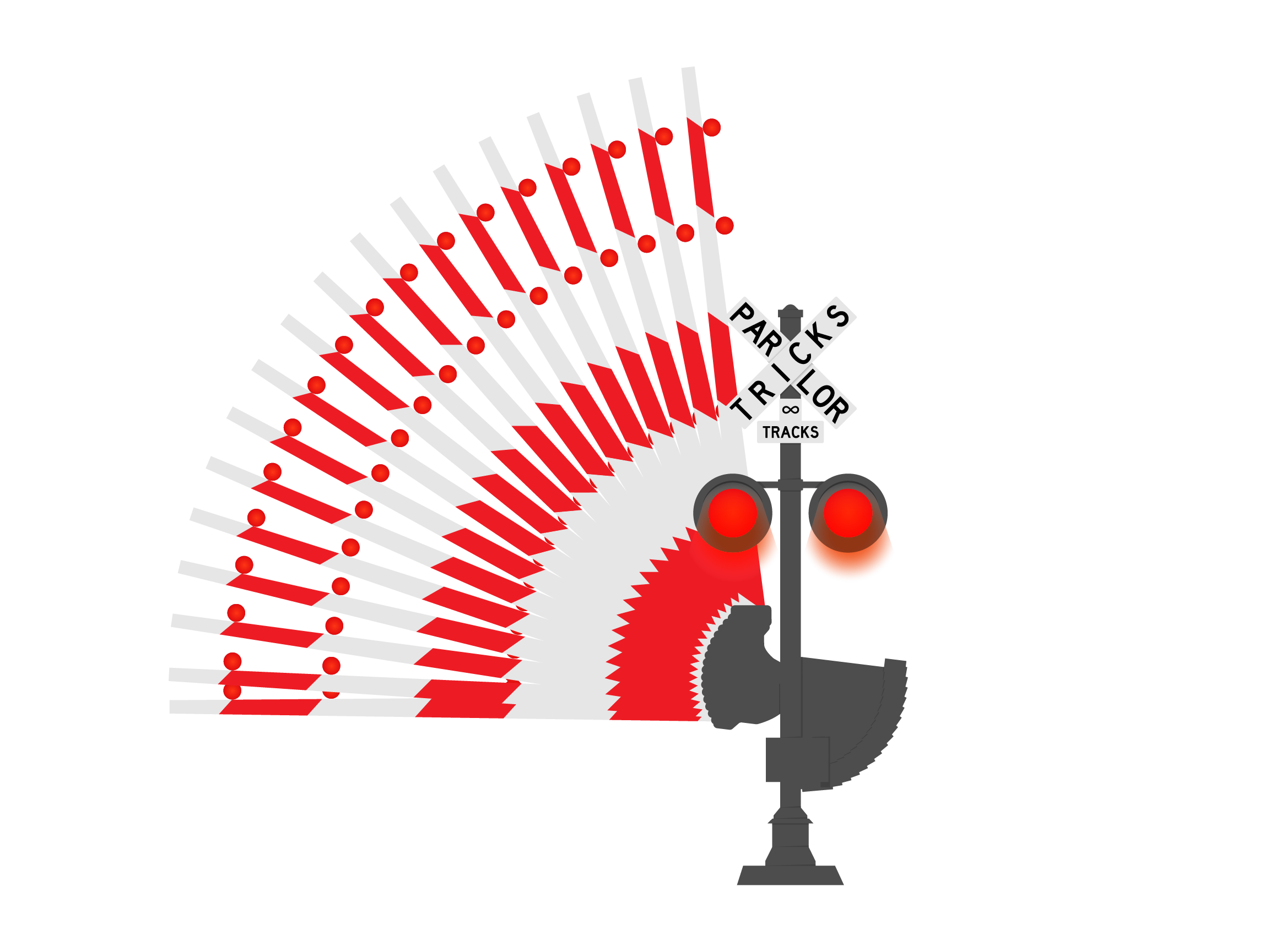
almost, almost, left out the railroad crossing sign from the journal cover. this was from a little while ago, which is still not governed by the same rules of time as “the before times.” so, to be more accurate, this is from early january this year. having already gotten to work on the warning signs, i was looking to create more road sign/warning sign type GIFs. railroad crossing was another straightforward design that incorporated motion.


couple of image references i used. the diagram on the left is from the previously mentioned MUTCD, continues to be a great resource. the image to the right is a cool articulated arm that i thought i would incorporate but realized partway into creating the base illustration that i would be punching way above my weight class. for now, at least.

sketch study of sign, working out whether to include “tricks” in the criss-cross or beneath it.

all the GIF frames collapsed into one. turkey tail? … anyone?
there were 20 frames in all. the arm at the top and bottom positions were 2 frames, one for each flashing light. the frames between could have been more frequent for a smoother animation. i also considered how this would look if i hand drew out the arm raising and lowering. i think there would be an opportunity to add smoothness (or, smoothnicity, as CrafsMan says). oh! or i could add motion blur between the frames in photoshop. that would double the ‘tweener frames though since i would need a motion blur for each direction… another to save for later.


color studies
first things first, yesterday kicked off a string of palindromic days this month: 1-20-21, 1-21-21… always enjoy a palindrome!
little bit of vamping for an intro that may be unnecessary. the title is a giveaway, right? simply put, continuing work on warning sign designs while studying color. here’s where i’ve been with that over the last couple of days:

at the start: stencils, color wheel, and construction paper

simple triad combo

triad: yellow, blue, & red
hi-yo! what better place to start than the classic primary triad of yellow/blue/red? seriously, it's the most straightforward so i really did want to start here. color seems really simple, which is usually the first indication of how complex something is.
i used the “hairpin turn ahead” graphic, i like it. looks like a “u-turn”, but it’s not. i think that’s because the momentum is up and to the right giving an impression of moving forward. like writing and reading. at least in a Latin/Greek influenced written language sort of way…
printed out some stencils that i made from my illustrator doc with other signs and stuff that i’ll get to later… anyway! printed some stencils and got to cutting.
kept the primary (yikes, punny) foreground color yellow, cause i like it; and because it’s evocative of the original warning sign design. then, cut the additional elements from the remaining colors to test which worked best as background/arrow/ring. having more cut-out pieces than needed gave room for experimentation with background, arrow, and border color. glad to have stuck around for a bit of swapping rather than just charging ahead. it allowed me to consider alignments and relationships i may not have otherwise.

i like how the blue arrow over yellow foreground looks like a cut-out in the foreground through to the blue background.

mock-up with red background and blue foreground arrow. i preferred the visual impact of the blue background and red foreground arrow.

now, cutting the little ring that borders the edge has bested me time after time. thought i’d gotten the technique down to where only one stencil could be used to make all cuts. not the case. what ended up working was to use one stencil for the foreground and background pieces and a second for the ring and arrow cut-outs. the stencil intended for the ring cut-out needs to have a bit more paper excess around the edges to allow the straightedge to keep the paper taut while cutting the thin strip. otherwise, if the stencil is cut too close to the design lines, the pressure of the blade on the paper pushes it down ending up with an uneven cut. these aren’t intended to be perfect, but i know myself better than to say i’d walk away happy from a roughly cut edge… i think i’ve gotten it down now.
i like all of the color combinations of this triad. the primaries are sort of fool-proof. they look good in any arrangement and working with them felt approachable and flexible.
using constriction paper in primary colors felt like bing in elementary school again - only now i understand a little more why they go together so well.


the ring of color matched the arrow here. when used in a split complementary or triad scheme, these elements appear as one “sign” kind of like they were offset screen printed over top. i dig.
the second study was violet/red-violet split complementary. using what colors i had from 12 included in the pack. this combination is reading between the lines a bit. the purple is taking the place of a more nuanced “red-violet” that may not even be available in construction paper of this quality… no matter, made do.
i like this one too. it’s not as bare bones basic as the primary combo, but it still feels familiar to me.

still using two separate pieces for the arrow cut-out. it was with this and the first r/b/y that i thought to cut away the arrow from the overlapping diamond to reveal the color behind.

“red-violet” split complementary: green, violet (should be “red-violet”), & yellow
so, a couple few things i noticed while working on the first studies yesterday:
when the background color and bottom arrow are the same, it appears as if the arrow is cut from the foreground. i hadn’t achieved it that way in the first two studies, i used two additive arrows
studies that followed had foregrounds with arrow shape cut from it
in the primary triad, the red ring is shifted left while the red overlapping arrow is shifted right. (that sentence reads funny. just scroll back up to see what it’s about.) this looks strange if the eye is meant to see the red ring and red arrow as paired together. however… the miss-match isn’t a deal breaker for me
i like the negative space around the overlapping arrows of the primary triad study. it feels like the right amount of breathing room in the main background/foreground offset and around the overlapped arrows
and probably some other things i forgot to jot down for later…

triad: green, orange, & violet

i do like this one as-is. maybe save for later.
worked on another triad of green, orange, and violet. there are two greens in my paper pack and i chose “yellow-green” for this, which should be accompanied by a “red-orange” and “blue-violet” according to my new, handy-dandy color wheel. in addition to the violet, i cut out a blue ring and arrow to test out as a stand in for “blue-violet”. with the orange it felt too New York Knickerbockers for my taste… no shade! went with violet in the end.
the violet gives this combo 1990’s Nickelodeon vibes. super into it. the simple study with green cut-out foreground and orange background is a fun one too.

first tetrad study testing out violet arrow with orange ring…

… or orange arrow with violet ring

tetrad: blue, yellow, orange, & violet


tetrad: pink, violet, yellow, & yellow-green
the last one for today was a tetrad of lighter colors. this, along with the other studies, looked instinctively harmonious once everything was pieced together, but i had my doubts… i wouldn’t have picked these colors on my own without the aid of a color wheel. realizations like this during the process of making each of these studies encourages me to continue exploring. i feel less intimidated by color after the last couple of days, and that feels empowering.
there are a couple of books that Sam has, and i’m borrowing, to help along the way. one is Josef Albers' ‘Interactions of Color’ and the other is Garth Lewis’ ‘2000 Colour Combinations’. i believe the Albers book has exercises in it which i’m excited to get into. i’m also cooking up project ideas that incorporate color studies experimenting in different mediums and techniques. hello appliqué!
this is only the beginning!
i had started to write a bit about yesterday’s presidential inauguration, but didn’t see much use. it is what it is. pomp isn’t really on the itinerary for me. i am glad i caught it in time to see Kamala Harris being sworn in as vice president. and to hear, and see, Ms. Amanda Gorman perform her poem ‘The Hill We Climb.’
continuing to observe and stay engaged. i am much more cautiously optimistic about things now than in the last four years. and, for lack of cheerfully enthusiastic words to raise a glass to, i’ll borrow a few from a fave: “to better times.”

speed hump
soooo… i’ve been working on some road signs - yes, sticking with that theme currently — and have been putting off documenting the process because… i don’t have a reason. not a good one at least. i think i was adding things to the overall project, and made myself believe that i shouldn’t post anything about it until it was buttoned up and polished.
hold on a sec…
lemme make sure this thing is plugged in…
*ahem*…
process is what you came here for!
ok? future me?! hope you remember that! or remember to come back here and refresh yourself. refresh yourself!
without further ado, or pomp, or verbose word vomit to vamp around my discomfort documenting something that isn’t finished (i’m working on it…), here are a few pieces that i’ve been working on over the last few weeks:

from left there’s the “winding road”, “hairpin curve”, and “added lane” ahead signs.
i’ve been using the Manual on Uniform Traffic Control Devices to reference design standards and sign usage. i hadn’t seen the design standards before getting into the making of the three signs above in illustrator, but am now incorporating the standards into future explorations. i’m not about to mass produce road signs, so i’m adhering loosely. nevertheless, the standards provide a helpful touchstone for composition and color.
started out looking at the “warning signs” which are classically yellow with black text or graphics. big fan of the color yellow, why resist it?

a good mess

the first iteration: solid yellow base with black cut-out glued over top

and the second: black loops cut from yellow.
i prematurely decided while making the recursive hairpin loops that i didn’t like the way the second iteration was going. so i got sloppy when i was gluing and ripped the yellow paper in a few places. looking at it now, i don’t dislike it as much as i had convinced myself in the making of, but i still like the first iteration better. i like the detail of the narrow strip around the border. i also cut it and remember how delicate i had to be to not rip the thin ring of construction paper.
i’ve been using run-of-the-mill construction paper. keeping that barrier to entry low, things aren’t as precious as they may be if i was using “nice” paper. i really like construction paper, actually. the cheapy, inexpensive stuff that litters elementary school classrooms. it’s no fuss and after being handled it starts to take on characteristics similar to fabric. i like that it has texture and character. i like it.
this exploration has also encouraged me to look at color using these simplified road sign graphics. that’s why i wanted to get a color wheel the other day. color is daunting, so i’m starting small.

using colors as close as i can get them from my pack of construction paper to explore color theory.
like i said at the top, i was putting this off after convincing myself i needed to have all of the pieces of this project completed, or nearly so, in order to document it. then, late last night, i opened an email from The CrafsMan and saw that he too was working on warning signs of his own. i felt excited seeing a creator i admire exploring something similar to what i had been. and with precision timing my anxiety walked through the door to let me know that i was un-original and anything i shared after-the-fact would be seen as a rip-off.
my head can be a mean place…
took a bit to shake those feelings away, but i have, and will continue to. this is just a pit stop along the way. a snapshot on the road trip. a whole host of other metaphors and similes and analogies that i don’t know or have the energy to corral.
alrighty, off for a morning walk to coffee and breakfast. back to the drawing board later.
fun after-the-fact: i used the phrase“without further adieu” when i first wrote this. thought it read strangely using the french word for goodbye. turns out i correctly identified my incorectness. the saying is actually “without further ado.” not this time, eggcorn!

buffering…

cleaned my desk yesterday. felt good to follow up on the phase one document purge-and-shred from earlier this week. needed to recalibrate my organization strategy to make space for my small reference library which had been living on the literal edge of my desk. anytime i accidentally knocked over a book (which was often) it set off a chain reaction with nearly half a dozen other precariously situated accoutrements. there’s no sense in that.
winding down on the cleaning process today, i’m confounded by all of the little things that are left without a spot or collection to be housed with. sometimes the little stuff trips me up more than the big stuff. making space for the dictionary isn’t so bad, but the small box of slide film holders? i guess those should go in the back of a huge box and stored in an unreachable spot on my bookshelf for a year or so. yup.
so, in an effort to avoid that situation, i’ve corralled the floaters for more consideration
the desk clean and other housekeeping took most of the day and mental energy. i didn’t have it in me to jump back into a project, but i did go on a walk and picked up a color wheel! and some other less necessary art supplies. i didn’t have a physical color wheel and felt the solution was pretty low effort; and there’s a good art store in walking distance. the walk allowed me to collect my thoughts on a few in-progress projects. i needed the space, desk and dome, to ruminate.
there were moments of desk-mess that were productive, and glad i caught them. fussed with a few of those images last night, testing and working out some ideas. hadn’t intended to make any images; but i like it, so there it is at the top. oh! and i made a recreation of the classic buffering cursor hourglass! i know, it’s simple; but i thoroughly enjoyed making it ^_^
it’s nice to have room to think about project stuff without the visual clutter of having it all out. and i’m happy to be in a productive mindset having become familiar with the opposite. definitely needed to clear some things out to make space for new stuff to load.
oop! just felt an earthquake…
ok, bye bye!


hello stranger

selfie, overexposed VW bus, and some houses i liked.
more instant photos that i’ve taken the last several days. the polaroids are from thursday, the 7th, on a walk around the neighborhood. i wore boots instead of tennies to slow myself down. i had some things on my mind that i wanted some time to think about. on my way through thoughts, i crossed paths with a couple of cats in a stroller, a crumpled monarch butterfly — unclear whether on its way in or out, kids skateboarding for snacks, and so many neighbors. maybe not neighbors i knew personally, but ones whose faces were becoming more familiar over the weeks and months of routine strolls.
it was a good walk. i didn’t go far, but i traveled.
on a technical note re: polaroids — i didn’t have as much success exposing the faster 600 film outside as i have in, but i’m pleased with what i got and moreso for having taken them in the first place. i can get self conscious taking photographs out and about. i worry i’m drawing attention when i’d rather slip into the margins of the scene — an observer, not a performer. i sometimes see people looking at me or in the direction of whatever the subject may be and i think to myself, “i wonder if they see what i see." which used to cause worry that what i saw was uninteresting or unimportant. gradually i realized those thoughts aren’t helpful. i take pictures of things i like, that catch my eye. no further self-explanation needed.

the subject isn’t provocative nor rendering exact. that’s rarely the goal with instant photos.
these next few instant photos are from the 10th and were taken with Sam’s square instax camera. we were spending socially-distant hang-time with friends in the parking lot across from their place. i’ve only been a handful of times and have so far seen the lot resourcefully used as a track, roller rink, playground, and stoop. the afternoon light was nice - shadows from utility lines complimented the roofline they were cast on. at one point several crows perched themselves on the lines and took flight before i could save it. these weren’t any ordinary crows either. they had just been at ground level, foraging and flipping over clods of dirt that seemed bigger than they were. seeing this effort had me looking at our almond and peanut fed yard birds a little differently…
the topic of conversation meandered momentarily to instagram, which i deleted from my phone and haven’t been on since october. well, that’s not entirely accurate… i haven’t engaged with instagram since then, but my account is still technically active; sitting somewhere in a data oort cloud, gathering dust. i stepped away from the platform for my own health; i felt like i couldn’t parse things out and gauge authenticity. i thought i was making an effort to be honest on the platform - honest with myself and the things i shared — posting photos in hopes of gaining exposure while also exploring others’ work. easier said than done, and i often found myself refreshing notifications after every post to surveil incoming “likes.” it felt an unnecessary pressure and source of anxiety that i could easily disengage from. so i did.
absence from mainstream social media can feel like invisibility. so much of life nowadays references back to one of a few “.com” addresses, everything else feels like small potatoes. it can feel isolating to exist in the digital landscape without a connection back to a larger network. i had briefly contemplated creating a “parlor tricks” instagram account to link to this space, and i’m embarrassed to even say so. social media isn’t an inherent part of the creative process, not for me, and that’s ok.
i considered how i’ve shared my photos on Flickr (the only social media i actively engage in and still enjoy) and in this space, and the purpose these spaces hold in my process: to leave clues and notes en route. i thought about the challenge and goal to maintain a digitally accessible creative journal that i can use as reference along my creative timeline. i needed a space that was able to move forward, backward, up, down, and sideways. i needed an accessible time capsule. i needed the internet. and maybe i am talking to myself in a void here, but it’s also the most crowded room i know with billions of other people criss-crossing it at any given moment. there is a nice solitude here knowing there may never be anyone else who reads any of this other than myself (and you, Sam. hi!). and by magnitude and chaos of the interwebz, i know that solitude won’t last forever… (another subject for another day perhaps?)
i am still getting comfortable with the direction of things, as evidenced by nearly every entry so far; and i will need to be compassionate with myself when feelings of isolation and invisibility creep in again. before signing off i want to install a reminder, should i find myself here again, to follow my instincts and trust myself whether it be in my work, social network, or instant photos.
and if you happen to find yourself here and you are not me, hello stranger.

not a planner
seriously, i am not a planner. not in the buzzy, corporate sense anyway. i love paper and pens and paper related things. and yet i’ve have managed to avoid paper that in planner form since since high school, or thereabouts, when everyone was issued an agenda for keeping academic engagements and homework organized. while i haven’t established a relationship with a physical planner as an adult, i have meandered through online planners and task-management apps. nothing’s really stuck. the closest i’ve come to it is drawing months onto post-it notes and marking days with color coded dots to signify whether i had an exercise class or evening meet-up. then slashing across the days as they passed and stacking up the spent months a little post-it pile.
around this time last year i prototyped a physical planner page, but only tried it out for one week. afterwards, i pasted it into my sketchbook like a piece of evidence and didn’t try it again. there’s a documentation method that could use some work… and i should probably prototype more than one week (uh, duh). i pulled it back out today and re-tooled it a little, just in case this year is the one that includes a planner.

style a: the iteration i tried last year, giving preference to friday which was a busier personal day of the week

style b: maybe this could work for a spread across pages or a small, single-sided planner?

style c: “the weekender”

fooling around with composition. i think this would be neat as a digital, interactive planner sheet. (and maybe one of these days i’ll finally learn After Effects for vector animations)
i computer-ized the first iteration from last year. this was from a time when i mainly used my work calendar for weekday things with personal appointments in the margins of weekdays and mostly on weekends. i still used my work calendar to log personal appointments as a courtesy for scheduling purposes in the office but not really for reminders or notifications. i wanted a calendar that had room for weekday reminders and notes, but gave preference to the weekends since that’s where i had the most personal time.
nowadays, in quarintime, my days bleed together without clear definition between work time and personal time. and seeing as it’s a new year, i’m willing to give this planner thing another shot and to see whether it can be flexible enough to handle the time-soup i’m in.
playing around with the composition and proportion of weekdays on the sheet, i thought it could be cool to explore as an interactive digital planner. that way the space for each day could respond to the schedule, sliding around and allowing some days to bloat and others to shrink. oh! and the boundaries of the digital “sheet” could be locked so that a really busy week would be stuffed and bursting! disgusting, but so real. lacking coding knowledge beyond very basic html, this would need to be a collaboration with someone literate in the computer languages and such.
keeping this open ended - i’m interested to see how this works out.

left: scanned a few hours after being taken. right: scanned this afternoon, about 24 hours later.
a followup to yesterday: there was a difference in the polaroid over time (i think). it may just be psychological, or most the difference is a result of scanning technique.
scanning Polaroids directly on flatbed scanner glass runs the risk of producing Newtonian rings which are a bit like a moiré pattern and a total pain in the butt to edit from images, so i usually just leave them in… i’ve found that leaving the scanner lid up helps a little since there isn’t pressure mushing the photo onto the glass, and that’s what i did with the first image scanned yesterday.
i tried something a little different today by keeping the scanner lid up and placing a blank sheet of bristol over the polaroid as a background. i think the improved results may be a result of the bristol rather than the development time, but i’ll have to try this again to see.

Newtonian rings, blast!
while composing this news was coming in that the Capitol building in Washington D.C. had been stormed by terrorist t**** supporters. i’m not immune to what’s happening, not by a long shot; but i am trying my best to focus on the things that are within my immediate circle of control. no notifications, no doomscrolling, and limited interactions with talking heads. it’s also important to remember that words mean things, no matter how hard politicians try to manipulate language to suit their agenda. here are a few that best describe t****, his actions, and the political climate he is inciting:
coup d’état (n): a sudden decisive exercise of force in politics; esp: the violent overthrow or alteration of an existing government by a small group
sedition (n): incitement of resistance to or insurrection against lawful authority
insurrection (n): an act or instance of revolting against civil authority or an established government
terrorism (n): the systematic use of terror especially as a means of coercion
treason (n): the offense of attempting by overt acts to overthrow the government or the state to which the offender owes allegiance or to kill or personally injure the sovereign or the sovereign’s family
thank you Merriam-Webster’s for keeping it real.

sidenote

took a snapshot of the desk and what’s going on. used the Polaroid since i’d loaded it up with fresh film last month to take a picture of Simon. up till then it hadn’t been used in a couple of years. whoops.
picked up a new pack of Polaroid 600 film a couple weeks ago. this pack in particular is a stop or two too quick for my camera which usually takes lower iso SX-70 films. to compensate i loaded a neutral density filter over top of the film pack to slow it down and allow for more accurate light control from the exposure wheel. the nd filter stays in after the dark slide is released, and then taken out at the end to use another time.
trying to get reacquainted with the feel and settings of this camera. for the desk pic i turned the exposure wheel a little to the right (from my position, behind the camera) to underexpose a bit. hit the red button: game on. camera makes its trademark shhhakunk whrrrrrrrrr… as though it’s somehow also making the film?
i’m glad the Polaroid formula is getting more dialed in, i’m liking the look of this film. but it is still finicky and likes a dark, warm place to develop. i haven’t found a consistent solution for quickly getting the film into an ideal incubation environment. clothes pockets work well, and my shirt breast pocket did the trick today. i think i gave it a half hour or so to develop before scanning it, maybe even less. it also takes a long time to really cook and “set”. i would venture to say it takes a full day before everything gels.
just took another peak at it and i think there’s more shadow definition with an hour or so more time. maybe i’m hyping myself up. should scan again in a few hours and compare.
ok, bye bye!

house numbers
walked into the first monday of the year pretty hard, a true headbanger. i had set myself up for a breezy morning after spending the later bits of sunday leaving breadcrumbs of ideas and thoughts from the weekend. instead, i turned to anxiety who is a dang hostess with the most-est. however, recognizing my uninvited guest, i tried not to allow anxiety to make itself comfortable. a conscious move toward self-care and kindness. while i don’t want to linger here, it did feel necessary to acknowledge the anxiety shaped elephant in my room before taking time to reflect on the walk Sam and i went on yesterday. the subject i had intended to come to at the start of the day. it was the first walk of the new year which came after a string of walks that had been postponed, delayed, or distracted from (can’t blame inclement weather for everything).

from left to right: love the “heavy bottom” of the mod numbers, the after-the-fact slant makes me giggle, sculpey can make house numbers too!, and the petite illuminated numbers are so sweet.
usually neighborhood walks, independently or with Sam, are without agenda or direction or concern for time. i think this approach has precedent in dérive and the situationists (a topic discussed in architecture school), but not quite. thought i’d mention it in case i need to come back to it, but i really don’t want to get into that…
contributing factors like time of day, light quality, season, and mindset, amplify or subdue the characteristics of each neighborhood. the feature that stood out more on this walk than others before was house numbers. i think because it was foggy and the field of view was limited i was focused on things nearer and at a smaller scale. a few house numbers jumped out toward the start, first taking notice of an abundance of sans-serif Neutra Modern numbers, the kind usually affixed to a remodeled or newly constructed home facade. to my surprise and delight, there were just as many numbers that embraced whimsy and playfulness, and even humor (although likely intentional). like ones that appeared to have been arranged on a level, horizontal line only to be mounted after the fact at an angle to match a railing or sloping trim.
i browsed the internet for a bit to see whether i could identify some of the more interesting looking house numbers, quickly ended up on pinterest, and became instantly claustrophobic from it all. so. much. Neutra. Modern.
spotted several homes with acrylic address numerals, a neat idea subject to questionable execution. there was one example i saw where acrylic house numbers were done sharply. in this case, the numbers worked in concert with the surrounding elements. opaque numbers were fixed to an acrylic base and hung above the door frame of an enclosed porch allowing the woodwork behind to remain visible. the numbers may have been an off-the-shelf selection (no shade!) but were set more thoughtfully than others like it, which is another way of saying that i liked the kerning and orientation. i think the italicized nature of many house numbers does a doozy on their installers. there were so many along our walk that were italicized and installed italic-ly (slightly leaning forward). looked as thought they were going to tumble right off the wall.
not this house. the numbers were nice, and so was the rest. the exterior was a rich jade green with white painted woodwork and trim and brick red stairs. the scale was nice and it had a well manicured yard, but not too fussy. i don’t know… i just got a good feeling looking at this house, and quickly realized that with three security cameras the house was looking back. yikes…
while i like to share many of the neighborhood photos i take, i do so with privacy in mind; omitting house numbers and street signs where possible when composing a photo. but seeing as how this was focused on the character and composition, including house numbers specifically, i thought it best to represent this house with a sketch from the photo rather than the photo itself and leaving some room for ambiguity.

i really enjoyed the scale and symmetry of the entry. the flanking sidelights are geometric and playful. it’s well detailed and uncomplicated. i appreciate that.
“gentrification special”
now, it’s not uncommon to pass by a remodel or ground-up home that falls into the category of “gentrification special”. several visual characteristics easily identify a house like this, including but not limited to: tall, narrow board ipe privacy fences, dark gray and black painted exteriors, and Neutra Modern house numbers (*wink) are a few. we came across just the sort containing the aforementioned characteristics: dark exterior, tall privacy fence, modern house numbers; the architectural headbanger of our walk. i remember passing it and doing a double take. stopping and pointing at it. gawking. reading an obnoxious “no dog poop” sign hanging from the handrail and feeling an impulse to hang an even bigger, “this is dog poop!” sign over it. i don’t know, i could go on about this house but i won’t. i mean, i don’t like it, but so what?
for me, stepping away from working in architecture also means stepping away from the toxic critique culture that it engenders. i am allowed my opinion, and so is everyone else. so what? i find it less useful or helpful to my own process to nitpick and criticize this house. people live here and call it home, their opinion on this house far outweighs anyone else’s. critiquing this house isn’t going to make me feel more confident in my design sensibilities. something i can extract and keep for personal benefit are design elements that i don’t like/agree with/care for and therefore won’t use in my own work. this one may not be worth remembering for the same reasons as the jade green number, but i’ll remember what i need to from it. “design moves to avoid…”
trying to stay mindful and present, i didn’t have my phone out to take quick pics the whole time. there was also a lot of juggling foggy glasses with my face mask that made taking film photos an effort. while i may not need specks to wander they do come in handy where clarity counts, like manually focusing an image. this situation was fully avoidable, but i forgot to do the whole contacts thing before heading out the door. what i’m trying to get at is that i won’t talk about things that aren’t here and that i didn’t take quick pics of. i’ll need to wait for the film rolls to get developed, whenever that happens.
though there were several moments that i may want to return to later including a cheerfully shingled two-story character, old-timey fonts on signs, and a cheery neighborhood offering of sweet limes.

it’s the roof shingles for me, i really dig the scale and coloration. on top of that, the symmetry, dormer, and birds of paradise give this a “Bahamian feel,” says Sam.

“by appointment only” sign font + camellia blossoms. yes please.

sweet limes offered with a fun handwritten advert. love to see it.
this one was hard.
i’m still looking for ways to exercise agency in creative spaces and what that looks like for me. i’m still trying to get into a groove and establish a rhythm and pattern that is sustainable, encouraging, and flexible. when i sat down to write this morning i wanted to bypass negative ideations and ignore my anxiety, but i think that would have been unfair to the spirit of this and other spaces where i record myself and ideas. my mind can be a clutter and anxiety comes and goes. my work doesn’t happen in a vacuum; and i want to be honest about that. i also want to be kind to myself now so that my future selves have an example, and reminder, of what self-kindness looks like. i am familiar with how anxiety has derailed me, and i’m becoming more familiar with how to be kind to myself and approach my feelings - including difficult, messy, and unpleasant feelings - with curiosity and compassion rather than shame derision.
and sure, this was a departure from what i had originally set out to do, and GIF free at that; but i want to be honest with myself. i started off in a different direction, but the breadcrumbs brought me back to thoughts from the weekend walk with Sam, our discussions about our neighborhood, foggy hair, gentrification and bad architecture, love, and becoming a jedi (you know where to find the more intimate tid-bits).

slow in, slow out

the new year arrived, as anticipated; and under current circumstances i feel motivated to memorialize it this time around. 2020 was a ride, and bore the blame for a heap; but not everything was bad. the coming of a new year injects renewal and hope and brings some relief, if only rhetorically. i’m steering clear of urges to produce grand summations or predictions, just excited to see where this one goes and play an outro to one helluva year.

from top left to bottom right, the numeral iterations got more curvy. there was one iteration past this that i tweaked on the final tracing base.
still being in GIF zone, i thought it would be fun to capture the change of year with an animation. i imagined it would begin as “2020” revealing “2021” as the last digit swings away to reveal the new year. this felt achievable: low barrier to entry and relatively straightforward in terms of moving parts.
starting with a quick sketch of blocky numerals i realized that using the same thickness for both positive and negative space in the numbers would work well for the reveal from “0” yo “1”. i’m not familiar with typographic vocabulary and terminology likely exists for what i’m trying to describe (*not to self: research typography anatomy, fill in the gaps!).
i worked through some iterations to use as a template to trace over for the animation frames in adobe illustrator making an effort to keep evidence of each design iteration along the way. may have missed a few but i think most are accounted for and it’s helpful, for me, to see where things started and ended up. kept things s-i-m-p-l-e design wise for time’s sake. future me is thankful to have spent less of it in a design iteration rabbit hole and endless tracing for the actual animation frames.
while i hadn’t intend to focus so much on the numeral design, i’m glad to have meandered in that direction.

first tracing template i tried out with crop marks to register frame alignment. i 86’d this template when i realized there wasn’t enough room for the zero to completely swing down within the frame… d’oh.

the lower frame is the version i used for all of the tracing. it also shows the revised version of the number “2” that i tweaked to have a longer leading “hook”.
i had imagined using blank paper for this exercise, but all i had access to was ruled 3” x 5” index cards (thank you Sam!). i’m happy with the way things worked out with the ruled cards. i dig the subtle jostle of ruled lines over the animated frames.
when it came to how to animate the swinging “0”, i focused on the animation principle of “slow in, slow out” illustrated in the linked video by youtube creator Alan Becker. “slow in, slow out” is one of twelve principles of animation used to achieve lifelike, dynamic motion. these principles have been described by Disney animators Frank Thomas and Ollie Johnston in the book “The Illusion of Life” .
i’ve come across a few youtube tutorials on animation that describe these principles, and have learned a lot from them. Andy Bailey, a stop-motion animator and flip-book illustrator, has good resources; and The CrafsMan, an all time favorite creator, has several youtube videos on animation too.
after jotting some sketchy notes that look like messy spirograph attempts i moved onto tracing. this part was tedious and a bit monotonous, but fun and enjoyable. I mapped out where i thought the “0” should be to achieve the “slow in, slow out” effect, going back to add in-betweens where the “0” swings back and comes to rest. i scanned the frames, and added more where the animation was choppy.

sketchy spirograph notes on top. the long tick marks in the bottom frame are radiating at intervals exercising the “slow in, slow out” principle.

the starting, stopping, and “1” frames felt too static as just one frame, so i traced multiple to add a little more wiggle to the squiggle.
in the end there were 23 traced frames that i brought into photoshop, straightened out, squared up, and added a little drop shadow for depth. several were used a couple times either for effect or to achieve the returning swing without re-tracing any frames; a big perk to doing a GIF animation rather than a flip-book. some things i learned on this trip to keep in mind for next time:
numbering the back of the cards was a lifesaver for keeping things in order. could think about ways to differentiate frames used several times in one sequence
complete all edits to each animation layer before adding to timeline in photoshop! this is a biggie. each time i made a substantial edit (mostly adding effects to layers or new frames) it would throw the whole animation timeline out of whack. layer edits would show up during incorrect frames and not for the intended for reasons that make total sense but result in an absolute nuisance. i think that can be avoided and the workflow could benefit a lot from storyboarding and planning out edits
like storyboarding edits, map out where elements are moving in the frame so that space, scale, and placement are accounted for (so the zero can swing out of the flipping way)
i think there will be nuggets of information and “hot-tips” from the making of this animation that will be apparent over time. simple and straightforward, this process was encouraging and i’ll continue experimenting with animation and the different principles. to close, i’ll leave behind the hottest tip: keep doing animations, this was flipping fun.

progress in work


used crayola markers for this. nice to relieve fear of using expensive or unfamiliar tools while keeping room for experimentation.
i arrived at last night’s desk appointment with every intention to continue working on the inaugural self-addressed online entry in what is my experimentation in documenting process. imagining there must be a simpler statement than that, but i need to continue working to get more familiar with what i need, and want, this space to be. this is for me and i will make it what i need and want it to be. i will make notes as it evolves, takes and changes shape. no rush to define or draw conclusions, this process is the work.
anyway… last night was also when this 10-year-old ride or die desktop announced its contribution to procrastination. it had, in fact, very little remaining storage space and could no longer execute the memory heavy tasks at hand. this is the point i’ve reached with most of my tech: balancing on the knife’s edge of obsolescence.
so, in an ongoing effort to keep the motor running, i faced months-old procrastination on another front and began revising the weather with clouds and sync settings. this unplanned computer snow day provided a getaway to escape the near crippling anxiety brought on by sitting down in front of the computer to do this right now.
but i stuck around and watched Normal People while i waited.
the series creeped completely under my radar earlier this year, and i had been reminded of it recently. four episodes into settling comfortable into my virtual waiting room i realized i’d been hooked. the troller was kind enough to bring me in 12 episodes later and i was able to come back to my desk this morning.
i rarely start a series with the intention of binging. sometimes i’ll watch a few episodes back-to-back, but not so much season-to-season. shorter half hour shows are a little harder to portion, especially when they’re good. this show is good. to prevent disrupting sam, who was working in the other room; i wore headphones. that made a huge difference i think. the sound design was top notch. and, because i watched it all in one go, i picked up on a few repeated elements: connell’s chain, hitched breathing, fringe, and marianne’s uncanny resemblance to anne hathaway and charlotte gainsbourg.


i like how this combo came out with the vector graphic sign board. used photoshop to put the GIFs together with different layers. hot tip: remember that files intended to be used for GIFs can be either 8-bit or 16-bit color, but not 32-bit in order to save/export as GIF.
among other things i also took notice of how often the term “struggle” was used. connell said it several times in the context of self critique, which is likely when i became aware of it. in part due to the frequency of use and also recognizing an internalization of that word. turning inward and thinking about what i struggle with, fear stands out most.
fear of failure stays right up there among the usual suspects. but this moment of fear was overwritten by excitement to make something for myself pure and simple. i wanted to start out making “under construction” type graphics between going “live” and actually writing something. maybe that’s because announcing something is “under construction” or a “work in progress” is a comfortable buffer between thinking and producing. however, it did provide an opportunity to test out some stuff with GIFs while tipping my hat to the OG internet days when i’d made geocities and anglefire websites that started out as a host for some “under construction” GIF. I kinda wanted to re-live the excitement of announcing, “just about, but not yet,” even if it was only to myself.

little bug model made from toothpicks, some card stock, and scotch tape. super helpful for visualizing tricky shadows.
the first GIF i tested out, the blinking sandwich board one, was made almost entirely in the computer except for figuring out the shadows. i had a hard time visualizing the shadows in photoshop alone, and i don’t have access to the 3D modeling software i used when i worked in architecture which would have made quicker work of it.
i started out in photoshop creating a silhouette for the sign the way i’d learned in architecture school when making shadows for entourage/scalies/people in renderings to give them dimension. but i was struggling with the sandwich board type legs and couldn’t visualize it when using a silhouette made from an outline of the image itself. sam passed by my desk and i asked him for help, not something i’m so used to doing. i don’t know why, pride maybe? pride probably… we talked about how he would approach it and tried this and that: distortion, perspective, warp, all that. we went around some quick sketches, but i didn’t really see it yet. i remembered we had toothpicks in our kitchen junk drawer and made a bug model which helped a lot.
i am pleased with the GIFs and the process making them. i am really, really happy i asked for help; and that i was patient with myself and sam when i had a hard time seeing things the way he did. this process helped me remember resources are in all shapes and that i’ll need to pick up more short-cuts in illustrator and photoshop in order to get faster at some of the digital stuff.
even with a bit of struggle, things turned out.