


quilted


taped muslin lining to the floor to keep smooth. whip-stitched two smaller pieces of cotton batting together to make up the length needed.

pin basted the quilt sandwich together and captured how impossible it is to keep black fabric lint-free.
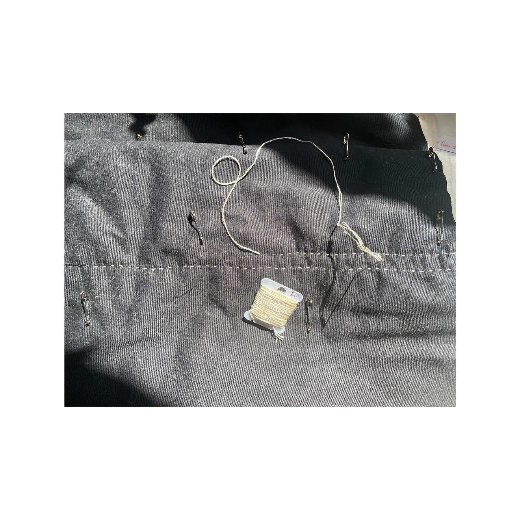
used DMC cotton stranded embroidery floss in ecru, separated into 3 strands, with a Tulip big eye straight thin size Sashiko needle. pulled strands over beeswax before quilting to help prevent fraying and breakage.

quilted in free-hand lines widthwise, starting from the center. i can see how my technique was affected over time as my fingertips became more tender.

kept the muslin lining and cotton batting long at the short edges. trimmed the batting to remove bulk and folded the muslin over to create a binding, blind stitching to the twill to finish. the light table fits snuggly in the cover, so i kept the closure simple using brass sew-on snaps to secure when stowed away.

trimmed excess muslin and batting to meet the long edge of the twill and finished raw sandwich edges with blanket stitch using 3 strands of DMC ecru embroidery floss – no beeswax this time. learned how to cleanly transition threads midway through blanket stitch using this tutorial from Upcycle DesignLab.

finished, “front” and “back”
the quilting turned out alright. started with tight tolerances and knotted off by the skin of my teeth. hadn’t expected as much shirring from the quilting process – my dimensions didn’t account for it. and while blanket stitch was considered as an alternative to more traditional finishing methods – bias tape/quilt binding – it turned out to be just the stitch for a narrow seam allowance.
i’m really happy with this.
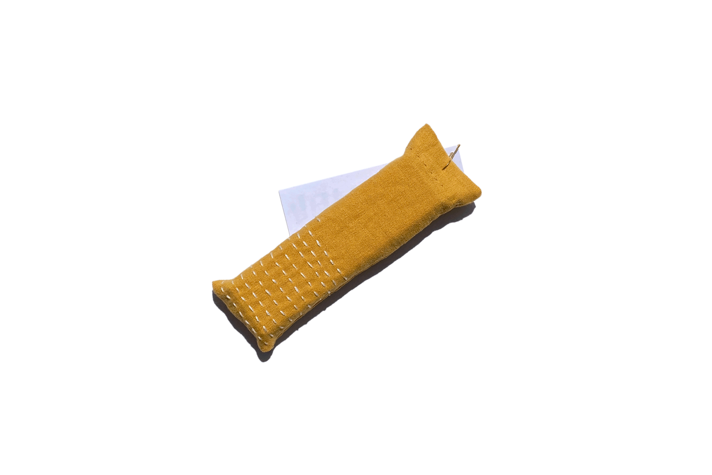
bonus: little sachet i made yesterday to hold a gift for a friend whose birthday is today (happy birthday!). pleased with this spur of the moment project.
warning signs

not the biggest art board mess i’ve made. yes, that is a little head illustration in the middle.
getting into good things. making good messes. although never intended, i often end up with an illustrator art board ‘splosion. i can make sense of it, which is what ultimately matters. the days of naming files “pinup boardsfinal-final-FINAL.ai” are in the rearview, mostly. i have created “file name_versionx.ai” a time or two. harm reduction. i’m hesitant to break up design families and iterations into different files. can be frustrating looking for an element that’s similar but saved in a different file. fortunately illustrator has a limited drawing area, otherwise…
up in the left hand corner i had been working on lettering to use as a journal cover based on the hairpin turn. with more work i think it could get there, but it needed a lot of time and wasn’t the originally intended subject. saving for another day.

original “winding road ahead”

winding, winding, winding

worked out the spiraling curves on dot-grid paper first.
the graphic brevity of warning signs can, at times, bely the severity of what needs to be brought to a driver’s attention. like, did a snake pave this road? why so windy? i imagined driving down a stretch and seeing a ludicrously exaggerated road sign for “winding road ahead.” a relentless warning.
“oh geez, well it’s gonna go on winding for a good ways there. be careful!”
i don’t know, that’s just what came to mind.
three main squeeze warning signs show up here: winding road, hairpin turn, and added lane. these schemes were simple and, importantly, repeatable. wanted something that could be made into an extended path or line pattern.
the original winding road graphic is more of a sine curve, and i was having a bit of a hard time re-creating it. i went off-book from the MUTCD and used half-circles instead. it’s not an exact replica. it was never meant to be.

tested out some of the lettering ideas too.
“hairpin turn ahead” was the first one i worked on in the series. it reminded me of a professor’s diagram on recursive design process. the gist of the pedagogical ideology being discussed was that working recursively encouraged processing ideas forwards, and backwards, yielding a more dynamic result than a linear process. each time the loop makes a turn to come back around it has to pass over a previous section of itself.
this graphic resonates with my own goals for process. hashtag goals.
the bit of yellow sign that peeks through when the loops cross-over is an overlaid path. i think that could be created more elegantly, but it worked!

original “hairpin turn ahead”

recursive loops

construction paper version. wrote a little about it a few days ago.
the “added lane ahead” sign reminded me of how easily thoughts can come and go. although i’m finding mine rarely go. my noggin can bottleneck.
i like that this sign is diamond shape, like the others, but the design is also on the diagonal. made for a fun opportunity to exaggerate the sign diagonally. imagine a sign like this jutting over a road, ha! aside from the obvious obstacle it would create, it would be a funny sight.
tried a version of this were the sign was vertically plumb. it just didn’t hit the same. there’s something about the angle to the graphic that gives the impression of the lanes coming from and going off the sign, “lanes are longer than they may appear.”
also recognizing that i’ve have been altogether too protective of this series of drawings. feel like i was saving them for some sort of grand reveal. to who? anyway, i could tell that i was starting to get all “my precious” gollum-y with it. cut that out!
i think i see potential for this exploration to generate other ideas and i’m feeling guarded about marking it down and moving on. no, moving forward. there will be a time when i’m not working with these signs, but that doesn’t mean i’m done with them. just need to switch gears and tend to the other simmering pots.

vertical version. was also trying out some graphics that would “make sense.” dropped that pretty quickly.

original “added lane ahead”

added lanes on lanes on lanes
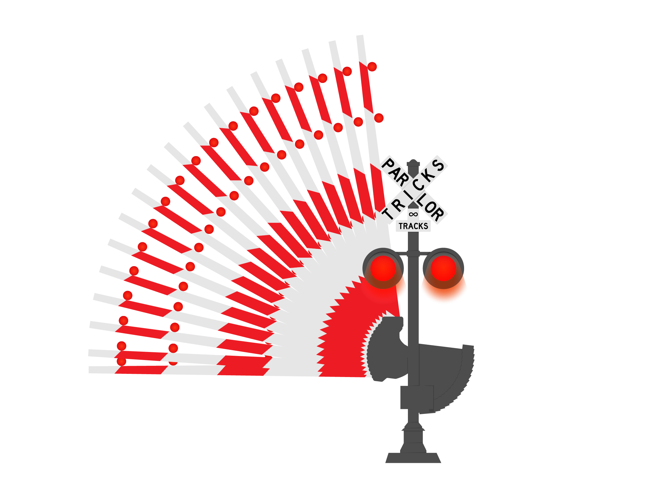
almost, almost, left out the railroad crossing sign from the journal cover. this was from a little while ago, which is still not governed by the same rules of time as “the before times.” so, to be more accurate, this is from early january this year. having already gotten to work on the warning signs, i was looking to create more road sign/warning sign type GIFs. railroad crossing was another straightforward design that incorporated motion.


couple of image references i used. the diagram on the left is from the previously mentioned MUTCD, continues to be a great resource. the image to the right is a cool articulated arm that i thought i would incorporate but realized partway into creating the base illustration that i would be punching way above my weight class. for now, at least.

sketch study of sign, working out whether to include “tricks” in the criss-cross or beneath it.

all the GIF frames collapsed into one. turkey tail? … anyone?
there were 20 frames in all. the arm at the top and bottom positions were 2 frames, one for each flashing light. the frames between could have been more frequent for a smoother animation. i also considered how this would look if i hand drew out the arm raising and lowering. i think there would be an opportunity to add smoothness (or, smoothnicity, as CrafsMan says). oh! or i could add motion blur between the frames in photoshop. that would double the ‘tweener frames though since i would need a motion blur for each direction… another to save for later.


color studies
first things first, yesterday kicked off a string of palindromic days this month: 1-20-21, 1-21-21… always enjoy a palindrome!
little bit of vamping for an intro that may be unnecessary. the title is a giveaway, right? simply put, continuing work on warning sign designs while studying color. here’s where i’ve been with that over the last couple of days:

at the start: stencils, color wheel, and construction paper

simple triad combo

triad: yellow, blue, & red
hi-yo! what better place to start than the classic primary triad of yellow/blue/red? seriously, it's the most straightforward so i really did want to start here. color seems really simple, which is usually the first indication of how complex something is.
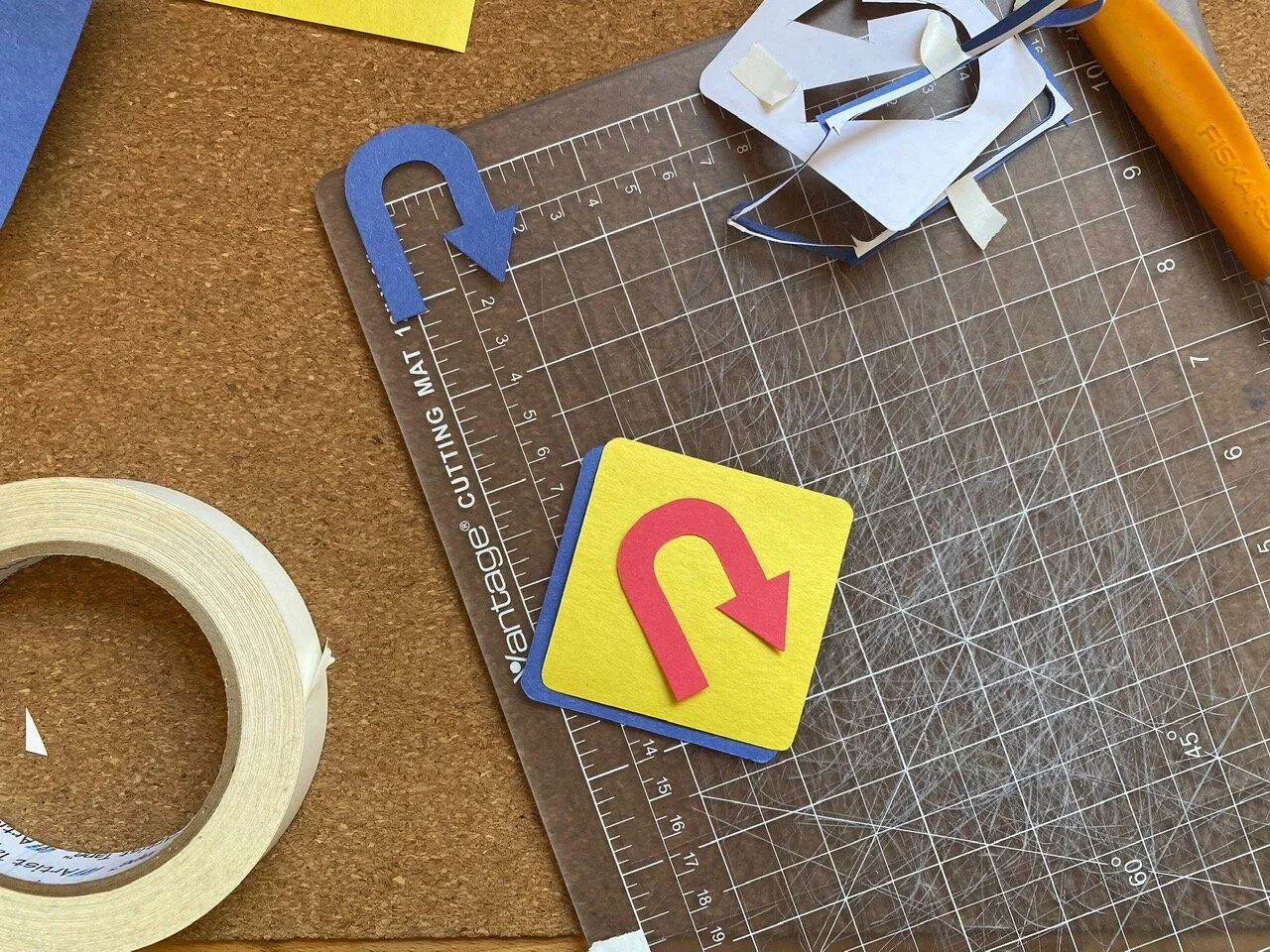
i used the “hairpin turn ahead” graphic, i like it. looks like a “u-turn”, but it’s not. i think that’s because the momentum is up and to the right giving an impression of moving forward. like writing and reading. at least in a Latin/Greek influenced written language sort of way…
printed out some stencils that i made from my illustrator doc with other signs and stuff that i’ll get to later… anyway! printed some stencils and got to cutting.
kept the primary (yikes, punny) foreground color yellow, cause i like it; and because it’s evocative of the original warning sign design. then, cut the additional elements from the remaining colors to test which worked best as background/arrow/ring. having more cut-out pieces than needed gave room for experimentation with background, arrow, and border color. glad to have stuck around for a bit of swapping rather than just charging ahead. it allowed me to consider alignments and relationships i may not have otherwise.

i like how the blue arrow over yellow foreground looks like a cut-out in the foreground through to the blue background.

mock-up with red background and blue foreground arrow. i preferred the visual impact of the blue background and red foreground arrow.

now, cutting the little ring that borders the edge has bested me time after time. thought i’d gotten the technique down to where only one stencil could be used to make all cuts. not the case. what ended up working was to use one stencil for the foreground and background pieces and a second for the ring and arrow cut-outs. the stencil intended for the ring cut-out needs to have a bit more paper excess around the edges to allow the straightedge to keep the paper taut while cutting the thin strip. otherwise, if the stencil is cut too close to the design lines, the pressure of the blade on the paper pushes it down ending up with an uneven cut. these aren’t intended to be perfect, but i know myself better than to say i’d walk away happy from a roughly cut edge… i think i’ve gotten it down now.
i like all of the color combinations of this triad. the primaries are sort of fool-proof. they look good in any arrangement and working with them felt approachable and flexible.
using constriction paper in primary colors felt like bing in elementary school again - only now i understand a little more why they go together so well.


the ring of color matched the arrow here. when used in a split complementary or triad scheme, these elements appear as one “sign” kind of like they were offset screen printed over top. i dig.
the second study was violet/red-violet split complementary. using what colors i had from 12 included in the pack. this combination is reading between the lines a bit. the purple is taking the place of a more nuanced “red-violet” that may not even be available in construction paper of this quality… no matter, made do.
i like this one too. it’s not as bare bones basic as the primary combo, but it still feels familiar to me.

still using two separate pieces for the arrow cut-out. it was with this and the first r/b/y that i thought to cut away the arrow from the overlapping diamond to reveal the color behind.

“red-violet” split complementary: green, violet (should be “red-violet”), & yellow
so, a couple few things i noticed while working on the first studies yesterday:
when the background color and bottom arrow are the same, it appears as if the arrow is cut from the foreground. i hadn’t achieved it that way in the first two studies, i used two additive arrows
studies that followed had foregrounds with arrow shape cut from it
in the primary triad, the red ring is shifted left while the red overlapping arrow is shifted right. (that sentence reads funny. just scroll back up to see what it’s about.) this looks strange if the eye is meant to see the red ring and red arrow as paired together. however… the miss-match isn’t a deal breaker for me
i like the negative space around the overlapping arrows of the primary triad study. it feels like the right amount of breathing room in the main background/foreground offset and around the overlapped arrows
and probably some other things i forgot to jot down for later…

triad: green, orange, & violet

i do like this one as-is. maybe save for later.
worked on another triad of green, orange, and violet. there are two greens in my paper pack and i chose “yellow-green” for this, which should be accompanied by a “red-orange” and “blue-violet” according to my new, handy-dandy color wheel. in addition to the violet, i cut out a blue ring and arrow to test out as a stand in for “blue-violet”. with the orange it felt too New York Knickerbockers for my taste… no shade! went with violet in the end.
the violet gives this combo 1990’s Nickelodeon vibes. super into it. the simple study with green cut-out foreground and orange background is a fun one too.

first tetrad study testing out violet arrow with orange ring…

… or orange arrow with violet ring

tetrad: blue, yellow, orange, & violet


tetrad: pink, violet, yellow, & yellow-green
the last one for today was a tetrad of lighter colors. this, along with the other studies, looked instinctively harmonious once everything was pieced together, but i had my doubts… i wouldn’t have picked these colors on my own without the aid of a color wheel. realizations like this during the process of making each of these studies encourages me to continue exploring. i feel less intimidated by color after the last couple of days, and that feels empowering.
there are a couple of books that Sam has, and i’m borrowing, to help along the way. one is Josef Albers' ‘Interactions of Color’ and the other is Garth Lewis’ ‘2000 Colour Combinations’. i believe the Albers book has exercises in it which i’m excited to get into. i’m also cooking up project ideas that incorporate color studies experimenting in different mediums and techniques. hello appliqué!
this is only the beginning!
i had started to write a bit about yesterday’s presidential inauguration, but didn’t see much use. it is what it is. pomp isn’t really on the itinerary for me. i am glad i caught it in time to see Kamala Harris being sworn in as vice president. and to hear, and see, Ms. Amanda Gorman perform her poem ‘The Hill We Climb.’
continuing to observe and stay engaged. i am much more cautiously optimistic about things now than in the last four years. and, for lack of cheerfully enthusiastic words to raise a glass to, i’ll borrow a few from a fave: “to better times.”

speed hump
soooo… i’ve been working on some road signs - yes, sticking with that theme currently — and have been putting off documenting the process because… i don’t have a reason. not a good one at least. i think i was adding things to the overall project, and made myself believe that i shouldn’t post anything about it until it was buttoned up and polished.
hold on a sec…
lemme make sure this thing is plugged in…
*ahem*…
process is what you came here for!
ok? future me?! hope you remember that! or remember to come back here and refresh yourself. refresh yourself!
without further ado, or pomp, or verbose word vomit to vamp around my discomfort documenting something that isn’t finished (i’m working on it…), here are a few pieces that i’ve been working on over the last few weeks:

from left there’s the “winding road”, “hairpin curve”, and “added lane” ahead signs.
i’ve been using the Manual on Uniform Traffic Control Devices to reference design standards and sign usage. i hadn’t seen the design standards before getting into the making of the three signs above in illustrator, but am now incorporating the standards into future explorations. i’m not about to mass produce road signs, so i’m adhering loosely. nevertheless, the standards provide a helpful touchstone for composition and color.
started out looking at the “warning signs” which are classically yellow with black text or graphics. big fan of the color yellow, why resist it?

a good mess

the first iteration: solid yellow base with black cut-out glued over top

and the second: black loops cut from yellow.
i prematurely decided while making the recursive hairpin loops that i didn’t like the way the second iteration was going. so i got sloppy when i was gluing and ripped the yellow paper in a few places. looking at it now, i don’t dislike it as much as i had convinced myself in the making of, but i still like the first iteration better. i like the detail of the narrow strip around the border. i also cut it and remember how delicate i had to be to not rip the thin ring of construction paper.
i’ve been using run-of-the-mill construction paper. keeping that barrier to entry low, things aren’t as precious as they may be if i was using “nice” paper. i really like construction paper, actually. the cheapy, inexpensive stuff that litters elementary school classrooms. it’s no fuss and after being handled it starts to take on characteristics similar to fabric. i like that it has texture and character. i like it.
this exploration has also encouraged me to look at color using these simplified road sign graphics. that’s why i wanted to get a color wheel the other day. color is daunting, so i’m starting small.

using colors as close as i can get them from my pack of construction paper to explore color theory.
like i said at the top, i was putting this off after convincing myself i needed to have all of the pieces of this project completed, or nearly so, in order to document it. then, late last night, i opened an email from The CrafsMan and saw that he too was working on warning signs of his own. i felt excited seeing a creator i admire exploring something similar to what i had been. and with precision timing my anxiety walked through the door to let me know that i was un-original and anything i shared after-the-fact would be seen as a rip-off.
my head can be a mean place…
took a bit to shake those feelings away, but i have, and will continue to. this is just a pit stop along the way. a snapshot on the road trip. a whole host of other metaphors and similes and analogies that i don’t know or have the energy to corral.
alrighty, off for a morning walk to coffee and breakfast. back to the drawing board later.
fun after-the-fact: i used the phrase“without further adieu” when i first wrote this. thought it read strangely using the french word for goodbye. turns out i correctly identified my incorectness. the saying is actually “without further ado.” not this time, eggcorn!

not a planner
seriously, i am not a planner. not in the buzzy, corporate sense anyway. i love paper and pens and paper related things. and yet i’ve have managed to avoid paper that in planner form since since high school, or thereabouts, when everyone was issued an agenda for keeping academic engagements and homework organized. while i haven’t established a relationship with a physical planner as an adult, i have meandered through online planners and task-management apps. nothing’s really stuck. the closest i’ve come to it is drawing months onto post-it notes and marking days with color coded dots to signify whether i had an exercise class or evening meet-up. then slashing across the days as they passed and stacking up the spent months a little post-it pile.
around this time last year i prototyped a physical planner page, but only tried it out for one week. afterwards, i pasted it into my sketchbook like a piece of evidence and didn’t try it again. there’s a documentation method that could use some work… and i should probably prototype more than one week (uh, duh). i pulled it back out today and re-tooled it a little, just in case this year is the one that includes a planner.

style a: the iteration i tried last year, giving preference to friday which was a busier personal day of the week

style b: maybe this could work for a spread across pages or a small, single-sided planner?

style c: “the weekender”

fooling around with composition. i think this would be neat as a digital, interactive planner sheet. (and maybe one of these days i’ll finally learn After Effects for vector animations)
i computer-ized the first iteration from last year. this was from a time when i mainly used my work calendar for weekday things with personal appointments in the margins of weekdays and mostly on weekends. i still used my work calendar to log personal appointments as a courtesy for scheduling purposes in the office but not really for reminders or notifications. i wanted a calendar that had room for weekday reminders and notes, but gave preference to the weekends since that’s where i had the most personal time.
nowadays, in quarintime, my days bleed together without clear definition between work time and personal time. and seeing as it’s a new year, i’m willing to give this planner thing another shot and to see whether it can be flexible enough to handle the time-soup i’m in.
playing around with the composition and proportion of weekdays on the sheet, i thought it could be cool to explore as an interactive digital planner. that way the space for each day could respond to the schedule, sliding around and allowing some days to bloat and others to shrink. oh! and the boundaries of the digital “sheet” could be locked so that a really busy week would be stuffed and bursting! disgusting, but so real. lacking coding knowledge beyond very basic html, this would need to be a collaboration with someone literate in the computer languages and such.
keeping this open ended - i’m interested to see how this works out.

left: scanned a few hours after being taken. right: scanned this afternoon, about 24 hours later.
a followup to yesterday: there was a difference in the polaroid over time (i think). it may just be psychological, or most the difference is a result of scanning technique.
scanning Polaroids directly on flatbed scanner glass runs the risk of producing Newtonian rings which are a bit like a moiré pattern and a total pain in the butt to edit from images, so i usually just leave them in… i’ve found that leaving the scanner lid up helps a little since there isn’t pressure mushing the photo onto the glass, and that’s what i did with the first image scanned yesterday.
i tried something a little different today by keeping the scanner lid up and placing a blank sheet of bristol over the polaroid as a background. i think the improved results may be a result of the bristol rather than the development time, but i’ll have to try this again to see.

Newtonian rings, blast!
while composing this news was coming in that the Capitol building in Washington D.C. had been stormed by terrorist t**** supporters. i’m not immune to what’s happening, not by a long shot; but i am trying my best to focus on the things that are within my immediate circle of control. no notifications, no doomscrolling, and limited interactions with talking heads. it’s also important to remember that words mean things, no matter how hard politicians try to manipulate language to suit their agenda. here are a few that best describe t****, his actions, and the political climate he is inciting:
coup d’état (n): a sudden decisive exercise of force in politics; esp: the violent overthrow or alteration of an existing government by a small group
sedition (n): incitement of resistance to or insurrection against lawful authority
insurrection (n): an act or instance of revolting against civil authority or an established government
terrorism (n): the systematic use of terror especially as a means of coercion
treason (n): the offense of attempting by overt acts to overthrow the government or the state to which the offender owes allegiance or to kill or personally injure the sovereign or the sovereign’s family
thank you Merriam-Webster’s for keeping it real.

progress in work


used crayola markers for this. nice to relieve fear of using expensive or unfamiliar tools while keeping room for experimentation.
i arrived at last night’s desk appointment with every intention to continue working on the inaugural self-addressed online entry in what is my experimentation in documenting process. imagining there must be a simpler statement than that, but i need to continue working to get more familiar with what i need, and want, this space to be. this is for me and i will make it what i need and want it to be. i will make notes as it evolves, takes and changes shape. no rush to define or draw conclusions, this process is the work.
anyway… last night was also when this 10-year-old ride or die desktop announced its contribution to procrastination. it had, in fact, very little remaining storage space and could no longer execute the memory heavy tasks at hand. this is the point i’ve reached with most of my tech: balancing on the knife’s edge of obsolescence.
so, in an ongoing effort to keep the motor running, i faced months-old procrastination on another front and began revising the weather with clouds and sync settings. this unplanned computer snow day provided a getaway to escape the near crippling anxiety brought on by sitting down in front of the computer to do this right now.
but i stuck around and watched Normal People while i waited.
the series creeped completely under my radar earlier this year, and i had been reminded of it recently. four episodes into settling comfortable into my virtual waiting room i realized i’d been hooked. the troller was kind enough to bring me in 12 episodes later and i was able to come back to my desk this morning.
i rarely start a series with the intention of binging. sometimes i’ll watch a few episodes back-to-back, but not so much season-to-season. shorter half hour shows are a little harder to portion, especially when they’re good. this show is good. to prevent disrupting sam, who was working in the other room; i wore headphones. that made a huge difference i think. the sound design was top notch. and, because i watched it all in one go, i picked up on a few repeated elements: connell’s chain, hitched breathing, fringe, and marianne’s uncanny resemblance to anne hathaway and charlotte gainsbourg.


i like how this combo came out with the vector graphic sign board. used photoshop to put the GIFs together with different layers. hot tip: remember that files intended to be used for GIFs can be either 8-bit or 16-bit color, but not 32-bit in order to save/export as GIF.
among other things i also took notice of how often the term “struggle” was used. connell said it several times in the context of self critique, which is likely when i became aware of it. in part due to the frequency of use and also recognizing an internalization of that word. turning inward and thinking about what i struggle with, fear stands out most.
fear of failure stays right up there among the usual suspects. but this moment of fear was overwritten by excitement to make something for myself pure and simple. i wanted to start out making “under construction” type graphics between going “live” and actually writing something. maybe that’s because announcing something is “under construction” or a “work in progress” is a comfortable buffer between thinking and producing. however, it did provide an opportunity to test out some stuff with GIFs while tipping my hat to the OG internet days when i’d made geocities and anglefire websites that started out as a host for some “under construction” GIF. I kinda wanted to re-live the excitement of announcing, “just about, but not yet,” even if it was only to myself.

little bug model made from toothpicks, some card stock, and scotch tape. super helpful for visualizing tricky shadows.
the first GIF i tested out, the blinking sandwich board one, was made almost entirely in the computer except for figuring out the shadows. i had a hard time visualizing the shadows in photoshop alone, and i don’t have access to the 3D modeling software i used when i worked in architecture which would have made quicker work of it.
i started out in photoshop creating a silhouette for the sign the way i’d learned in architecture school when making shadows for entourage/scalies/people in renderings to give them dimension. but i was struggling with the sandwich board type legs and couldn’t visualize it when using a silhouette made from an outline of the image itself. sam passed by my desk and i asked him for help, not something i’m so used to doing. i don’t know why, pride maybe? pride probably… we talked about how he would approach it and tried this and that: distortion, perspective, warp, all that. we went around some quick sketches, but i didn’t really see it yet. i remembered we had toothpicks in our kitchen junk drawer and made a bug model which helped a lot.
i am pleased with the GIFs and the process making them. i am really, really happy i asked for help; and that i was patient with myself and sam when i had a hard time seeing things the way he did. this process helped me remember resources are in all shapes and that i’ll need to pick up more short-cuts in illustrator and photoshop in order to get faster at some of the digital stuff.
even with a bit of struggle, things turned out.