


unbiased
changed my mind on the kitchen curtains – feeling pretty happy about it
however…
made a mistake early on in the process of making bias tape for finishing them
here’s how it went:

first things first: fabric grain
the lengthwise grain (warp) runs the length of the fabric and crosswise grain (weft) runs the short direction with selvedges along both lengths
the bias runs 45-degrees to the warp and weft grains and provides stretch

here’s where i messed up
folded the fabric in half along the cross grain (weft) to cut strips instead of on the bias grain

pappardelle nest of 1-inch muslin strips

next: sewed strips together to make a single, continuous ribbon of fabric
since the strips weren’t cut on the bias they lack stretchiness
and, what they lacked in stretchiness they more than made up for in frayed threads…
after sewing i trimmed, hand creased, and ironed the nearly 20-foot length of fabric into 1/4-inch double fold unbiased tape

for good measure, here’s one possible approach to preparing fabric for actual-factual bias tape
lived and learned…
along with becoming re-acquainted with autumnal sunlight
afternoon light can be real pretty, but wasn’t quite what i was looking for when photographing the spool of unbiased tape yesterday
got up early this morning for the sunrise light

s’pretty nice

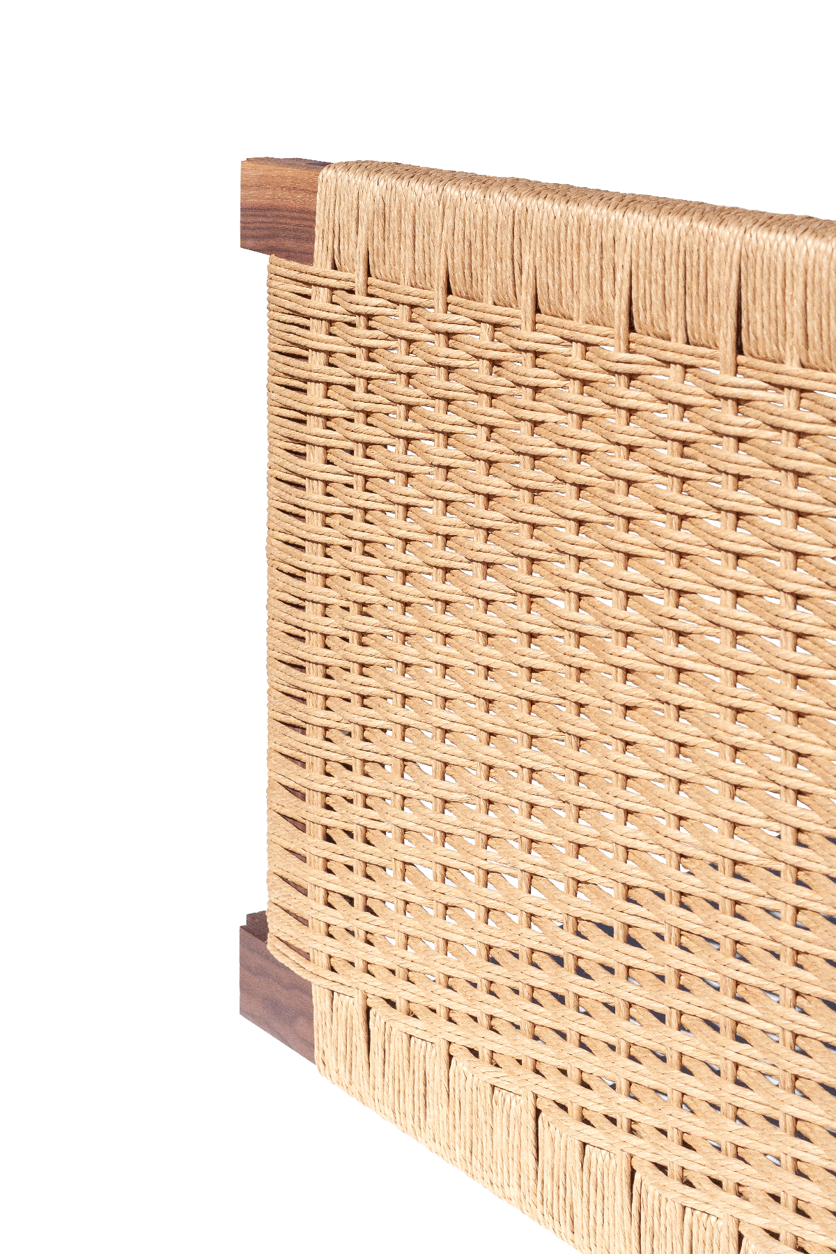
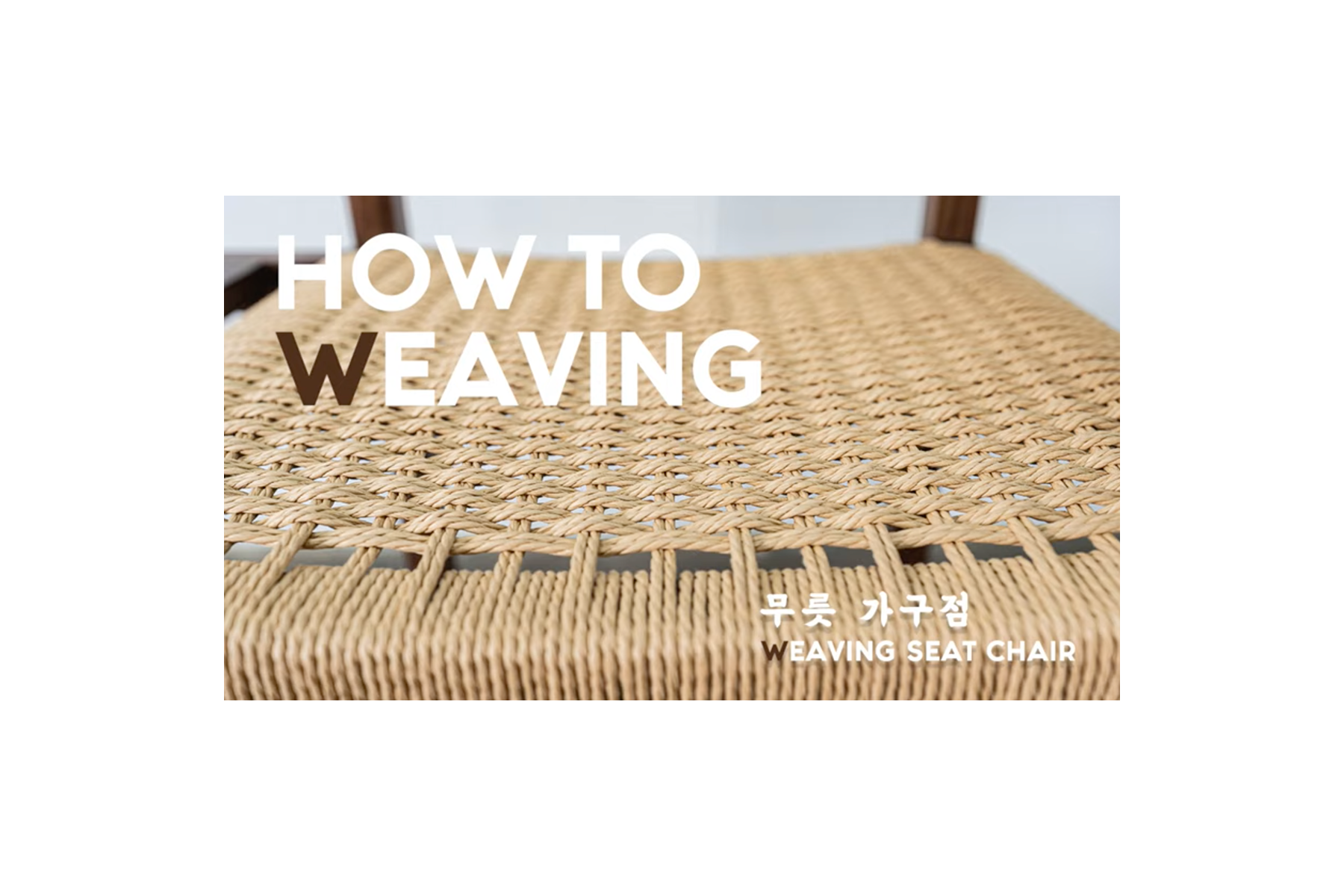
et voilà!


wrapped
that’s a wrap on the Danish cord project – wove the second frame Monday evening and handing them off tomorrow
i’m pretty happy of myself with this one
taking process photos and notes has been an invaluable part of my process, and i’m all the more encouraged to keep experimenting and developing my practice


taking my time through each step was important, too
the pace and planning of the first round helped ensure a smoother trip through the second
and at this point, i’ve decided pulling the cord from the center of the spool was not the way to go… d’oh!

frame one

frame two

nice nice…

wefts

job box
serendipitous curbside find now holding cording supplies
wove the first Danish cord frame last Tuesday – feeling accomplished having that step under my belt now

several tacks secure the start and end of the weaving cord
used most nails twice, and a few just once

45 rows of weaving, in all

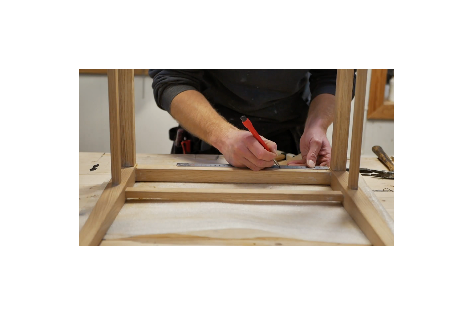
onto the second frame – got the tacks in last Thursday, and just got through warping and wrapping the rails Saturday
hot tips and observations from the first go were helpful for the second round of drilling pilot holes, hammering tacks, warping, and wrapping cord
picked up a few more since
HOT TIPS:
pack rows of weaving as you go (like Jim said), otherwise you may run out of nails…
don’t pull weft cord too tightly – there should be a little slack in the cord while weaving
don’t work frustrated – take mental and physical breaks whenever necessary
that last bit is somewhat of a universal revelation: don’t work angry – that’s when mistakes happen

spotted this flower while looking through process photos
different from how i saw things through the viewfinder
reminder to keep my eyes peeled, for something new… !
learning scheduling and time management on this project
practicing setting reasonable goals and expectations, and making time for rest
remember:
practice makes progress
ok, bye bye… !

tacky
kept on cording this past Wednesday – got things pretty well set up for weaving.

the Danish “L” nails for warps and wefts – technically not tacks
these are round-about 7/8 inch long with a 1/6 inch shank and 3/8 inch flanged head for holding strands of Danish cord

cordless drill and 1/16 inch drill bit
using tape on the bit to help prevent drilling too far
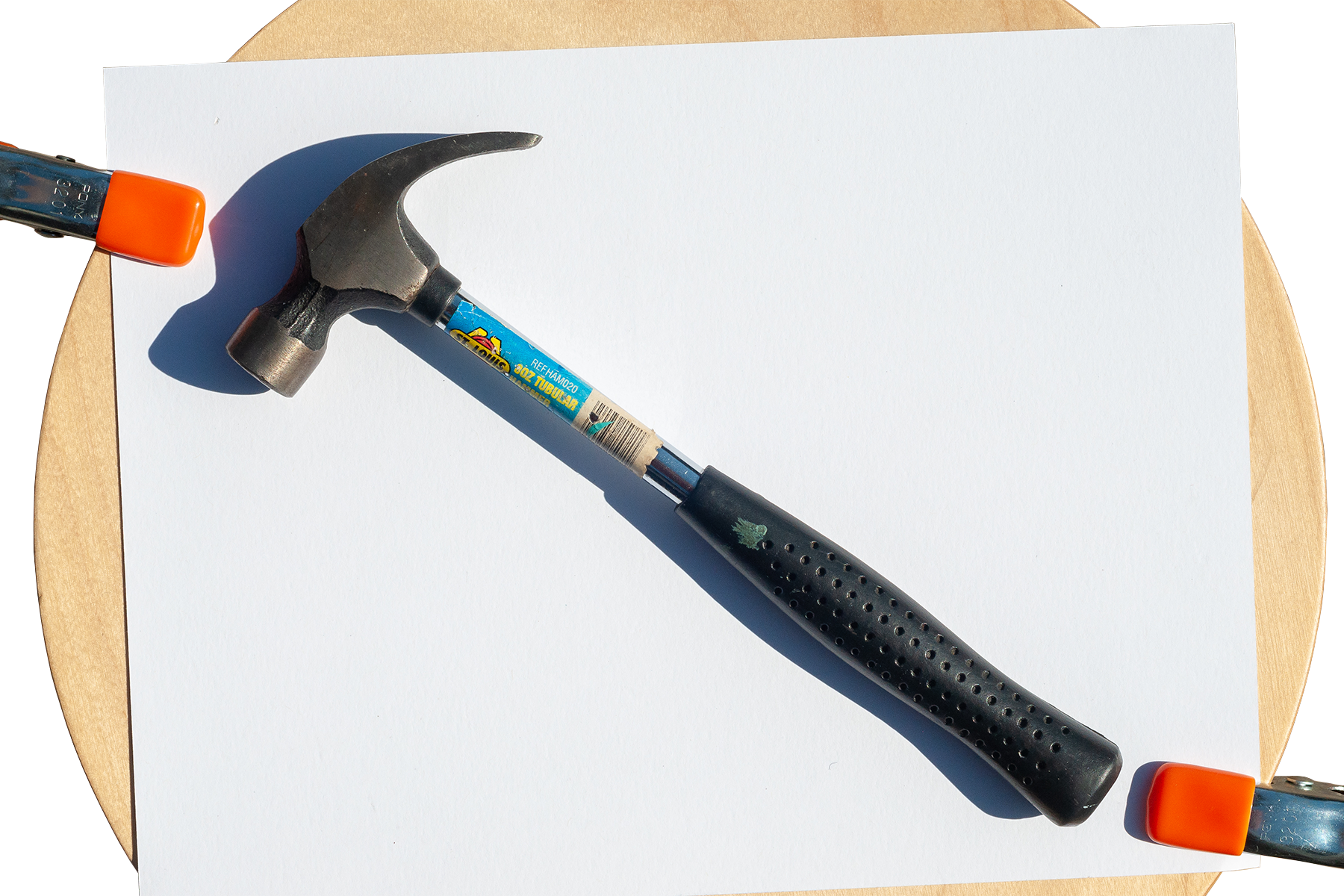
8oz claw hammer
good general purpose banger – got most of the nails in with this

7oz tack hammer
real handy for the corners

needle nose pliers
essential for holding corner nails in place to hammer without smashing fingers

went through 100 on a single frame – dang

used templates as guide for punching nail locations, drilled pilot holes, then hammered them home.
kept the weft nails staggered and aligned the warp nails down the center of the rail – less fussy, i think.
HOT TIPS:
drill ALL pilot holes before beginning nailing
set nails closest to the inner corner FIRST (in this case the corner weft nails)
set outer corner nails second (corner warp nails, here)

RIP to the first drill bit… oops.

baby steps
notes from a visit to The Caning Shop – several of which may no longer apply… !
weaving Danish cord on a project for a furniture designer and carpenter friend.
learned a good deal so far about weaving Danish cord, communication, time management, and developing a process.
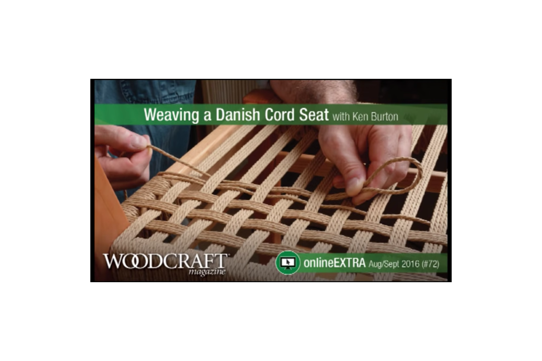
bookmarking a few reference videos to come back to as i get going on the weaving:


steadily working through this. weaving is in my wheelhouse, woodwork isn’t.
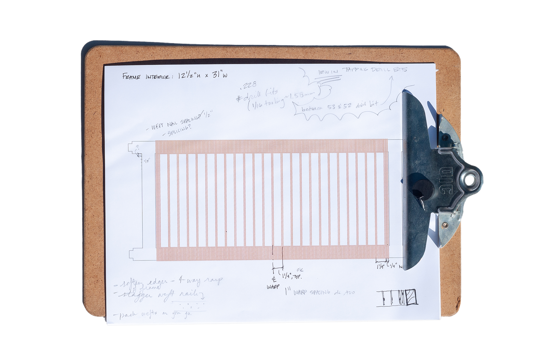
taking baby steps – starting with weaving diagrams and nailing templates.

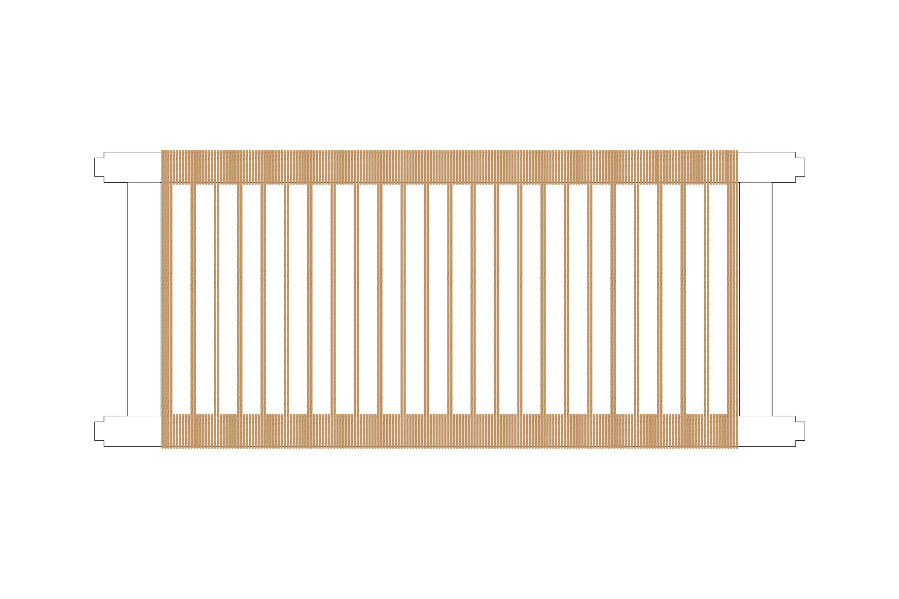
1 inch warp spacing with typical 1/2 inch weft spacing. most conventional approach resulting in ~ 4 wraps between each warp pair.
1-1/4 inch warp spacing
i like the proportions of this – a bit more frame wrapping between warps (~ 6) and less weaving, seems alright.

1-1/4 inch warp spacing along the frame stiles – kinda neat. may not be the pattern for this, tho.
need to locate and drill pilot holes for the “L” shaped Danish nails to get tacked into.
that’s a measure twice drill once type deal. so imma measure a few times more…

made nail templates indicating 1/2” weft (top/cyan) and 1-1/4” warp (bottom/magenta) spacing. first and last warps are a double pair – hence the 1/2” spaced pair at either end.
staggering the nails to help prevent the wood from splitting – a tip first picked up from The Caning Shop.

nail template taped to the inside face of the rails (warp) and stiles (weft).
seeing the template on the frame i’m thinking the orientation of the weft nails should flip. or – could eliminate the farthest weft and warp nails at the inside corners and tack down to start and finish.
goal for this week is to drill pilots, tack “L” nails, and weave at least one frame.
remember: take time to brainstorm, ask for help*, mock things up, take care of your body, document, and enjoy… !
(*thank you, Sam, for your help and support along the way)
sidenote: reminded of Broken Social Scene’s OG version of “Lover’s Spit” via “… (Redux)” off ‘Bee Hives’ played by Rare Earth on KALX last week.
sparked a trip through ‘Spirit If…’ yesterday, from rooter to tooter – *chef’s kiss*
ok, bye bye… !


toronadoes

got no business with tornadoes, but when lightning strikes… !

seems i like adding an “o” to “tor-o-nado” and an “e” to “light-e-ning” – something i’ve come to realize in all this.
sure, why not?

french curves

‘Complete Stretching’ - Maxine Tobias & John Patrick Sullivan (1992/Knopf)
picked this up in the ballet days, trying to achieve better flexibility and turnout.
slightly different goals nowadays. glad to have held on to this.


came across ‘Bob and Brad’ today. super helpful, given the current circumstances.
“Skeleton Sam” with shoulder-saddled Gumby were eerily on the nose… !
visualizing auto encounters. just getting started, trying some things out. here’s where i’m at:

‘Courtesy Van’

Toyota Warhawk… ?
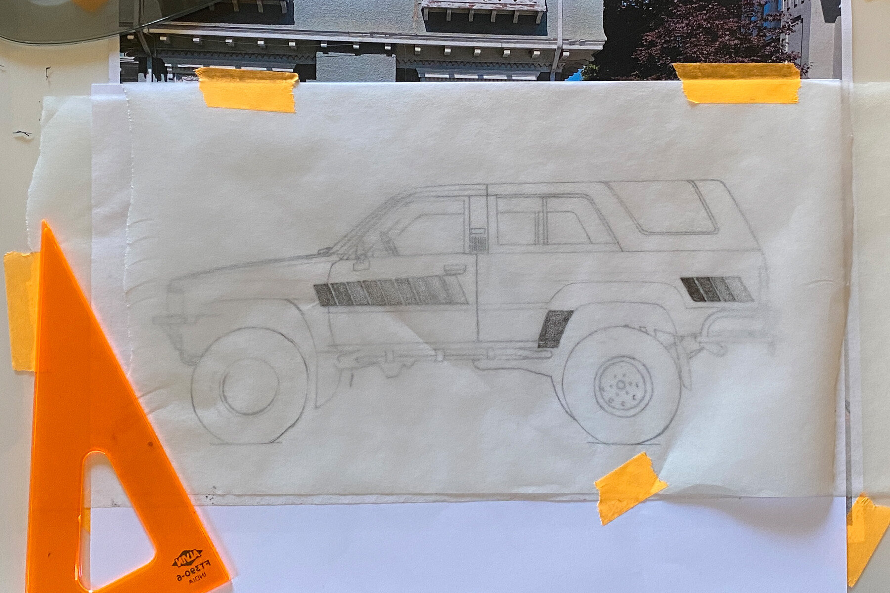
using french curves for the first time – in earnest. it’s interesting. gonna take some getting used to.

Pearl’s Shapes
“A Single Pale Rose” - ‘Steven Universe’; Season 5, Episode 18 (2018)

channel surfing

‘WandaVision’ - (2021/Marvel Studios) directed by Matt Shakman, created by Jac Schaeffer
started this a few weeks ago and got back into episodes this week.
ooowee!!! even Wanda has a “Wanda”… !

‘Maps of Home - ACTION EDIT’ - John John Florence (2021)
watched after ‘GQ Sports Breakdown’ videos featuring John John and Kolohe Andino.
watching more surfing vids – super badass… !
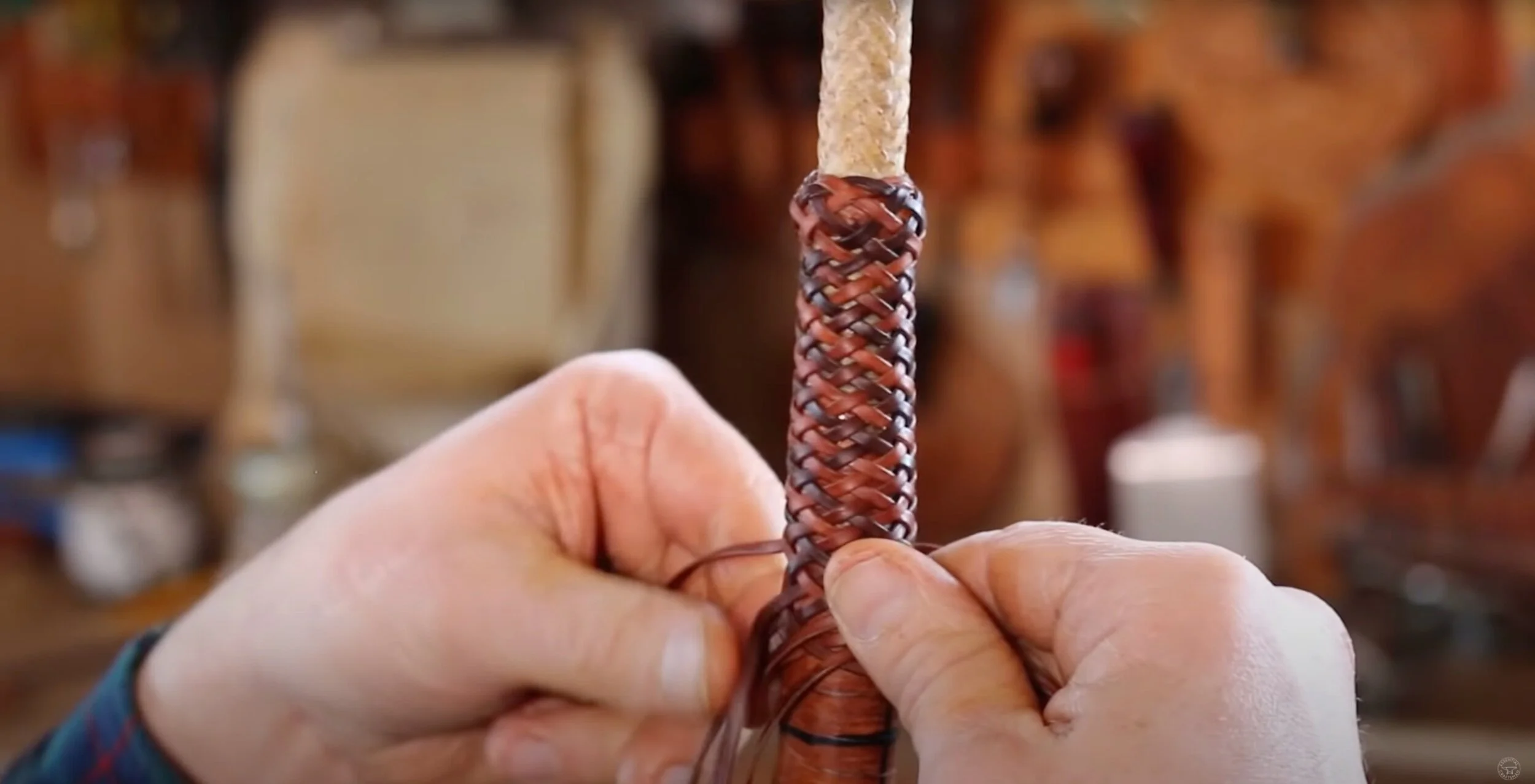
‘Rawhide Braiding’ - Essential Craftsman (2021)
Youtube suggestion, likely due to the increased volume of farrier videos… i watched it, of course – very cool.
Essential Craftsman has a lot of construction content, watched another video on using a tape measure – learned some neat things!

another GQ Breakdown video, this time with hunter Steven Rinella – super interesting!
gotta loop back around and watch Part 1.

“help yourself, fresh lemon”
spotted yesterday on the walk to dinner.

made a sign for some glass jars we offered curbside.
sketched out ideas and lettering. kept it simple.
bottom right sketch was the last – then tracing, and inking.

scanned the inked version before launch this afternoon. here it is with an after-the-fact digital adjustment: bigger jar.
worried no one would want our jars, but that box got scooped pretty quick. guess it had curb appeal… ha!
happy of myself and this process – yay!

status update

status update on "762" (aka kitchen door curtain panel): finished blanket stitch along the vertical edges.

used DMC size 8 pearl cotton in topaz with Tulip big eye straight thin size Sashiko needle for these Sashiko-inspired stitches.


sketching to document and ideate – no set orientation yet. originally imagined the vertical yellow stitches as an edge-to-edge field, but that may be relentless… got seven vertical lines of topaz stitches in so far. leaving that area as is, for now.
picked plum and antique blue pearl cotton from my stash to start stitching with next. they compliment the topaz stitches and silver-gray fabric pretty well. yeah, i like that. onward!

DMC size 8 pearl cotton in plum (718) and topaz (725), and smaller size 12 pearl cotton in medium antique blue (931)
listened to the back half of this for the first time this morning. woof… thought i oughta save it here.
swapped the order of two songs on DO NOT ENTER, too. listened to it during my shift today – feels better…
ok, bye bye!

762


58” wide tweed from Joann Fabrics – i like the silvery color and larger weave.

wanted the stitch detailing to fade away and picked a few colors i thought might do the trick: ecru, 762 “very light pale gray”, and white DMC stranded embroidery floss.

(from left using 3 strands of floss in white, ecru, and 726)
using blanket stitch at the vertical edges of the panel to prevent fraying and reduce bulk. 726 blended the best in different light conditions.

(top “right side”, “wrong side” below)
continued with 762 to test stitch detailing ideas. tried options that show only on one side, and a traditional blanket stitch that shows on both. i like the “both sides” approach best. keeping even tension is easier, and it’s nice to have the stitch detail face inside and out.

fabric is trimmed down and thread color selected. wish i could have kept the selvedge with its lovely tufts, but i’m holding on to some for test strips and maybe something fun later? who knows.

day one

‘Back to Black’ - Amy Winehouse (2006/Island Records) design by Alex Hutchinson, photography by Mischa Richter
trying to reflect on recent experiences and feeling rusty. it’s been a while and the words aren’t coming out right, but i need to process things in order to move forward. making peace with a sh-tshow of a week closing out May, and welcoming in something new. today was the first day at a new job – day one. in the lead up i’ve felt excited (and nervous!), which was nearly toppled by an unexpected cascade of emotion and conflict. it’s been a doozy… (note to future-self: more nuanced reflections have been recorded elsewhere)
project progress over the last month has come in starts and fits. put together a couple mixtapes earlier on that gave me some confidence, and then hit a wall. it was a bummer. felt like i’d been in the pocket, music-listening wise, and then i wasn’t. on top of previous feelings of being sidelined, i was f--king frustrated.
took a break and got back on the horse arranging songs that’d come over the alarm clock radio first thing in the morning. some played as the radio faded on at 7:30 am; others followed in the moments after while i debated whether to get up or stay in bed a little longer. only condition was the tracks be played via alarm activation. did’t take long for them to gel, but they weren’t quite right over several iterations. felt like i was hitting a wall again until deciding to just flip the whole thing and play the sequence in reverse. ta-da.
called this one ‘snoozy’ on behalf of the material and as a cheeky reminder that the “snooze” button on our alarm clock doesn’t actually work…!

sunrise inspired gradient iterations scattered about the Illustrator workspace. been using a heavy magenta boundary to indicate which iteration i like.
the stuff to the far right was fun – maybe it’ll come back later.
had ideas for the cover inspired by themes of morning and sunrise and started iterating in Illustrator. i like the way the sky is represented in Steven Universe – wanted to use those environments as reference, but quickly ditched the idea of illustrating clouds (or, rather, saved for a later date) and focused on a simple color gradient.
listened to the mix while working on the design and took a moment to investigate a sample used in Vince Staples’ ‘Alyssa Interlude’. learning it was Amy Winehouse catapulted me back to her album ‘Back to Black’, and what an experience that trip was given yesterday’s emotional environment and what lead to it. afterward, i knew i had to leave breadcrumbs back. couldn’t allow myself sleep on Amy’s work again.
fussed with gradients a little more when i felt the tension of frustration creeping in. after pivoting in a completely different direction in a desperate search for something (see lower right of Illustrator workspace), decided to apply the same approach i’d used when feeling frustrated with the sequencing: flip it around. bingo.

‘On Sunset’ - Paul Weller (2020/Polydor) design by Alex Hutchinson

blend modes and overlay experiments in Photoshop – lots more options than Illustrator.
efforts to memorialize my experience listening to Amy’s music began by doing the rounds on Discogs and the like for album liner notes and creative credits. found the designer and the photographer – bing, bang, boom. on my way through graphic designer Alex Hutchinson’s portfolio i saw the cover he designed for Paul Weller’s ‘On Sunset’ and thought, “you’ve gotta be f--king kidding me… come through tangential turbo boost!”
up to that point i’d been hung up on the cover design and where to take the graphics. seeing some of my ideas reflected in Hutchinson’s work was really helpful to get me back into the swing of things. brought the Illustrator gradient background into Photoshop and applied gaussian blur to soften the gradient banding. added a noise filter too, like ‘On Sunset’, to evoke fuzzy, groggy feelings sometimes associated with waking up in the morning.
after considering about a dozen font options from the endless offerings in Adobe, i narrowed it down to LoRes 9 Minus OT and LoRes 28 OT designed by Zuzana Licko at Emigre Fonts. although Illustrator is typically my preference for type design, i used Photoshop this time to take advantage of more versatile color blend modes and overlays applied to the overlapping text of the cover and track list.

‘snoozy’ mixtape cover – front & rear
not sure whether this would have come together without going down a rabbit hole – tangentiafying. and perhaps this wasn’t so far a leap, but i’m still glad i made the jump.

common assets, vol. 3

one Youtube video usually leads to another, and a revisit to the lexicography video led to this Vox video about the Cooper Black typeface by Oswald Cooper.

while working on the… title card, i’ll call it, for this entry i thought of these logos. have nostalgic sentimentality for both. the Payless logo identity has since gone in a different direction… and Love’s looks Cooper Black inspired – it’s not as round, but there are similarities (it’s in the “o”).

“Gimme Some More” - Busta Rhymes (1998/Elektra Records) directed by Hype Williams
(sample from Bernard Herrmann’s “Psycho” theme)
really dig Busta Rhymes’ music videos from this era. “Put Your Hands Where My Eyes Could See” is another favorite, also directed by Hype Williams.

“The Rain (Supa Dupa Fly)” - Missy Elliott (1997/The Goldmind) directed by Hype Williams
(sample from Anne Peebles’ “I Can’t Stand the Rain”)
Missy Elliott has some of the best music videos, ever. period.
“beep, beep. who got the keys to the Jeep? vrrrrroooooom!” ;-)

“B.O.B.” - Outkast (2000/LaFace-Arista) directed by Dave Meyers
such. a. good. time !!! 808s, off the wall colors, candy painted Cadillacs – what more could you want?

“You’re Makin’ Me High” - Toni Braxton (1996/La Face) directed by Billie Woodruff
love this music video (*ahem* Bryce Wilson *ahem*). ‘Secrets’ and ‘Space Jam’ were the first two CDs in the collection. was probably too young for Toni, but… whatever!

“Fantasy” - Mariah Carey (1995/Columbia)
the inspiration drawn from Mariah Carey and this music video specifically runs deep.

crossed paths with a De Tomaso Pantera last autumn. didn’t recognize it and assumed it was an Italian sports car – and it is, sort of. i’ve since learned more about it, in large part from watching Jay Leno’s Garage.
watched a few more episodes since and some favorites include the 1966 Oldsmobile 442 (love, love, LOVE the “442” enameled nameplate !!!), 1931 Duesenberg Model J LaGrande Coupe (that interior, and rumble seat !!!), 1972 Citroën SM (super neat engineering !!!), and the 1957 Imperial (super sweet, retro detailing !!!). been liking the “pandemic editions” – they feel more intimate. Leno’s knowledge and familiarity with his fleet is impressive, and i appreciate the narrative style of his explanations. wish the jokes would catch up…

meant to include this in vol. 2 and forgot. another Youtube gem – meditative bonsai art by a creator in the UK. this is from the beginning of the video – thought it looked pretty nice to start, and was stunned by the result. carefully meticulous and fascinating process.

one trick pony

‘Show Pony’ - Orville Peck (2020/Columbia)
came across this album review while looking for liner notes. stopped to read through – appreciate the perspective.
watched the music video for “No Glory in the West” last year, sometime toward the start of the pandemic lockdowns in the states. i liked it, a lot; and then didn’t listen to it again until earlier this year. this song shakes something up in me and is the reason why i picked up guitar again. far beyond wanting, i needed to play this song. so i learned it; and it’s the one song i know how to play front to back – my parlor trick.

‘Ride ‘Em Cowboy’ - Paul Davis (1974/Bang Records) art direction by Eddie Biscoe, embroidery by Michele, photography by Nick Rietz, packaging by James Flournoy Holmes & David “Worm” Holmes for Wonder Graphics
titular track “Ride ‘Em Cowboy” is a standout – “i started in New Mexico, must have been a thousand years ago…”
with country western on the mind it would serve me well to return to a record vaguely mentioned before – one that needed “proper” photos taken.
hadn’t heard of Paul Davis before coming across his album ‘Ride ‘Em Cowboy’. the packaging alone is a home run. embroidered western wear? yes please! the album jacket feels like a shirt with embossed denim and embroidery textures, and “unbuttons” onto a saloon scene with track listings in cowboy lasso type. pulling out the liner reveals another layer: the undershirt and hankie of the denim wearer. really into the visual narrative of this album, and it was only a buck – wins all around.


3/$25

carried the stash from 101 Records. into the colors, big time.
started out real wordy with this one. the long and short of it is this: didn’t want to sleep with my phone in the bedroom, but still needed an alarm clock. easy solution: get an alarm clock.
found a suitable candidate on Craigslist and drove into the city for the meet-up. it was a success; and i tacked on a visit to 101 Records on the condition that there was a reasonable place to park – convenient and often used errand loophole. got a spot right out front, of course, and spent some time digging before realizing i was in a different physical store than i’d been in a couple years back when Ed first introduced me and our dinner party after we moseyed over from a nearby restaurant. that shop was around the corner – it’s closed now.
enjoyed convo with the shopkeep – which is one place i struggled with wordiness before; cause there’s a story in it, i think. anecdotal hang-ups aside, this took me somewhere and i need to leave some crumbs. in favor of the new equipment i’d picked up, i got some CDs. “3/$25” is what the sign on the wall said, and here are the three i chose:

‘In Spite of Ourselves’ - John Prine (1999, Oh Boy) design and art direction by Dana Arnett & Jason Eplawy, photographs courtesy of Elliot Erwitt/Magnum Photos
the photograph is what got me. seeing it was a John Prine album, whose catalog i’d been nervously circling and hadn’t listened to, i knew this would be where i started. “Dear John (I Sent Your Saddle Home)” has been a favorite.

‘Shades of Blue’ - Madlib (2003/Blue Note) cover photo by B+, cover design by Jeff Jank
most familiar with Madlib from his Madvillain collaboration with the late great MF DOOM. experimentations with Blue Note recordings sounded intriguing. really digging the tracks “Slim’s Return” and “Stepping Into Tomorrow”.

‘That’s Where It’s At!’ - John Lee Hooker (1979/Stax Records) art direction by Honeya Thompson, design by Christpher Whorf, photography by Beverly Parker
until recently i hadn’t heard much of John Lee Hooker’s music. the album cover’s bright yellow shout and graphic layout immediately caught my attention. recognized John Lee Hooker and Stax – i’d be in good hands. “Slow and Easy”, that’s where it’s at.
‘That’s Where It’s At’ influenced the latest journal cover, too. been experimenting with and developing typography for another project and felt i was playing it safe – being too precious. figured a journal cover could be a good place to test things out. feel less inhibited designing for this space right now. working toward uninhibited.
looked at similar graphic text design and sign painting. iterated, iterated some more, and asked for feedback from Sam. important to recognize the collaborative parts of the process. asking for and receiving feedback has been another hang-up for me. it’s all a work in progress.
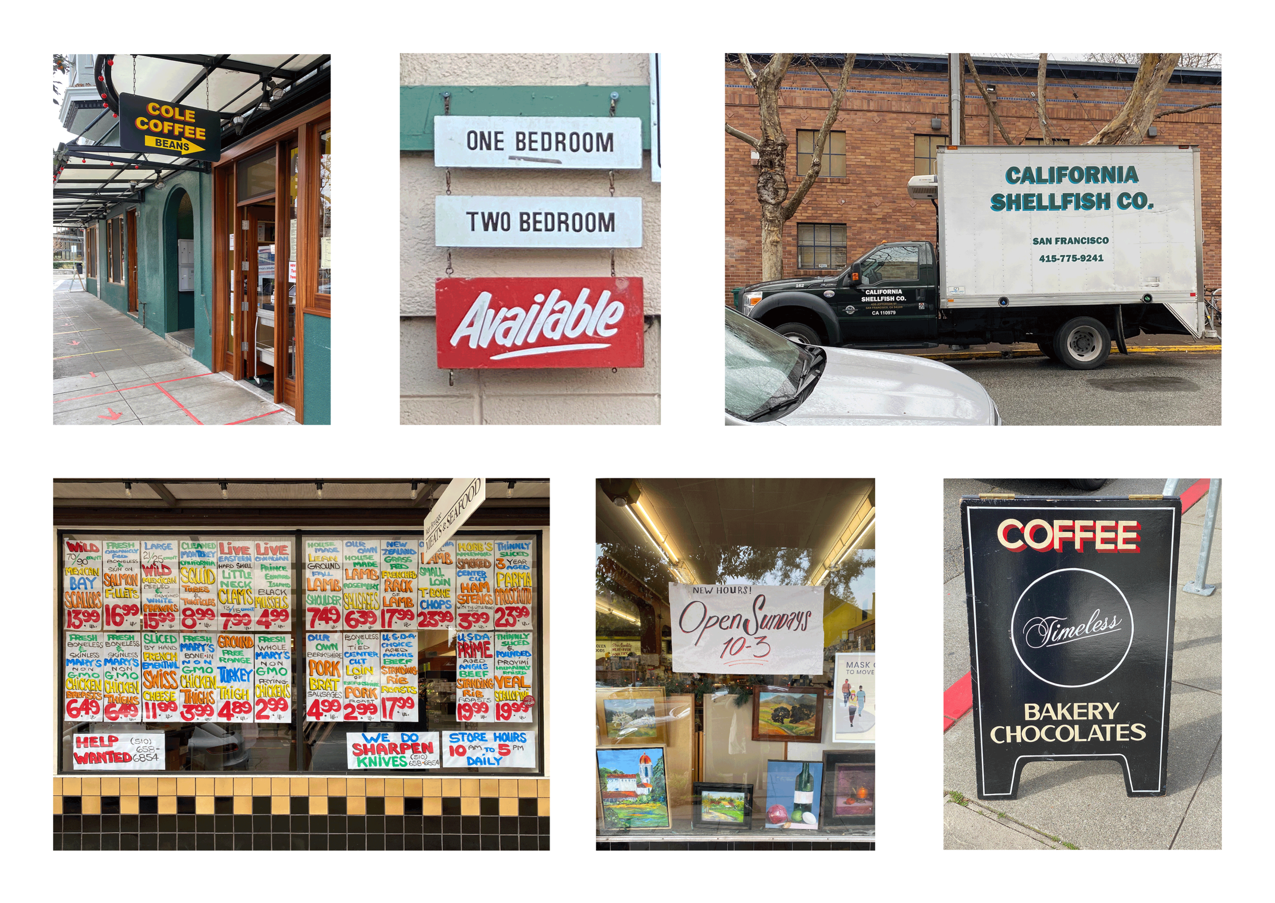
some frequently observed neighborhood inspirations. Cole Coffee and Timeless signs by sign painter Patrick M. Piccolo. outside Cole is where i’ve seen the California Shellfish Co. truck – nice colors, not sure whodunit.

iterating and experimentating.

happy with the color scheme. a little John Lee Hooker, a little Oakland A’s – nice nice.

freebie


prototyping. traced lavender salve tub sized discs of stabilizer backed linen remnants. a triple twist of light-gauge floral wire was sewn down the center of one disk on the stabilizer side in order to hold the future fortune cookie shape. the wire side is then sandwiched onto a second linen disk and attached using blanket stitch. and with a few swift hand moves, the disk turns into a fortune cookie. came across this tutorial when i needed help understanding the folding technique.

picked up heavier gauge wrapped floral wire and covered the ends with floral tape before sewing down to help prevent the wire from poking through the right side of the linen – works pretty nice… this was also my first attempt at using butterfly-clutch pin backs. piercing the pin through the interior to the backside hid the flat fastener, but it needed glue to keep it in place since it lacked any way to mechanically fasten. not fond of relying on glue in this situation.

tried using safety pins too, which had their perks. they were the least expensive option, i already had them, and they did a better job of pinning the width of the cookie than the butterfly-clutch, but they were cumbersome to attach. i’d been wearing a safety pin version on my jacket, and it was tricky to fasten in the right way. mine was too tight, causing the cookie to curl up into a shape more closely resembling tortellini. wasn’t mad at it, per se; but it wasn’t the intended effect…

after exploring a few options for pin backs, i landed on bar pins. they can be sewn in place at several points, provide stability across the pin width, and are much more user friendly.

imagined packaging as a narrative element, too. inspired by takeout fortune cookies and a well known “Thank You” bag motif.
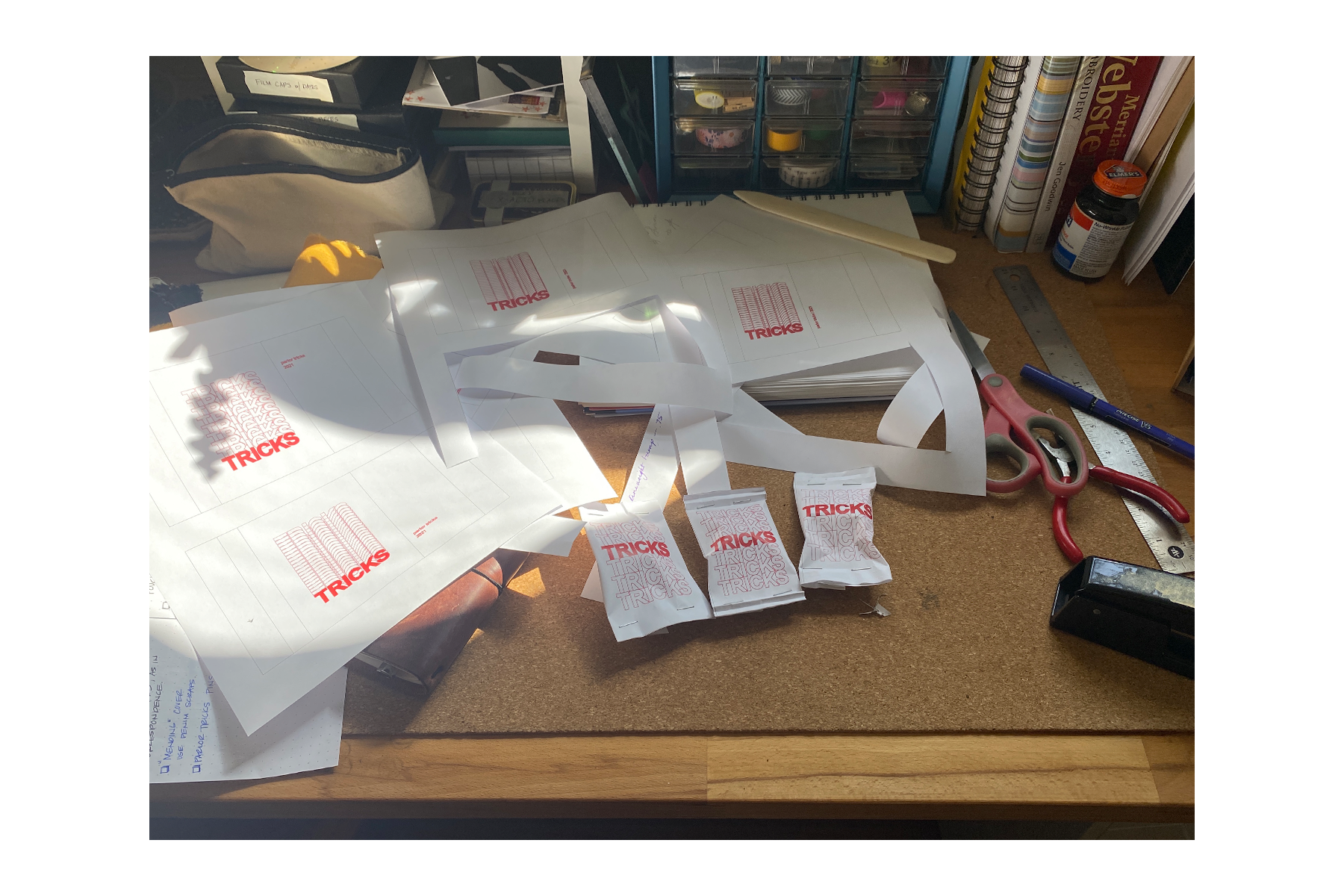
designed several iterations of the cookie size packages. digitized in Illustrator and mocked up on printer paper to test dimensions and volume. used actual pins and wadded up balls of paper to make sure the packets would puff enough to hold the pins. in retrospect, i should have started with the wadded up paper. ripped up good prototypes to get the cookies out. d’oh… !

moved on to vellum for the next series of prototypes. i like using vellum. it’s a little transparent and works in the printer – nice nice. used a pattern tracing wheel to pierce a line about half an inch from the top and bottom edges, and hand sewed closed with red Gütermann poly sew-all thread. fan-creased the ends for a finishing touch.

looked into paper crimping tools and techniques and came across a tube wringer which looked like it’d get the job done and could work on heavier materials, too. the package on the left has tube wringer crimped edges, and the right is by hand. the little tags are two Avery labels stuck together, hole punched, and tied to the end of the enclosure string. i’m happy with how these came out.
digging this process. still not quite done yet – need to give the vellum printing another go. using a laser printer and the toner flakes off more easily than i want it to. don’t think the printer settings are quite right yet. also, need to try sewing the closure stitches on the machine instead of by hand to see how that turns out. maybe it’s too powerful for the vellum and makes a mess of things. or maybe it’s perfect! gotta try it.
been incubating these for a little while now and need to push them out the nest… i’ve set aside a couple prototypes as freebies to give folks that strike up conversation about the pins/patches on my jacket – things i’ve made. i imagined the freebies as an opportunity to help me talk about my work with interested folks. however, it’s still in my imagination since i haven’t yet had the confidence to take the final step and hand one over. or i’ve forgotten to bring them with me, like this morning… double d’oh!
i’m feeling nervous about putting them in someone else’s hands – giving up control – and being at the mercy of public opinion. but i suppose that’s the rub: no risk, no reward. working to remember that opinions are only as important as i allow them to be. constructive critique is one thing; ruthless subjectivity is another. i recognize the importance of putting myself out there and i’m working toward the next step, no matter what other people think of me. it’s a fortune cookie, for Christ’s sake…

*created and drafted March, 2021. posted March 23, 2022.