


quilted


taped muslin lining to the floor to keep smooth. whip-stitched two smaller pieces of cotton batting together to make up the length needed.

pin basted the quilt sandwich together and captured how impossible it is to keep black fabric lint-free.
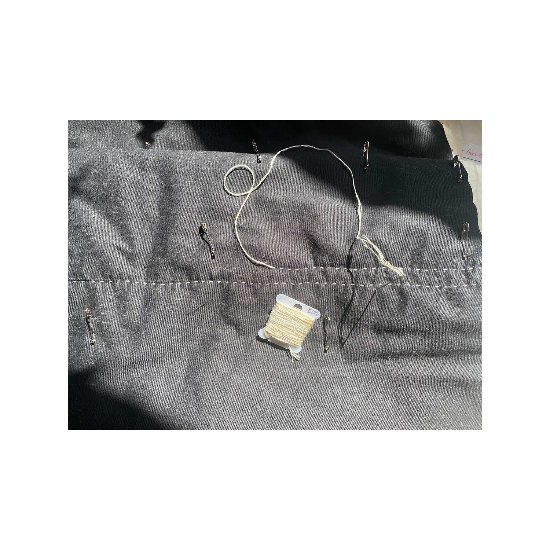
used DMC cotton stranded embroidery floss in ecru, separated into 3 strands, with a Tulip big eye straight thin size Sashiko needle. pulled strands over beeswax before quilting to help prevent fraying and breakage.

quilted in free-hand lines widthwise, starting from the center. i can see how my technique was affected over time as my fingertips became more tender.

kept the muslin lining and cotton batting long at the short edges. trimmed the batting to remove bulk and folded the muslin over to create a binding, blind stitching to the twill to finish. the light table fits snuggly in the cover, so i kept the closure simple using brass sew-on snaps to secure when stowed away.

trimmed excess muslin and batting to meet the long edge of the twill and finished raw sandwich edges with blanket stitch using 3 strands of DMC ecru embroidery floss – no beeswax this time. learned how to cleanly transition threads midway through blanket stitch using this tutorial from Upcycle DesignLab.

finished, “front” and “back”
the quilting turned out alright. started with tight tolerances and knotted off by the skin of my teeth. hadn’t expected as much shirring from the quilting process – my dimensions didn’t account for it. and while blanket stitch was considered as an alternative to more traditional finishing methods – bias tape/quilt binding – it turned out to be just the stitch for a narrow seam allowance.
i’m really happy with this.
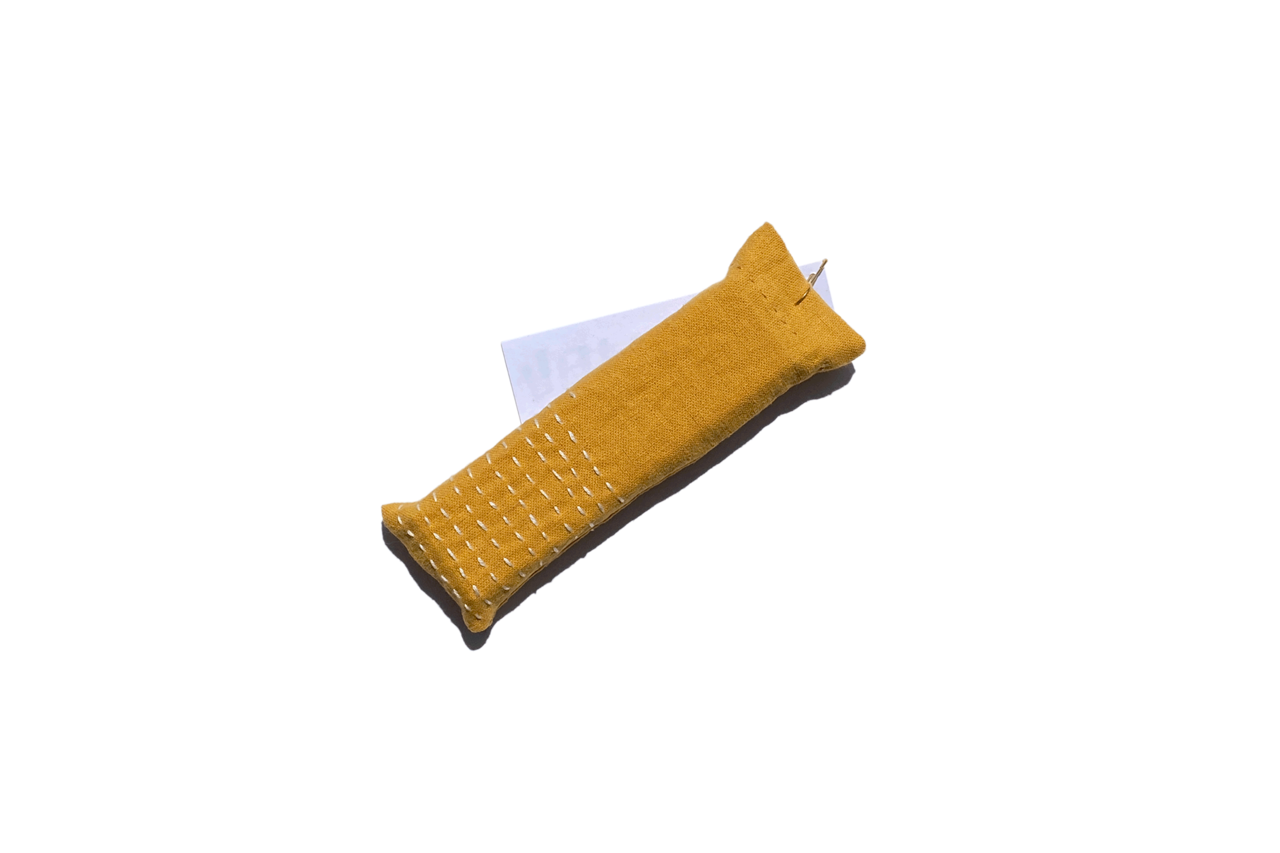
bonus: little sachet i made yesterday to hold a gift for a friend whose birthday is today (happy birthday!). pleased with this spur of the moment project.

Sashiko sampler

some Sashiko practice, and other threaded meditations. can’t remember the order i did them in, other than which was first. even then i can’t tell for sure because i sewed the first to the second – so it’s one of those two.
big gratitude to 刺し子 & Sashiko Story and Upcycle Stitches – very helpful resources.


STOP

stop sign sketch – Crayola Super Tips on trace paper.
experiencing some blockage and working to dislodge it – it’s slow work, requires a fair amount of focus. keeping company with Ever Given… couldn’t help myself ( •̀ᴗ•́ )و ̑̑
i’ve been feeling a way about something that happened in the beginning of February. while working offline, i got wrapped up in thoughts about what other people – complete strangers – might think of this space, should they come across it. i worried what they might think of what i’m doing here, what i’m making, how i’m writing. i worried about being judged. i worried people would think my work was derivative, stupid, a waste of time. i got caught up worrying what other people might think and considered editing the content of earlier posts in hopes of preventing negative opinions of me.
holy sh-t…
STOP.
STOP!
first off, editing the content of old posts is completely antithetical to my conception of this space and especially harmful when influenced by the desire to satisfy others’ perceptions of who i am or should be. changing my mind is ok, that’s progress. changing myself to fit someone’s perception of me is unhealthy, regressive, and untrue to what i’m trying to establish in my practice. it’s disingenuous and inauthentic behavior which doesn’t serve me. i have, in the past, felt it necessary to hide parts of myself – code switching and contorting to satisfy social or cultural expectations. that’s not where it’s at for me. not anymore. so who the hell is making me feel like i need to keep up the contortion? ain’t nobody else here but me! this is personal…
i recognized the pattern as the thoughts were pouring in, back in February. i stopped what i was doing to draw a sloppy stoppy in my journal, and reminded myself of some key revelatory material: changing my mind is ok – good, even. recording a catalogue of process with the emotions that accompany brings visibility to how ideas about work and creativity are influenced and change over time. i want this space to reinforce flexibility and exploration in process, which may mean trying an atypical approach and “feeling a way” about previous iterations. going back through old posts and tinkering with time is NOT a helpful way to document process. heck – re-examining and continuing to reflect on processes, experiences, and context is a big part of this thing!
i won’t deny it – i was disappointed in myself for even hosting those thoughts; but i’m glad i caught it and hadn’t acted on the impulse to change myself in order to satisfy a self-projected standard of acceptance on what is “right” or “good”. i woulda been pretty sour had i taken it that far... these thoughts spun around a specific post, one that is more personal than i’d expected to explore in this space, and i felt discomfort around externalizing emotional vulnerability. although spare for personal details; it has still been difficult for me to process.


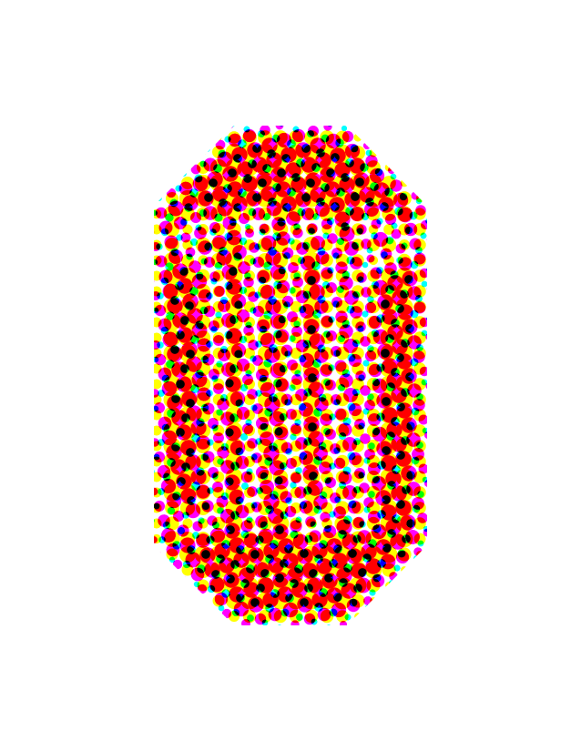
there has been a glint of silver lining from this in my work – i’ve been experimenting with stop sign designs and making GIFs. i wanted to abstract it and stretch it out like i had with several other warning signs, which inspired the first GIF. in order to achieve smoother animation i made more frequent in-between frames, which revealed compositions of stretched letters i don’t think i would have seen otherwise. cool beans. the next GIFs were created from fooling around with CMYK halftones in Photoshop. i’ve used halftone in projects before – it’s fun and pretty simple, and i like it… the second GIF uses varied dot sizes and angles for a spinny-zoomy hi-lo resolution effect. the third was goofing around to create a lo-res halftone version of the original GIF. no big deal, simple. and i like it… another step in this exploratory process will be to make some patches. i recently picked up red velveteen fabric to use as a base – it’s fabulous… the velveteen has a nice texture and matte finish, and is much more vibrant than the red cotton fabric i’d picked up prior. not quite sure how i’m going to approach all the steps of this project – i’m unfamiliar with using velvet/velveteen. i’m hopeful fora fun experiment!
not every creative effort needs an analyzed explanation of how it came to be, but in this case it felt important. the stop sign was introduced because i needed it; and, like the recursive loops before were a way for me to imagine processing through design, the stop sign was a visual cue to pump the brakes before careening into unhealthy territory. i felt embarrassed about the misdirection of energy, and yet work came from it. i haven’t felt like i could reflect on it without feeling shame that i’d even considered tinkering in the first place, which allowed this work to stay hidden and more guilt to build around not staying true to the spirit of this space: reflecting on work as it happens. i thought i was past this, but i’m still working through it.
in the months since, i’ve recognized the hard work in gaining, and maintaining, confidence in my authenticity. i also recognize the work in resisting outside influences that i should do or be something i’m not. and should those negative influences call from inside the house – come from me projecting on behalf of some fictional entity – i’ve got to stop. that. sh-t.
i’m still learning. i’m still growing and becoming more comfortable being myself. i’m more confident in what i desire to do and who i desire to be. i’m excited to keep moving in each of the directions i’m going, even if i don’t know exactly where i’m headed or how i’ll get there.
needed to stop for a little bit back there, but i’mma keep it going.

fortunate

disclosure: this household has consumed copious amounts of Chinese take-out – pandemic or not. with two fantastic Chinese restaurants on our block, it’s hard to resist. Chinese food is comforting, and this last year has seen an exponential increase in need for comfort.
dozens of sweet-and-sour chicken, steamed dumpling, Mongolian beef, and veggie orders later we’ve simultaneously increased our fortune cookie consumption. naturally, i’ve collected the fortunes once dispensed from their snappy cookie shells and saved them in a little box on our kitchen counter. a lot of them are corny, on par with Snapple cap facts and Laffy Taffy jokes. others are egregiously ill suited for the medium (identified below), and several deliveries felt fated – truly fortunate.
for months they’ve sat in their little box on the counter, with a few exceptions that have been pinned and pasted around the apartment. can’t continue to keep them to myself, because with great cookie fortunes comes great responsibility.


easier said than done, but well stated.


yippee-ki-yay.


wow, where to begin… this fortune cookie advice column is punching above its weight here. perhaps these topics require more nuance than a narrow strip of paper jammed inside a cookie can handle?


got it. procrastination is double homicide; unless opportunities are curiosity, which cannot be killed.


;-)


wait… what?

well i’ll be damned.
i’ve been sitting on these fortunes for a while, true; but it would be tone-deaf not to address the racism, misogyny, and violence that the Asian-Americna community has faced, especially this last year as fueled by 45’s racist framing of COVID-19.
it has been upsetting to see community elders attacked and in fear of their safety; and the shooting in Atlanta last week where a racist coward targeted Asian women and murdered 8 people is a heartbreaking tragedy. can journalists and news outlets stop humanizing mass murderers? please?
i was nervousy writing about this here, but i know from experience that silence is more harmful. i stand in full support of the Asian American and Pacific Islander communities and will lend my voice in any way possible to amplify demands for justice.

this old house

it recently struck me that letting things hang around without considering or reflecting on them leaves an accountability loophole. “there was nothing to remind me so i forgot to investigate/work on/maintain it.” want to avoid that, when possible. thought i’d follow Tuesday’s u-turn with another project hidden away in cold storage before it gets too old: this house portrait embroidery.
i “finished” the embroidery part late last year in November and swiftly moved on to other things. originally conceived as part of a larger quilt project – a collection of house portrait embroideries – i haven’t made progress on and am becoming less tied to as time passes. with no plans for what to do next, i’m going to keep it in its raw state for a little while longer – no rush. but it would be nice to see this embroidery, and any project for that matter, in a somewhat diegetic context. without further ado, here’s an account of things up to this point:

11/07/2020 - shortly after getting started. this is the point where i realized i might want process photos…

11/08/2020 - Gameboy break.
when i started this embroidery i had just left my office job. this project felt like the inaugural step toward investigating my independent creative practice, and what that could look like. this embroidery also allowed me to reconnect with photos i’d taken earlier in the year and the early months of shelter-in-place.
a lot of my recent photos were taken on walks – neighborhood photos, houses mostly. in the early weeks of shelter-in-place walks were almost daily, and taking photos helped me feel connected to the physical character of the neighborhood while being physically isolated. i like to refer to them as “house portraits.” i’ve come across several house portraits that lent themselves to line drawn renderings and, i thought, embroidery. one had bright red and freshly painted concrete steps standing out against a well manicured but otherwise unremarkable façade. it was simple with a pop of color – a good place to start.
i used one, two, and three strands of DMC cotton embroidery floss in black (310) for most of the outlining, DMC red (321) for the feature red stair, and black Gütermann all purpose polyester thread for the shadow hatch and details. used only outlining stitches – most being less-than-well executed back-stitch. more like forth-back-stitch – it’s a bit of a mess…
i’m happy with how the outline embroidery turned out. the stairs were too small to attempt shading them, that came later…

used DMC stranded embroidery floss and Gütermann polyester all purpose thread for the outline embroidery drawing.

11/08/2020 - starting to shade beneath the rake.

11/10/2020 - added a second hoop to study an area in detail.

11/10/2020 - chose two DMC corals for the steps’ vertical face in sunlight.

11/10/2020 - steps shading in sunlight and shadow.
there was a lot of unused fabric beneath the first hoop, so i put another hoop on it. thought i could do a blow-up embroidery of the pathway, steps, and porch. using the light table and an enlarged print of the photo, i traced the stair onto water-soluble stabilizer using a fine-tip permanent marker (which will be important later). started with two coral reds (350 & 351) for the path and sunlit step risers. used a light pinky-peach for the treads, and i cannot remember what i used for the shaded portion of the step. i think it was garnet? i don’t know…
i completely lost track of which browns, beiges, and taupes i used for shading the walls. some were DMC, and others were from a cheapy pack of embroidery floss i ordered from Amazon several years ago. the colors are ok, but none of the skeins had labels or identified the color. it’s a toss-up really…
practiced satin stitch and long-and-short stitch techniques to achieve the shading. it’s a little goofy and there are flaws, but i learned from it.

there were several helpful takeaways that i’ve since been able to apply to my other embroidery projects. the ones i can remember are:
do NOT use permanent marker for design transfer - i realized the consequences of this after washing away the stabilizer from the stair shading and the permanent ink had bled into the lighter thread fibers. that was a bummer – won’t be doing that again. i’ll stick to pencils and Frixon pens in the future.
use stabilizer for stabilizing – don’t do the permanent marker thing on the water-soluble stuff… do use fusible stabilizer to provide structure to lighter fabrics for a crisper, more defined finish.
use the shading hatch to compliment geometry - try stitching the shading lines parallel to the plane of the material the shadow is being cast upon. i was going to try to stick with just written explanation of what i mean by this, but here’s a sketch:

the shading beneath the eaves illustrates this best. i was unsure about shading the outriggers, but this is close to what i was thinking. the hedge shading is tricky too, and i don’t particularly like how i outline embroidered edges that could have been more softly rendered in a hatch. just a thought…
work shaded fills from the farthest area of the image forward – in the case of the stair detail piece, i should have started at the far wall of the porch and door and worked my way forward toward the steps and path. if i were to shade any of the shrubs, i would shade the wall behind them first and then the shrubbery over top to build more realistic depth. make sense?
try different shading stitches - the steps look kind of furry due to the nature of long and narrow stitch shading i tried to use. i’m still learning the technique, so i’m by no means blaming the technique for the muppet-y nature of that portion. seed stitch could be cool to try. or hatch lines like the larger piece. i don’t know, experiment! try different sh-t!
a technique i learned after “finishing” this was how to embroidery without leaving any knots! i’ve used that technique on all embroidery projects since – so much tidier. i learned that and other techniques from Sarah Homfray’s youtube videos – she has so many fantastic tutorials.
there are a few more house portraits i’ve considered embroidering. houses with neat facades or a sweet feature and otherwise straightforward geometry. should there be a next time, i’d probably start off larger and try to execute more detail in one single embroidery rather than splitting it up into two – which wasn’t planned – but i’m happy with the direction it went.
yesterday afternoon i wrapped the quilting portion of another project – one that hadn’t yet been flung from its spinning plate… (alright, beat it with that hateration!)
the process has been going well so far. not that things are perfect – no – but i’m learning, moving somewhere, and getting better at testing ideas and identifying what i like and don’t like in whatever it is i happen to be working on. in this case: leaving expectations at the door and adapting to what unfolds. i’m learning to recognize successes yielded while executing a process, and to relieve pressure created from the notion that success is singular and lies within a very narrow margin.
i went into this most recent project with a much more involved and technical execution in mind. i’d also procrastinated working on it for months… in an effort to be more efficient with my time and allow attention to be paid to other projects – and life – i simplified. in doing so, i saw shared sensibilities with previous projects and drawings. maybe it’s subconscious… still worth a mention.
anyway, i need to photograph it in the state it’s in right now – post-quilting – before moving to the next step, and wanted to leave a dash of what i’m coming away with so far.
keep it going!

u-turn
swinging back around to lay down some graphic experiments from a few months ago while working on color studies. focused on construction paper colors for the physical work and schemed in CMYK digitally. i liked what came from it, but kept it in a digital locker. reminding myself, “that’s not the point…”
relieving pressure from feeling like there needs to be some in depth process run-down. it’s not that deep – i did the work and want to have it for reference later. so, here goes:


fretwork

i think i’ve already mentioned here that i’m getting back into guitar – pretty sure i’ve mentioned it… anyway, set it up nearby and it’s been what i turn to when i feel distracted and need to focus. noodling on the guitar has felt better than picking up my phone to thumb-scroll into a dissociative fugue. comparing those two things is absurd, i know; but i’ve recognized a marked improvement in well-being since trading phone time for guitar time.
spent the last couple months dusting off the few songs i’ve learned over the years, and learning one new song. i wanted to finally learn and play a song all the way through, and i have! 22 years after picking up a guitar for the first time and i’m actually learning how to play it. wow…
i realize that playing one or two songs doesn’t amount to knowing how to play the guitar, so i’m doing some exercises to learn the natural notes of the fretboard. i can poke around and make stuff up, but i have no idea what i’m doing or any of the notes i’m plucking away at. that’s no good. found a couple helpful videos from Music Theory for Guitar and Redlight Blue that encourage getting to know the fretboard and provide some pointers, and that’s just what i’m setting out to do.
although the internet has endless diagrams mapping out the fretboard, i felt i’d get more from the exercises if i started out making my own (this was also in an effort to keep my wheels from spinning into distraction and overthinking elsewhere). made the fretboard diagram in Illustrator and made each GIF in Photoshop. set the GIF frame durations to 1.5 seconds, an approximation to match the 40 bpm i set my metronome app to for practicing. here are each of the notes on the fretboard isolated out from A to G, moving from the sixth to first strings:
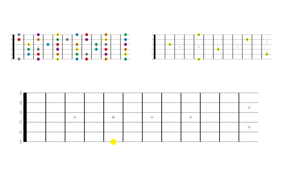


like i wrote earlier, i know this is procrastinating from actually doing the exercises. i just thought making my own diagrams would help connect the dots. i think it has, and will. nevertheless, this was a fun diagrammatic exercise and a good distraction. there are plenty of other things tugging at my attention right now, getting in the way of work and thoughts. so annoying…
time to get back to it – lots to do.
ok, bye bye!

softwood

split at the base. it didn’t look deep, but a fella from the tree service said it couldn’t be fixed.
a tree is being removed from our yard today – like right now. there’s a crane outside the window, and a wood chipper in the driveway. men in orange tops and vests are carrying bags of gear, chainsaws, gas cans and gesturing skyward… it’s impossible to ignore.
rainstorms have been blowing through this past week. the first came last Friday during a virtual happy hour with friends. first came rain, then the wind whipped up and i heard a loud *POP*. sounded close, but there weren’t any obvious signs when i peeked outside. the next morning i saw the damage: one of the three trees directly outside our place had a long split shooting up from the base of the trunk.
“sh-t…”
utility lines criss-cross the neighborhood with trees interlaced among them to varying degrees. we worried the crack could put the lines, and our neighbors’ homes, in jeopardy should it cause the tree to fall over. we worried about our house too. well, not our house – the house we live in. it’s someone else’s house and, technically, someone else’s tree. Sam got in touch with the property manager who got in touch with the owner who got in touch with a tree service… i had hoped there would be an intervening solution between disaster and removal, but that didn’t turn out to be the case. and now it’s being removed.
the tree was supposed to come down yesterday morning, but it rained again and had to be postponed, providing an opportunity to observe the daily routine one more time. it was a handsome tree – a Monterey cypress i think. host to a squirrel family and numerous birds that i’ve observed closely over the last year. today, nearly a year to the day since we started our stay-at-home order, things are changing again – uncanny timing. seems it’s because of the time spent closely observing and interacting with our home over the last year that i was even able to notice the split. damned if you do…
this makes me sad. really f--king sad…

the crane hook made frequent appearances as it lowered and lifted from view, usually with huge sections of tree attached…

what remains: soft heartwood stump.
i was taking photos this morning when the tree crew drove up. i introduced myself and met Roberto, Julio, and “the new guy”. several more crew members and a crane operator arrived shortly after, but i’d already gone inside to hunker down with my feelings. from my east facing window i could see Julio, the climber, gearing up. he pull-started his chainsaw and clipped it to a carabiner on his harness before being hoisted into the canopy – the chainsaw and extra lengths of rope dangling from his waist like a charm bracelet. over the next couple hours branches, needles, and cones fell to the ground; and whole sections of tree were lowered to awaiting hands and the chipper’s maw.
Roberto let me know when they were wrapping up and described what had been done – dead branches were trimmed and a tree closer to the front of the house was cleaned up too. he showed me the state of the remaining stump and it was clear that the crack indicated a larger problem. the wood at the center was soft – so soft i could pull pieces up with little effort. the tree wasn’t well, and removing it was in the best interest of what had been developed around it; but i’m still sad to see it go.
i hope the squirrels find a new tree to nest in and the birds come back. i hope the remaining trees – what’s left standing of them – are healthy and don’t need to come down anytime soon. *knock on wood* (too soon?)
i could read into this and telegraph out some metaphorical meaning, but i just want to be sad right now.

interference

started with a vector illustration created from a photograph. sent it through the GIF-itizer and this is where it landed.
this last week has been a whirlwind (read with enthusiastic “wh” sounds) and also ushers in the fourth month of my self-established sabbatical. i pivoted some of my attention back to the website i have for presenting “professional” work, which has been more or less neglected – for years. i’ve been wanting to dive back into that work, and now feels like the right time. Tuesday afternoon was productive – i got several ideas out of my head and down onto paper, road-mapped layouts, did a few tests, and identified a strategy for achieving what i want. frankly, a good portion of the work so far has been fiddling with website templates, making tweaks, and letting go of the design i worked on several years ago when i was just getting myself out onto the job market. this time, it’s a little different – i’m feeling much more agency over my work and how it’s represented.
that being said, i realize how diving back into the other side of my online presence has taken some time away from here. doesn’t mean i haven’t been making and reflecting on other projects going on. got a few things out of the embroidery hoop and nearly wrapped. started a new “tri-fold” – a strategy for organizing projects and to-do’s without completely overwhelming myself. in fact, those tri-folds have been much more effective for me than any agenda i’ve tried out (couldn’t have been more serious when i said i’m not a planner…). these next few weeks, and months, will be a lot of work – and that’s exciting! i look forward to it, and the challenges i may face as i continue showing up, authentically. showing up here, and in my “professional” work, and everywhere else i can take space and time to be myself.
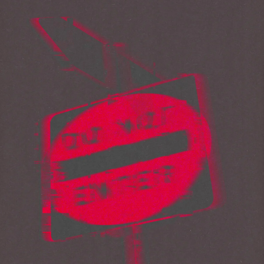
something i haven’t yet reflected on here is a personal project i came to a point of closure on at the end of February. it brought up a lot and was difficult to get through, but the process helped me externalize uncomfortable feelings that i had been holding on to. while making the “DO NOT ENTER” illustration, i kicked around a few songs that allowed me contextualize and reflect on what was coming up. i don’t want to leave the energy i came into this project with here in this space; but, i do want to leave evidence of the process-ing involved.
the project – another mixtape – isn’t so dissimilar from “expect trouble…” – they overlap. what’s unresolved between them has been complicated, messy, and confusing… confusing. but not confusing in the same way as “expect trouble…”. this was born from another pain – very much related, but different still. i’m being cagey reflecting on this – this sh-t was tough. (there are plenty of reflections in the offline journal should a refresher be necessary). what it came down to, for me, was recognizing difficulty processing my feelings from “expect trouble…” without acknowledging other pieces of the puzzle around it.
the process for the cover design started with an illustration from a photo taken earlier on during our stay-at-home order. used Illustrator to draw a vector version of the road sign from the image and thought that was the end of the effort and just an extension of warning sign work. it was during that time i recognized feelings spring up that were interfering with what i was doing – getting in my way and preventing me from gaining traction on other fronts.
i wanted to visually represent the interference i was experiencing and brought the “DO NOT ENTER” illustration into Photoshop to experiment with making it into a GIF. i wanted to make it look like it was being pulled apart, as though something was causing a bad connection – “i can’t hear you! you’re breaking up!” that was the feeling i was getting trying to work among unprocessed feelings – some i’ve avoided mostly out of fear. fear of discomfort, and sadness. fear of re-visiting past mistakes and staying there.
i used a couple of youtube tutorials to help me create the GIF from creators Made by Mighty and Photoshop Tutorials | photoshop effects. the effect was pretty easily achieved, and i appreciated having the tutorials as a guide. i used to feel like a cheat using tutorials. like the only way to learn was the hard way. gross. at least that’s the way i felt about using tutorials at some point in time. i haven’t felt that way in a long time, which is good because i use tutorials a lot. like, a lot a lot. it’s curiosity and intentions to realize a concept or idea – i.e. my lack of knowledge on making this idea into a GIF – that lead me to them; and i will gladly engage with guided content from experts in whatever field i happen to land within the perimeter of. like David Bull’s channel a few months back. Bob Ross, move over! but truly, the ability to recognize what you don’t know and seek the information to learn is an asset, not a handicap. traveling down those curiosity streams has taken me places i didn’t even know existed. glad i changed my mind.

leftmost is original illustration, and the following are the frames used throughout the GIF. interestingly, when i change the canvas size, the center blend mode area changes. kinda neat. also, kinda f--king annoying. should figure out why that happens… used layers similar to the last two for the mixtape cover. side note: the blend modes didn’t save out with the GIF either…
i compiled music over the course of working on the illustration and GIF, and a mixtape started to gel – consistency is key for making, and breaking, habits. it seemed a likely pair to use the warning sign illustration as a cover; and, because this sign had text, the mixtape name came as a sign-ing bonus. i’ll show myself out… anyway! the starting point drawing was ok, but flat; so i picked a couple layers from the GIF that had interesting distortion – one with a red shifted blur, the other blue – and brought those layers into a separate Photoshop file to experiment with transparency blend modes. several options didn’t do much, but a couple stood out: a monochromatic red result using “saturation” blend mode and a more vibrant version using “color” blend mode. i like both, and if this process maneuvered around a different memorial narrative, i may have used it.
i liked the distortion of the text in the monochromatic design, too. the lack of clarity resonated with how i felt around the set of circumstances i was revisiting. there are no requirements that these mixtape covers illustrate the musical mood, but i saw an opportunity for this to move in that direction and went with it. i think it fits. and, in a way, serves as a cautionary reminder of the effects of distorted resolution.
monochrome red effect achieved by layering the red shifted layer over the blue with “overlay” blend mode. grouped the two layers and applied “saturation” blend mode to the group.

similar to the monochromatic version, but layered the blue shifted over the red and applied “color” blend mode to the group. i like this one a lot, but it felt too playful for this project.
the work experimenting with layers and blend modes was done over a black background layer. i liked the digital distortion produced in the sign images – how the glitch effect distorted the legibility of the sign – and tried applying distortion and texture to the background digitally, but wasn’t able to achieve what i was looking for. i don’t really know that i had a solid idea of what exactly i was looking for; but i could tell photoshop filters weren’t leading me there. instead, i scanned a texture used in several physical iterations of “warning signs”: construction paper. (ring any bells?). i liked how the flecks and irregularities in the paper’s surface added an organic distortion i wasn’t yet able to recreate using digitally. coupled with the foreground, these designs remind me of spray painted stencils on asphalt. that would be fun to do… the rear cover/song list was created in Illustrator using the Highway Gothic font in a similar red to the original “DO NOT ENTER” sign. brought the vector file into Photoshop and applied saturation blend mode to match the effect of the cover design.

DO NOT ENTER playlist cover – digital illustration & vector graphics

with 17 songs the mixtape came in at exactly 80 minutes.
the past has a funny way of showing up. sometimes, it never leaves and i carry the baggage around with me. i’ve gotten more efficient about it over time – packing it down into smaller containers to make it more manageable. or so i thought. this mixtape and “expect trouble…” have served as emotional containers of sorts – for things i’m resolving and don’t need to be packed away anymore. i’m not sure whether i’ll revisit “DO NOT ENTER” in the same way i would other mixtapes; not that “expect trouble…” is a walk in the park for me either. however, i will admit, the last five or so songs on here serve a mood that i am absolutely here for.
while i can’t say that this process was entirely fun, it was certainly helpful. a couple-few takeaways from the process for the future:
K.I.S.S. – keep it short(er) – 80 minutes or less: the time limit on common 700mb CD-Rs. i know there are 120 minute varieties out there, but i needed to draw the line somewhere. 80 minutes felt like a good length and accommodates about sixteen 5-minute-long tracks. should there ever be a reason to have a longer playtime i might consider 120 minutes. might.
mixtape covers can be digital art – or anything else for that matter. i had originally envisioned making physical collage covers and changed my mind when i was fussing around in Photoshop. changing one’s mind can be a good thing.
keep written reflections on songs – this was an important part of my process for the last two mixtapes – helped me better understand my relationship to the music and narrative sequence.
use what you got if it’s given – if the reference image or collage piece has text that can be used as design and title, go for it. two birds…
this recent stretch of time has been instrumental in figuring some sh-t out. i’m feeling more and more myself. more confident to actively engage in difficult and uncomfortable topics rather than passively allowing things outside of my control to affect my life. spending this sabbatical time the way i have been, here and in projects, has been an important part of the process so far. it’s still work, no doubt, but i feel like i’m getting somewhere that i wasn’t able to before – moving through and to the other side of things that i’ve ignored or left unresolved. and in the absence of interference i’m able to find some clarity.
P.S. …

final covers for DO NOT ENTER. set blend mode for the vector text to “color” to better compliment the cover. and that’s that on that.
gave this mixtape another listen as i was coming back through this entry for an edit yesterday evening (more for clarity than content, but let’s not bring the editor into this); and again, on a drive earlier this morning. the past two trips resonated differently than before. i switched out the cover this morning, before my drive; bearing in mind a recent personal revelation:
it’s ok to change your mind.
after the first full listen-through yesterday, i knew. the drive this morning was my due diligence: the road test; and, an opportunity to validate the tone struck the night before. as i was beginning this process and processing – moving through this song list and holding space for what came – i remember how much discomfort i was encountering. the red alarm of the monochromatic design was what i most emotionally aligned with. DO NOT ENTER – this might sting. and, until yesterday, i had yet to make it from start to finish without teasing up something that made me squirm — literally, figuratively, take your pick – and i’d ultimately switch to another album that provided more buoyancy (“… a Seduction”, in most cases).
these last two listens were different. the sign is still there, warning of discomfort and, perhaps, pain and sadness. that’s where things started. over time, and with work, i’m making my way through it. now, i’m starting to see there’s something just beyond; and it’s so much more vibrant.

“you’ve got the spirit…”

‘Streethawk: a Seduction’ - Destroyer (2001/Misra) design/layout by Rob Carmichael
been meditating through this over the last week. woof. digging it. each time i finish a song on this album i’m convinced it’s the best there is until the next song kicks off and replaces the one before.
sat at the desk yesterday to leave breadcrumbs for a photoshop process i’d learned during another project — one i’d started toward the beginning of the pandemic lockdown. back when having a passion project was a fun distraction from what was supposed to be a few weeks of staying at home. psych!
felt i could handle music while i worked since it was pretty easy stuff. chose Destroyer's ‘Streethawk: a Seduction’ as my dance partner and have yet to be disappointed with that decision. it sends me every time. f--k, this is good.
tossed me into a mood to revisit a couple albums that have been absent from the rotation for a little while:

'Primal Dap' - Secret Sidewalk (2019/Primal Dap Sound) photography by K2 WCF_Lords Krew, layout by Justin Boo

‘tamer animals’ - Other Lives (2011/TBD) art direction by Jesse Tabish and Jonathon Mooney, cover artwork “Casey and Bri. Oklahoma Summer Night” by Benjamin Lee Sperry, design by Ellen Wakayama
Secret Sidewalk’s ‘Primal Dap’ accompanied my desk clean this morning. top notch. and ‘tamer animals’ was a pleasant reunion Other Lives and their country western twang and moody stylings. pretty good. pretty… pretty… pretty good.
also trying to listen to more new music — or, to be more specific, music i haven’t yet listened to. a lot of the albums i’ve got lined up are decades old, but completely new to me. when i start a new album i need to listen to it several times — rooter to tooter — to get a sense of things and identify why i do, or don’t, like something. it can be tough to commit to, but i appreciate what that practice can yield. now that i have more availability to dig in i feel like i’m slowly chipping away at that goal.

‘Hejira’ - Joni Mitchell (1976/ Elektra/Asylum) art direction by Glen Christensen, design by Joni Mitchell, photography by Joel Bernstein, Norman Seeff, and Keith Williamson
Joni Mitchell’s ‘Hejira’ is the current endeavor. i’ve listened once so far, still trying to recover so that i can get back on. admittedly, i sorta slept through the first seven songs. then ‘Blue Motel Room’ pulled up a chair… and ‘Refuge of the Roads’ invited herself in and scuffed up my insides. this is why i can’t have nice things… ‘sgood. i’m nervously excited to start it up again, but in no rush.
this past Saturday i dropped by Dave’s to browse through records. didn’t find what i was looking for (Destroyer’s ‘…Seduction’), but picked up a few albums i thought would be interesting — one fantastic cover — and a few freebies that should be good. Dave and i were chatting and landed on streaming services. i mentioned being a ‘tweener going from cassettes to CDs to mp3s and now streaming. i used to really f--k with CDs. at that comment Dave turned to a box behind him, pulled out a short-stack of jewel cases, and set them on the counter. “would you listen to these? you can take ‘em if you want ‘em.” a collector never turns down a freebie and now i’ve got 11 new CDs to listen to, and one to consider. i don’t know about you Robin Thicke…

in the stack of CDs from Dave’s there’s Sade, Herbie Hancock, Gil Scott-Heron, Donna Summer! these’ll be fun to go through

‘Bonnie Raitt’ - Bonnie Raitt (1971/Warner Bros.)

‘The Band’ - The Band (1969/Capitol) design by Bob Cato

‘You Gotta Walk It Like You Talk It (Or You’ll Lose That Beat)’ - Donald Fagen, Walter Becker, Denny Dias (1978/Visa) art direction and design by Joseph Hosey and Murray Brenman, cover concept by Murray Brenman, photography by Joseph Hosey
the records i picked up were not what i’d come looking for, but also not absolutely random choices.
i really enjoy Bonnie Raitt’s hits like ‘I Can’t Make You Love Me’ and ‘Silver Lining’, but i’m not familiar with her origin story. excited to take that one for a spin. The Band is another that i’m not at all familiar with; but i really like ‘Up On Cripple Creek’. and as a late-onset Steely Dan fan, i couldn’t pass up this intriguing collaborative effort by Steely founders Donald Fagen and Walter Becker.
there’s one other that i got in this bunch — the one with the fantastic cover — but i want to take proper photos of it. i also want to get this entry off my desk, so i’m trying to move at a quick-ish pace that doesn’t quite allow for an impromptu album cover photoshoot. and trust, it deserves it.
there are notes scattered about in my journal (the other one) on the music i’ve been listening to. i’ve found it helpful to jot down thoughts while i listen, and this space can help capture the ephemeral participants in the creative process.

this page was on the stoop when i went out to water this morning. it had been stuck in the lavender and turns out Sam brought it up last night.
went out this morning to water the yard: garden patch, lavender, clover, the grassy hill. it was colder than i expected and my hands felt numb after several minutes holding the dripping spray nozzle. when i came back up the steps i saw a piece of paper with typing on it — looked like a loose sheet from a book. the sheet was tucked beneath a glass container on our stoop, which i thought was strange, but as it turns out Sam had put it there after picking it out of the garden patch yesterday.
just wanted to leave it here — a token from the morning.
anyway! long story short, i needed to feather the selection border in order to mask out hair in Photoshop. make the selection — marquee tool, polygonal lasso, pick your poison — feather the boundary starting at around 5 pixels and make a mask. ba-da-bing i’m sure i’ll realize it’s more complicated than that and fill in the gaps later…
turning my attention now to some bits that i’m having a lot of feelings around ahead of getting into: fear, discomfort, anxiety. i’m reserving judgement and holding space and curiosity for my feelings. this is a door that i opened, and resolution that i’ve sought out. i am confident that i can stick to the conviction and authenticity of my intent.
it’ll be ok. i will be ok.
“…don’t lose the feeling”

pick up

from left to right: first pick from around 22 years ago, Fender tortoiseshell pick from ???, second Fender tortoiseshell street find, unknown tortoiseshell pick from today

second pick from the left in the image above but taken with my phone. the scanner doesn’t pick up the gold foil. i think the sparkle helps these stand out when i find them on the sidewalk.
i keep finding picks on the ground. i’ve found a couple over the last few weeks. one is similar to a Fender tortoiseshell pick i already had (second from the left) and, come to think of it, i don’t know how i got that one either. i can’t remember buying any guitar picks other than the purple Dunlop one purchased with my very first electric guitar 22 years ago — it’s a thick one, unbreakable almost — and a thumb pick that i just can’t get the hang of… a friend gave me a yellow New Orlean’s Jazz Fest pick in middle school. wish i’d kept a better eye on it, don’t know where it got off to.
i don’t even use picks when i play but i can’t help but pick them up when i see them on the ground. i don’t yet have the confidence to play with that much articulated amplification, i’m still very much in the learning and noodling phase. besides, i like the soft tone of strumming with my fingers.
i found another pick today on my way to see a friend for lunch. it’s the last one on the right — nameless, but with the same tortoiseshell pattern as the Fenders. again, couldn’t just walk away from it. it’s a little thinner and lighter than the others, so maybe it will be the Goldilocks “perfect pick” when i finally reach for one. not there yet, but this growing collection leads me to believe i’ll be ready when i do.

common assets

needed to scan some construction paper to use as a digital background and thought about all the times i’ve scanned materials for textures and saved the files into specific project folders — a one way ticket to a digital black hole.
hadn’t considered making a digital catch all until the other day. now i have a “common assets” folder for all the ticky-tacky pieces that get used in all sorts of different ways. so far i’ve only scanned construction paper… but it’s gonna grow!
typing that name, common assets, i couldn’t help but think of it in the context of marriage. common assets: the car, the apartment, the record collection, the cat… as icky as it makes me feel to consider describing things in order to litigate over them; i do like the sound of it: common assets. i like the way the two words look side-by side — the humps of the m’s and n in the first leading into the squiggles of s’s in the second. i think it would make a good name for a restaurant or bar. just saw that there’s a company called uncommon goods… bwah
then, i thought to myself: “where does your digital miscellanea live?” a place for videos and articles and music that i encounter and find helpful or resonate in some way, or that provide motivation or perspective. the last several days have yielded inclusions into the digital library of common assets:
on Saturday i joined a virtual discussion about the work of quilter Rosie Lee Tompkins presented by the Berkeley Art Museum and Pacific Film Archive (BAMPFA). Dr. Carolyn Mazloomi and Ms. Ora Clay spoke about quilting and the work of Ms. Rosie Lee Tompkins. i hadn’t familiarized myself with either speaker before attending, which has its benefits and drawbacks. i didn’t want to form any preconceived notions of what they would speak about or who they were from static representations. and for that, i’m ok with my decision to “under-prepare”. Dr. Carolyn Mazloomi was a force. there were a few things that she said during the discussion that pierced deeply and i am grateful to have been witness to her presentation. one point she emphasized was the importance of the creator’s voice in their work. Rosie Lee Tompkins left no interpretation or writings about her own work which is a loss for the diasporic quilting community. hearing Dr. Mazloomi speak to the notion of being the voice for your own work motivated me to continue doing what i’m doing.
on Sunday i watched a video suggested by the Youtubes featuring cinematographer Brad Rushing speaking about doing the work, success, and the power of listening. i wasn’t familiar with Mr. Rushing before, but looked him up after starting the video and learned that he was the cinematographer for Britney Spears’ ‘Toxic’ music video. wait, what?! another instance of uncanny timing having just watched ‘Framing Britney Spears’. sure, there’s no doubt something algorithmically driving this content to me — that’s life now. but what Mr. Rushing has to say about creativity still rings true.

‘MAGDALENE’ - FKA twigs (2019) creative direction Matthew Josephs, design by Matthew Stone
i also listened to FKA twigs’ ‘MAGDALENE’ for the first time. not unlike LA Priest’s ‘GENE’, i’d been saving this album for the “perfect time” to listen. years have gone by and i was too ashamed and nervous to listen to it. twigs’ music hits a sensitive spot, and i didn’t think i was ready to go there. but i did, and i love it. holy sh-t, like really love it. which isn’t a surprise, i enjoy her work very much. i don’t know why i do this to myself…
yesterday morning i browsed for a podcast to listen to while taking a shower, and saw the latest episode of This American Life entitled ‘Secrets’. it’s a doozy, and another uncanny arrival.
i thought, “what do we do with our common assets that are not commonly known?” everyone has secrets. what do you do when you have shared secrets? or if you are the secret?
the episode discusses embarrassment, shame, and the feeling that you should be able to handle your secrets on your own. yeah, this one was important to listen to right now. one of the statements that went straight to the marrow was this one:
“telling my story has opened up a lot for me, especially with the people i’m closest to. but telling is a beginning, not an end. it’s not a solution… it doesn’t release you from shame. to release yourself from shame, you need to understand where the shame comes from. telling alone doesn’t get you there, but it puts you in conversation with people who can help.” - Susan Burton
and this:
“i never lied, i neglected to tell the truth. that’s how secrets are made.” - Pavan Bivigou
Susan is speaking to the secrecy around eating disorders, and Pavan about keeping her sickle-cell anemia a secret. even though these are two things that i don’t have experience with, i do know what it’s like to keep a secret… and these stories were incredibly helpful to add perspective to that understanding.
last night i watched this discussion between Daniel Kaluuya and Timothée Chalamet. it’s old, i know; but i like Daniel Kaluuya’s work, and Timothée Chalamet’s even though i feel a growing gulf of disconnection from his generation. i’ve watched a few others in this series, and they can feel stuffy and forced. but this one felt so fun and energetic. it felt like both of these artists were genuinely interested and excited to be in conversation and learn from one another’s experiences.
i really appreciated what Daniel had to say about reading scripts and why he reads them: in part to better understand why he likes something so that he’s better informed as to why he says “yes” or “no” to projects. using it as a tool to know himself better.
gem dropping… so good…
that’s it for now. i am hoping that this space can be a useful library for videos and music and books and all the stuff that flies through while i’m working. i have some patches to sew a merrow border onto, so…
ok, bye bye!

speedsuit
i’ve been in “heads down” mode for a little bit. listening to a lot of music — stuff that’s for listening to and not just having on in the background. it’s not easy to have on while writing without getting distracted so i’ve been working on embroidery while listening. it’s allowed me to focus on the repetition of stitches and get into a meditative zone. good for where my head is at right now.
the music is a whole other digest…. i’ll keep it simple for now and stick to embroidery.
so i have this “flight suit”. it isn’t really a flight suit, just looks like one. sort of. the actual factual name is a “speedsuit”, which i’ve come to possess since it’s what me and my fellow architecture graduate cohort wore for our graduation ceremony instead of traditional cap and gown and hood and yada, yada, yada. following a sartorial tradition started who knows when for who knows what reason, one of my classmates got everyone’s orders together and i went with it. it was one less thing to think about while being tossed around in the whitewater of the final semester of architecture school.
i’ve kept mine after all these years because it’s well made and functional. what’s kept me from wearing it is my school and degree program embroidered above the left breast pocket. i’m proud of my degree, but i don’t want to advertise it. it’s not as though the school is paying me to be a billboard. quite the opposite…
coveralls are a suitable outfit for work these days, so many useful pockets. i’m moving away from carrying bags with lots of sh-t in them, not a fan of how they cut into my shoulders. i always feel like i’m stinkier in the pitty area when i wear a backpack or a purse too. probably because the straps get mushed up in there. i’ve lost some good shirts that way... anyway, wanted to revive my pair since i held onto them and they are otherwise occupying very limited closet space.
covering up the old embroidery had an easy solution: make a patch. so i got to embroidering one of the warning signs as a cover-up. i could have ripped the unwanted stitches out, but i think it would have torn up the fabric in the process. easier to sew a patch over top, and this way i could try out other methods of representation.

graduation “flight suit” from 2014. mocked up a few sizes of patch to cover the graduate program embroidered over the left breast pocket. (the footies all balled up at the bottom look creepy…)
started out with a few different sizes of patch templates and taped them over the stitching to be covered. the one i ended up going with was a ‘tweener size between a smaller and bigger version. it’s about 5 1/2” without the border.
the base is a linen blend fabric that i have several yards of. i really like the color — it’s a warm mustard yellow. looking back at the process photos i realize i could have done more than one patch in this hoop instead of one, but i did save the scraps to use for sashiko practice. i’ve started another hoop since this one (more on that later, i presume) and have made an effort to maximize hoop economy and efficiency to prevent wasting fabric and materials.
used a light table to trace the pattern directly onto the fabric this time, foregoing stabilizer/interfacing for the design transfer. this linen has a pretty open weave and i could easily see the stitches through the fabric onto the backside. not ideal and could have been prevented with interfacing, but since it was going against a dark material i didn’t stress it too much. i also used a different kind of pen for marking the design: a Pilot FriXon pen, which is heat erasable. tested the pen on a corner of the fabric and used hot water to erase the markings away and voilà! worked like a charm.
stitched all the outlines, borders, and satin stitch fill with two strands of DMC stranded cotton and clover embroidery needle. not sure which size. not the biggest and not the smallest needle in the pack.

just measured the needle with the set of calipers Sam got me, i think it’s a #5 needle (here’s a chart to reference next time). i’m assuming that needles are measured at their shaft length without the eye/shank, making this a #5?

2/4/2021 - just getting started. used backstitch for the linework. i’d started out trying stem stitch and didn’t like the raised effect. should have taken a photo but didn’t before picking the stitches out and doing it over again.

2/4/2021 - started the satin stitches moving from right to left starting at the arrowhead.

2/4/2021 - the satin stitches at the bottom of the loops were tricky to keep consistently tensioned and also not pierce the fabric too many times leaving holes.

2/5/2021 - catching rays to help it dry faster. don’t know if this actually worked, but i liked how it looked from outside. so there.

2/5/2021 - done drying and ready to seal the edges in Mod Podge. i stitched another row of linework outside of the first border as a guide for the interior edge of the satin stitch border. i don’t think it was absolutely necessary, but i like to have it. i’ve found that guidelines help keep my stitches neater.

2/6/2021 - glued the edges to prevent fraying and started making my way around…

left & middle: J&P Coats Silk Finish Crochet Cotton, right: linen thread

top: Nun’s Boilproof, middle: DMC pearl cotton, bottom: Royal Society Embroidery Floss
sidenote: started out using the scanner to document these pieces and was fighting it at every turn. trying to get the white balance to work or arranging things on the scanner bed, it was becoming a project in and of itself. was starting to set up a long and unnecessarily arduous process just to digitally capture threads. no thanks. yesterday was a nice, sunny day and the oxalis (Bermuda buttercups to be exact) in the yard were blooming and looked pretty, so i took a loose piece of bristol i’ve been using as a background for these kinds of little vignette photos and went outside. used a rock to keep the paper from scooting away in the breeze, and found it a handsome accompaniment. this one is a rock Sam brought home from a recent walkabout — a practice both he and i have carried on from our mothers. we are rock collectors.
the photos above are from yesterday, but these are some threads i picked up midway through the patch making process from a local vintage seller who had a pop-up shop in her garage. Sam and i came across her set-up by chance on a walk the weekend before last. there were so many interesting things for sale, but i was drawn to a little basket of threads and sewing notions. got a couple wooden spools of a bright yellow cotton thread, looks like somewhere between a #5 and #8 pearl cotton? could use it for quilting. also got a little skein of linen thread and several skeins of embroidery floss: Nun’s Boilproof thread size #3, DMC pearl cotton #5, and Royal Society Embroidery Floss without a size indication but the words “ROPE” instead. i probably won’t use the skeins of embroidery floss because it would require taking the packaging apart, and a big draw for me was the old school packaging and labels. the spools and linen don’t feel as precious since there’s no packaging to get through in order to use them. i’ll be giving those a whirl on future projects when i can.

2/8/2021 - made it around with smoothly laid stitches. a miracle.

2/8/2021 - stitching the patch in place while on the phone with mom.
came back to it on the 8th and completed the edge stitching, which i just today learned is called a “merrow border”, and sewed the patch onto my coveralls over the old embroidery. it looked good, but i hadn’t considered the direction of the arrow and proximity to my armpit until finishing up the patch and putting the coveralls on. not that i’m suggesting there’s a hidden interpretation when arrows and armpits meet, it’s just hard to see the arrowhead in the fabric folds since the suit is a bit baggy on me.
i was a little bit bummed to realize the arrow position after the fact — i just hadn’t seen it when i mocked it up in paper earlier. not to worry, it just provided another reason to try out more patches. i have a few more iterations in the works now, each different in one way or another. i’m using it as an opportunity to experiment with technique and materials. there’s one design that i’ll swap out for the one on the coveralls now and the rest will be put out into the world somehow. not too worried about it.

all stitched on. the color combo and patch geometry reminds me of Napa Auto Parts. i dig it.
ok, made it through that one. i started writing yesterday and paused for a bit to step away and take care of some other things: embroider a little, hang out with Sam and Simon, practice guitar. i didn’t see any need to barrel through and finish last night — there are no deadlines here. come this morning, i had some jumbled feelings of doom and gloom around recent medical goings on. it’s been a month-long endeavor to figure out what’s what, and i’ve reliably come to the most catastrophic conclusion with every new piece of information. handling medical situations with calm is not my strong suit, but i’m working on it. adding “battling hypochondria and catastrophizing” to my growing list of things to work on…
whatever it is, i have to just roll with it. i can’t wish a good outcome into existence or continue living in fear of the worst. it was important for me to confront my feelings of anxiety and fear, externalize them, and try to turn my attention to the present. i’m glad that i’m getting things taken care of — or that i have health insurance at all — and i’ll work on responding to new information as it comes rather than succumbing to the knee jerk reaction to spiral out into doom and gloom.
*deep breath*
P.S. i’ve had something on my mind that i want to add to the previous entry:
a big part of why i was uneasy and upset with folks for not observing the “rules of the trail” is because of the global pandemic we are still experiencing. i have complicated feelings about going out in public as COVID-19 and its numerous variants continue to put devastating numbers on the boards. there’s an inherent risk involved, and i do not take lightly. i’m relatively young and relatively healthy — *knock on wood* — yet it remains a consideration wherever i go. the grocery store or gas station are one thing, but it isn’t essential to go on a trail hike and eat oysters. however, i do want to continue to enjoy the outdoors and support local businesses. everything took place outside, with masks on, and we did our best to keep a safe distance from other folks as i usually do. just wanted to add that little bit of context.

coasting


went on a hike along the coast this past Sunday, followed by a visit to one of my favorite spots north of home where Sam and i watched cormorants dive for their meals while we sipped bevies and dined on oysters. guess i’m a coastal broad now? never imagined i’d joyfully eat oysters. outside. in the rain. ha! some things do change.
something i realized while we were out on Sunday is that hiking etiquette is important to me and i cannot expect other folks to feel the same. the trail was pretty busy but i felt little sense of community or communication when someone needed to pass — that woman had no home training... those sorts of things can upset me, and i can get pretty worked up over it. i’m working on that, and trying to better understand where my feelings of frustration stem from without judging myself for being upset. i’m making an effort to focus on the things that are in my control in order to let the other stuff fall away. water off a duck’s back…
still trying to keep the pressure down. don’t know whether i can completely turn it off just yet. and while i can’t expect myself from other people, i will continue observing the “rules of the trail”.
“caret navigation”
i’d been thinking about making a “search bar” journal cover for a while. it was another straightforward idea and workflow, so why not? i had imagined trying an 8-bit style, but knew that would take some time. i wanted to make something quick-and-dirty for proof of concept, it didn’t need to be perfect or the only version. the primary requirement was that it live outside of my head.
looked at a couple examples to start: Google, iTunes, Chrome, etcetera and the like. most of the search bars were rounded, either with half circles at each end or filleted corners. most had a magnifying glass icon, and several had “search” faintly written in the bar prior to typing. i like that approach: using graphics and text to signify use.
what i didn’t know was what the blinking text cursor was called. i was sure it had a name. if there was design or engineering involved it had to be called something.
this is exactly the sort of question i’d be too bashful to ask out loud in certain company. it isn’t elegant, but it’s what i could think of to get where i needed to go. i typed my question into Google and bam: turns out, it’s called “caret navigation”. asked and answered.
not far below the highlighted Wikipedia answer was a link to a blog whose author was also curious about cursors. i clicked through and was pleasantly surprised to find a “blog blog” — the old school kind with minimal formatting. i read the post about cursors and a few others. turns out the author, Paul, has several blogs in addition to the self deprecatingly eponymous one i had clicked on. some dedicated to niche interests like flipping the bird to routine inconveniences of life such as COVID-19 spam emails or cooking lasagna. i like his writing, but not all of it was to my taste — and that’s fine. for me, that wasn’t the point… *
in many cases when i’ve searched Google and clicked through to a suggested link the results have been severely underwhelming. it was serendipitous to find a human voice in the din of corporate jargon and sponsored content. i was excited to stumble across someone else’s reflections in the process of documenting my own and seeing where our curiosities overlapped.
*growing up in the states and on the internet, and given the current state of the world, i have come to expect horrific things from white men online. i read the posts with some tension, anticipating super offensive stuff. nothing found, also not digging too deep. just thought that was important context to keep in mind.
started cutting my hair today, and now it’s short. shorter than i was going for originally, i can say that for sure. “just a little bit” went in one ear and out the other. so far, i’ve shaped the sides and trimmed my bangs. now i need help with the back. i’m waiting for the work day to end so Sam can give me a hand. this isn’t my first rodeo at the DIY haircut corral, but it is the first time i’ve cut my own hair from shoulder length. glad it’s curly. relying heavily on the texture to hide any mistakes…
today’s writing was an exercise in processing some of the tangential moments that happen when i’m working, and oh are there tangents! i had started writing this last week, but took a break to give myself room to breathe through some other things. it was also in an effort to distract myself from returning to my “home salon” before i can get some assistance. i even gave the shears to Sam to hide — i can’t stop!
i’m doing my very best to remind myself that the mullet i have right now is temporary, and that it’ll be ok if my hair doesn’t turn out perfectly (i’m not a professional, it’s sort of a given that it won’t be). i just don’t want it to be totally f--ked up… ugh. *fingers crossed*
(p.s. the escape key in draft mode gets rid of all edits. try not to remember that the hard way… again.)

pressure: off
working through some stuff (same date, different journal for the details), but that hasn’t halted process and progress. and i have mostly been able to balance enthusiasm around work with external distractions and feelings of sadness. although it would be a feat to narrate it all together, i don’t want that to be the thing that hangs me up like it almost has several times before. i’ve got some ground to cover still before i can even imagine putting myself under that kind of pressure.
last week was a tough mental stretch — spotty reception. however, i don’t want that to get in the way of looking at things i’ve worked on during that time. i want to take the pressure off and release myself from feeling like i need to have things buttoned up and polished in order to be here. one: that’s not the point of this space and, two: looking at work separately doesn’t mean i’d be ignoring the introspective processing. again, this isn’t all-or-nothing…
breaking it down into smaller pieces, starting with some photos from the weekend. the minis are from our Friday breakfast walk, and the squares are from Sunday.
i like ‘em.


hey you,
remember: this is going to take time. you’ve come all this way — try not to get discouraged. the blues come around sometimes, and you’re learning how to body surf when the waves aren’t so gentle. take a deep breath… you may have to go under for a bit and tread water, but you’ll come up again. this weekend wasn’t entirely blue either — there was a lot of brightness, too. it’ll almost always be a balance, and you are getting better at being honest about how you feel and holding space for what comes. that’s nothing to slouch at.
try not to be so hard on yourself — i think this is part of the process.
listened to LA Priest’s ‘GENE’ while putting this internet thing together. me likey.
the thought just ran through my mind that i’ve been sitting on this album, saving it for a perfect time to listen, or something like that; and then totally forgot about it… until just now when i went cruising through my music library and scrolled to it. considered saving it for another time, then clicked play.
glad this was when it happened — great sound for right now. gonna give it another round…

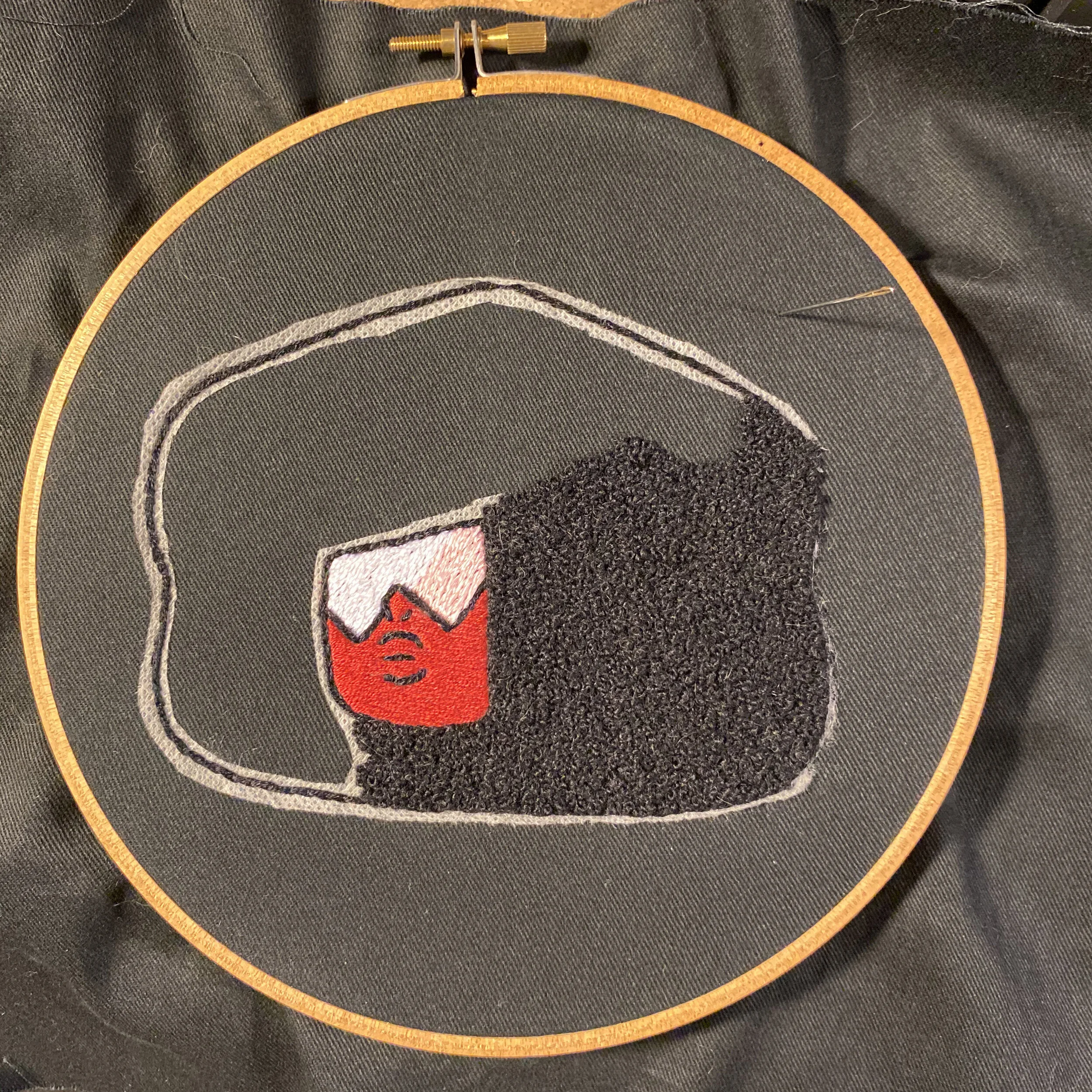
keeping it together

looked at a few hair color and border schemes once the chibi-inspired head design was finished. came across some cool references at characterdesignreferences.com when i was researching Steven Universe character design.
watched Steven Universe with Sam during lunch today, as usual. the episode, “Keeping it Together,” was Garnet heavy, no complaints here. Garnet is a pretty boss gem and definitely my favorite. i identify with Garnet a whole lot. the show is great, and each character is relatable in one way or another, except for Onion, maybe? no, no way. Onion is a big deal. i love Steven Universe…
Garnet focused episodes get me so hyped. “Keeping it Togehter” was pretty dark though, not as much fun, uplifting stuff going on. it kicks off with laundry folding (yuck!), then Ruby and Sapphire nearly split after experiencing internal conflict (yikes!).
got me to thinking about my Garnet patch — the one i made last year — and that i hadn’t done anything with the pictures i’d taken. so here that is, because why not? better out than in!
i started with a full body Garnet reference (which would have been so cool!), but decided it would have taken more time and resources to make than i necessarily wanted to spend on a patch at that time. so i re-illustrated Garnet to a chibi-inspired head. Garnet’s whole form is rad, she has gauntlet hands for Peedee’s sake! but probably my favorite part of Garnet’s physical form is her hair. for lots of reasons, one being that it’s awesome! i was on the fence about making her hair frame her entire head. happy i did. more merrier hair.

6/20/20 - filler stitches for Garnet’s face and shades

6/21/20 - outlining face and features

6/21/20 - starting Garnet’s hair. stitched french knots using a lightweight wool yarn.
6/22/20 - just before this point i realized i should have dissolved the stabilizer before stitching the hair…

6/25/20 - the color in this pic is goofy, and there’s cat fur everywhere… but look at that hair!

6/25/20 - choosing between satin and cotton stranded embroidery floss. had also just trimmed the fabric leaving a 1/8” or so border for stitching in yellow. used tacky glue at the edges to prevent fraying.

6/26/20 - decided to use the regular cotton six-stranded DMC floss in color 973 - bright canary.
alrighty, a few hot tips — no… super tips! — i’ve taken away from this process:
stabilizers are great for transferring designs onto dark fabric. i’ll try using tear-away stabilizer instead of water-soluble next time. and/or don’t embroider outside and then water the garden… had issues with water-soluble stabilizer on another embroidery project after this one, so it’s not just situational.
soak the fabric to dissolve the stabilizer before starting dense stitches (especially if they’re wool). i didn’t do it here until after starting on the hair. it became apparent that soaking it and trying to remove the stabilizer after finishing the french knots would be frustrating. it wasn’t too bad getting it out of the stitches i’d already done, but there wasn’t any reason to keep it, it was just a large fill area with no design information.
don’t need to use mod podge or heat n bond on the back of the patch. i used a heavyweight cotton for the base and the stitches were pretty stable. i would consider starting out with fusible stabilizer on the back (wrong) side of the patch fabric if i felt it needed more structure.
mod podge is pretty runny, and even though i used it carefully it came through the front stitches a little. some of the glue got into the satin floss fibers of Garnet’s shades. bummer…
i used the heat n bond on the back of the patch thinking it would make it more rigid. it did not… it’s intended for making iron-on patches and fusing appliqué. skip it.
uh, do this more. yeah… more things like this.

when i was working on my Garnet patch identity was the topic on everyone’s lips. June 2020 was a time. yeesh… i was still at my last office job and felt isolated and invisible. i saw myself in Garnet, and wanted to make Garnet visible on me. making the patch was an escape from the world, basically; and the process of making, now as ever, has kept me together. last June, through all the bullsh-t, i was able to make space to protect my mental health and exercise creativity authentically. one of my earlier revelations! was realizing i had the agency to do so. it’s a process, baby…
my Garnet patch lives on the back of my jean jacket, which — oh! — reminds me of another time from last year! Sam and i were eating at a seafood spot we really enjoy, celebrating our anniversary and my departure from “work-work”. i was feeling good, feeling confident, feeling myself. i can’t remember who shot first, but eye contact was made with one of the servers and she said, “great patch, i love Steven Universe!” ugh, cherry!

ubiquity

‘Everybody Loves the Sunshine’ - Roy Ayers Ubiquity (1976/Polydor) design by Beverly Parker, photography by Leonid Lubianitsky
remember this?
it’s getting nice outside. the birds singing this morning sound like they notice too. the first thing that came to mind was singing, “my life, my life, my life, my life! in the sunshine!” from ‘Everybody Loves the Sunshine’ by Roy Ayers Ubiquity.
“just bees, and thangs, and flow-wahs!”
feeling good.

Pokey

dropped off a typewriter to get fixed the other day. after some chit-chat with the typewriter repairman, i set out to road-test the mixtape i’ve been working on. i like doing that — driving and listening to mixtapes-in-progress — before putting my pencil down. i hadn’t planned on going driving, but plans change. i headed down a familiar avenue and took it farther than i have before. several towns from home i realized i was heading toward an antique store i like and charted a course.
the shop is small with stalls arranged thematically, and an entire corner filled with toys. on my first visit i spent a bit of time in the toy corner and found a posable, rubbery Pokey figure just like the one i had as a kid. i wanted to get it then, but resisted on account of my penchant for collecting. on every visit since then i’d play a game: check the toy shelves for Pokey, leave him there for next time. this Pokey wasn’t in great condition, or particularly collectible; but he was recognizable, familiar. i looked forward to searching for Pokey just as much as i did combing through the bric-a-brac.
last time i stopped in i noticed that the shop was downsizing. one of the two back rooms that usually showcased larger pieces had been closed off. i was seeing that Pokey wasn’t the only thing that could disappear on the next visit — it could be the whole store. queue the world’s tiniest violin please…
i decided to buy the Pokey toy before i even pulled into the lot. i regretted not buying it last time and didn’t want to pass up the opportunity. (also, there were a couple brochures i had seen that would make great collage material. two birds, really.)
i walked in, said a quick “hello” to the gentleman arranging items in stalls and headed straight to the toy shelves where Pokey was, right where i saw him last. i pulled Pokey from a clutter of toys, grabbed the brochures and excitedly chirped my Pokey story to the same gentleman as before who was now ringing me up. he obligingly replied, “oh, yeah?” unsurprisingly, he wasn’t as humored to hear my story as i had been to tell it. can’t win ‘em all.
i finished listening to the mixtape on the drive home. i’m happy with it. it tells the story i need it to, for me. it is finally done, and Pokey is finally my pony.
the mixtape making process is a whole other thing. i had tried writing it along with my Pokey story, but it was proving quite challenging. i thought it could be the character building kind of challenge, but it was getting confusing and i kept generalizing important details. when i read back what i wrote, i feel as thought it was written for someone else. not helpful, and more disorienting.
i need space to reflect and clearly articulate some complicated feelings. feelings around processing relationships and memory. i want to give myself room to move and breathe before unleashing it to this space and the internet time capsule.
also, i want to dispatch another note-to-self: this is for you - write for your own self-reflection. what is it that you need from this? write to describe your process so that you may better understand how you move through the world. you got this…